FS Colour Series: Poppy Inspired by Howard Hodgkin’s Emotional Resonance
Bold, powerful and intoxicatingly bright, POPPY Linen’s candy hue can bring a snap of life to everything around it. British abstract painter Howard Hodgkin saw this colour’s vibrant, sparky potential, layering it into his evocative arrangements of colour, texture, shape and light as a foreground flare of colour that jumps towards us. He also saw the potent emotional resonance in this shade of red, which brings fiery heat into his intensely personal artworks, leaving them red raw with passionate wounds of expression. “The only way an artist can communicate with the world at large is on the level of feeling,” he wrote.
Hodgkin was born in London in 1932, but he spent three years in Long Island in the United States for during the Second World War, where he first encountered the art of Henri Matisse, Pablo Picasso and Pierre Bonnard. Following his return to England, Hodgkin was sent to boarding schools at Eton and Bryanston, but he struggled to settle and ran away from both on various occasions. One constant in his childhood was his love of art, particularly anything with bold, vibrant colour. At Eton he was first introduced to Indian miniature painting, and began buying a small collection as a teenager, falling in love with their intricate patterning and lavish detail.
Hodgkin began studying art at Camberwell School of Art in 1949, but felt at odds with the teaching methods and soon left to finish his degree at Bath Academy of Art in 1950, finding a relative period of stability. A slow and steady worker, Hodgkin took time to find his signature voice. Several teaching posts in England kept him afloat while he searched for a true, authentic means of expression, but even after his first solo exhibition at Arthur Tooth & Sons when he was 30, featuring a series of semi-representational, brightly coloured figurative paintings, Hodgkin was still dissatisfied.
A breakthrough came in the 1960s when Hodgkin visited India; the vivid, vibrant culture he experienced opened him up to new ways of thinking about art. Even so, Hodgkin was well into his forties before he found serious recognition as an artist, while continuing to live and work in London. Success came his way when he allowed himself to become lost in a purer, freer form of abstraction, increasingly obscuring any references to the real world, while memory, feeling, colour and light took over. Printmaking became an important strand to his art during this time, a medium that allowed him to extend his painterly language in daring new directions.
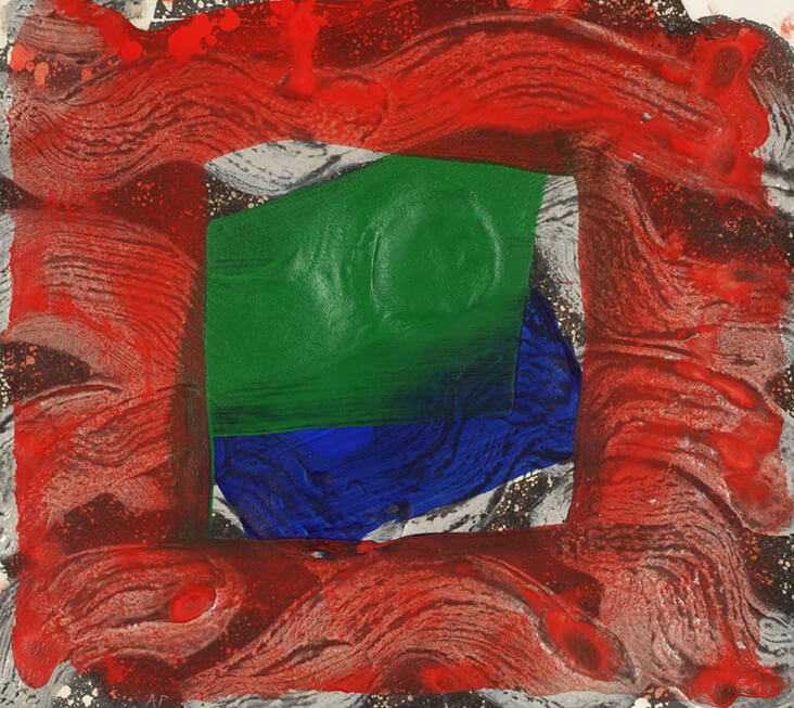
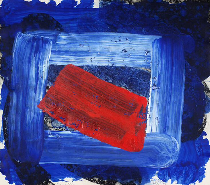
Hodgkin won the Turner Prize in 1985; buoyed up by success, his work became ever more direct in colour and expression. Much of his work has been made in response to memories of specific times and places, such as the intensely bright mixed media print Norwich, 1999, in which dark, cobalt blue streaks of ink flow across the rugged, textured surface, while a boxy, painterly frame adds structure and weight. Breaking apart the sea of blue is a single, precariously placed streak of poppy red that hovers overhead, as if suspended mid-air. In the later etching Strictly Personal, 2001, angular, gestural brushstrokes sweep across the surface with apparent ease, overlapping one another in a rhythmic, melodic dance. Acid bright crimson seeps into the paper like a deep stain, vibrating against a deliciously liquid streak of apple green.
Hodgkin continued in this expressive vein throughout his later years, expanding his hard-won, painterly language of expression. Despite their spontaneous appearance, he often spent years on his paintings, letting them develop slowly over time alongside one another in the studio through a process of layering, scraping back and re-applying. The decadently rich Paris, 2010-16, took Hodgkin six years to complete, balancing soft tones of turquoise, blue and brown against a dazzling rectangle of red that seems to burn with searing heat. Like many of his other artworks, paint spills outwards onto the surrounding picture frame as if making a bid for freedom. In Morning, 2015–16, the entire frame becomes engulfed by waves of watery blue paint, weaving in and out between three gloriously bright strands of blushing crimson that pulse across the scene with urgent, flowing energy.

















2 Comments
Vicki Lang
What a beautiful red and Howard Hopkins makes it jump off the surface of his paintings.
Rosie Lesso
Yes, it’s such an amazing shade – he really balanced it carefully with other, more subdued colours…