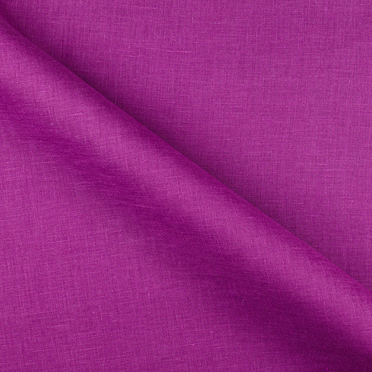
FS Colour Series: DAHLIA Inspired by Cy Twombly’s Floral Blooms
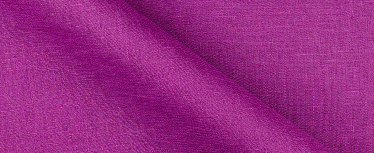
American artist Cy Twombly made the kind of art that celebrates what it is to be an artist, with wild scribbles, streaks and swipes applied with a raw and primal energy. Twombly made his name during the 1950s as a leading member of the second-wave Abstract Expressionist school, alongside Robert Motherwell, Helen Frankenthaler and Robert Rauschenberg. But he spent much of his later life in Italy, where he interwove classical ideas into his abstract art. He then began painting with an increasingly spontaneous language, and shockingly bright shades of pink and purple like DAHLIA. Flowers were a recurring theme in his later art, but they were far from pretty and sentimental, instead expressing the messy, tactile, and all-consuming qualities of the natural world.
Twombly was born in Virginia in 1928, and went on to train as an artist in Boston and New York. It was Twombly’s close friend, Robert Rauschenberg who persuaded Twombly to attend art classes at Black Mountain College. From there Twombly went on to travel throughout Italy, soaking up the way classical art told mythological stories with energised bodies and wild drapes of fabric. The art that Twombly subsequently made was filled with swooping and looping lines in grey graphite that form a kind of rudimentary hand-writing, coupled with streaks of sharp colour. After building up a reputation as a leader in the 1950s New York school, Twombly would thereafter spend the rest of his life living between Italy and the United States.
In his later years, Twombly adopted a more fluid and painterly way of working, with larger passages of colour and broader marks. In the lively and spirited work on paper titled Naumachia, 1992, Twombly combines free-floating swirls of dark fuchsia with the blackest black, a dramatic contrast of tones that jostle against one another. Above them, we see Twombly’s trademark child-like proto-writing. The painting is named after the famous mock sea battles Romans would stage for entertainment, and Twombly’s high-contrast colour scheme here mimes the theatrical danger that such an event could convey.
In the later painting Untitled, 2001, we see Twombly toying with more intense, all-consuming colour scheme. He contrasts bright purples and pinks here with zesty yellows and oranges, building up thick and thin washes of paint in loosely applied layers and letting it run in rivulets down the painting’s surface. Here and there paint gathers in solid patches, blooming like fresh flowers. The overall result is a glorious tangle of messy marks that tap into the primal, human spirit of being alive.
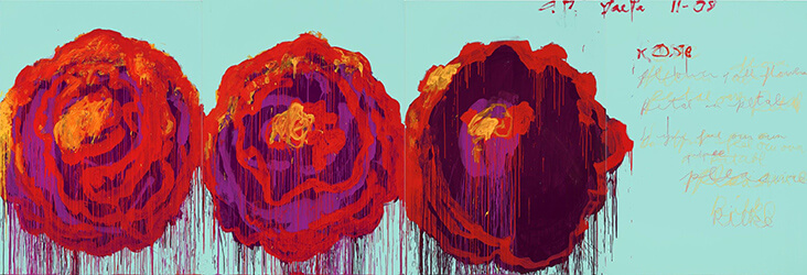
In 2008 Twombly made a series of paintings, drawings and prints based on floral subjects. But he deliberately avoided making his flowers too decorative by working on huge canvases with shocking, acid-bright shades of pink, purple and yellow, and applying great gestural passages of wet, watery paint that drip in appealingly tactile ribbons down the surface of the canvas. Twombly’s rose paintings are among his finest artworks ever made, a celebration of nature in all its dirty, sensuous and tactile wonder. In many of these paintings, we also see how Twombly has masterfully interwoven hot shades of purple into his art. In Untitled (The Rose), 2008, he toys with how shades of purple and blue can dominate the canvas with luminescent light. By contrast, in The Rose, (I), 2008, Twombly builds jagged streaks of purple on top of golden yellow, suggesting the dark fleshy interior of the flower. Meanwhile, in The Rose (IV), 2008, Twombly layers bold accents of bright purple on top of dark aubergine, along with rippled, wavy ribbons of crimson red. Together, these two unlikely bright hues weave in and out of one another as if catching the light, and carrying it to the centre of the flower.














One Comment
Vicki Lang
Love the vivid colors of the flowers and also the new color of linen.