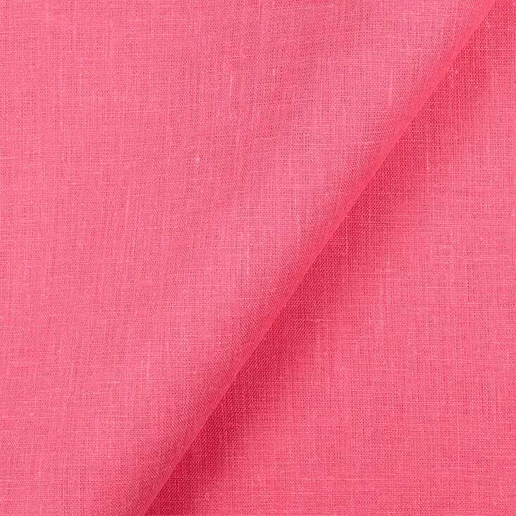
FS Colour Series: Honeysuckle inspired by Patrick Caulfield’s Coral Pink
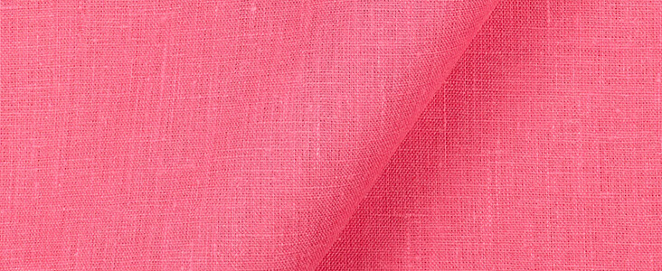
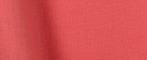
HONEYSUCKLE linen’s coral pink slices through Pop artist Patrick Caulfield’s paintings and prints, causing a striking and instantly memorable impact. Still life and interior views were his favoured subjects, brought bursting to life with the acid-sharp colours and flat, gimmicky style of comic book art. Eclectic arrangements of big, bold and simplified objects in deliciously bright colours, patterns and textures allowed Caulfield to produce imagery as seductive and enticing as a children’s sweet shop. But underneath all the shop-window-display artifice Caulfield also hints at a certain ennui and unease; pipes are dropped on the floor, food is cut open and abandoned in a hurry, and we are left wondering where the people in his stories have disappeared to.
Caulfield was born in 1936 in Acton, London. He studied at London’s Chelsea School of Art and graduated in 1960, before going on to study at London’s Royal College of Art shortly after David Hockney and R.B. Kitaj, artists who would become fellow Pop contemporaries in the years to follow. Travel to the Greek island of Crete had a marked impact on Caulfield’s early art, as he sought to emulate the flat, crisp and clean colours of Minoan art. Back in London, Caulfield first came to prominence in 1964 when his art was included in the landmark exhibition ‘new Generation’ at London’s Whitechapel Gallery, which marked the arrival of British Pop Art to a public audience.
In early paintings Caulfield adopted household gloss paint for its slick, polished veneer, a material that suited the flat, graphic style and domestic subject matter of his art. Although he later moved on to oil, acrylic and screenprinting, Caulfield continued to paint with the same clean flattened language for the remainder of his career. The subjects Caulfield selected were deliberately ordinary and lifted from traditional art genres including still life and domestic interiors, injected with a curious, intriguing and sometimes unsettling quality Caulfield referred to as “the shock of the familiar.”
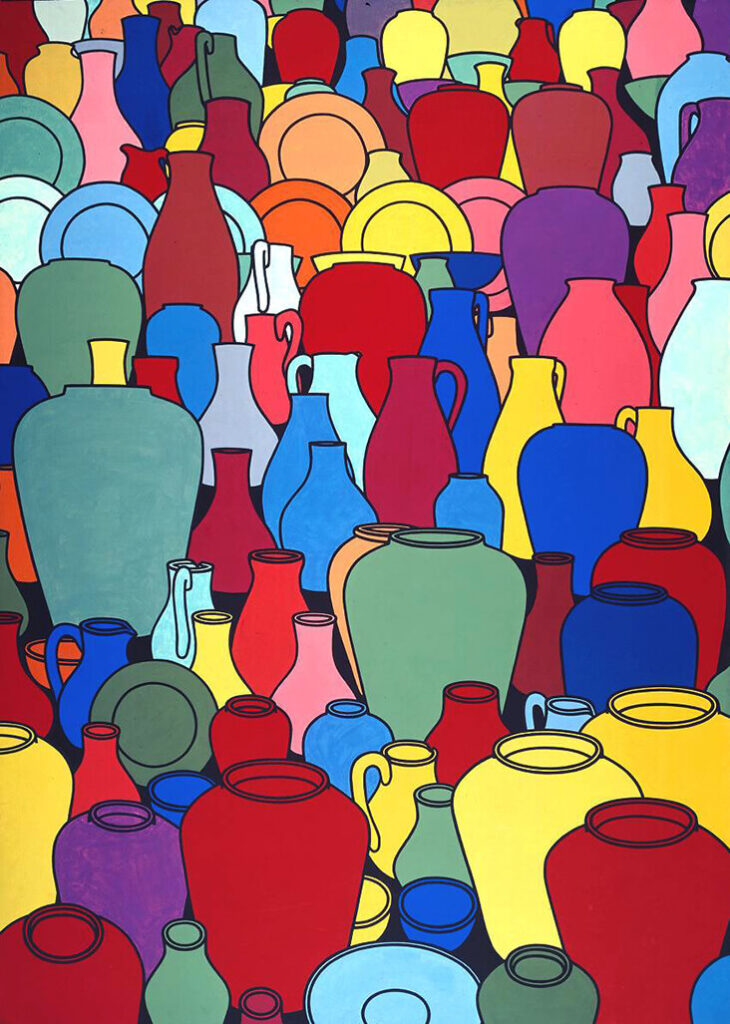
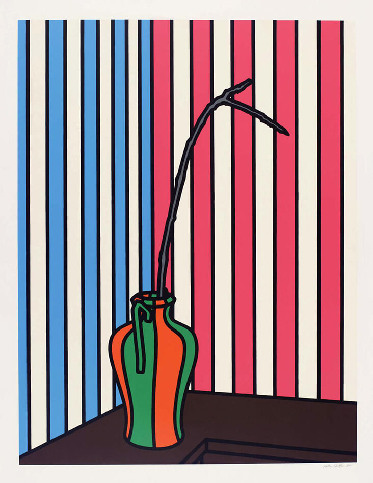
In the deliciously vibrant oil painting Pottery, 1969, Caulfield crams into view a motley crew of pots, jugs and plates seen from varying angles as our eye moves up the scene. Described by Caulfield as “an excuse for me to use a lot of colour,” the crowded scene is an eye-popping array of rainbow hues, but slabs of warm coral and hot pink bring humanity and warmth into the scheme. In the later screenprint Fig Branch, 1972, ludicrously colourful stripes adorn the walls and decorate the exterior of a single precariously balanced pot. An ominously jagged fig branch reaches out from the pot and extends over a panel of hot pink stripes, cutting in to their sickly-sweet optimism with an air of menace.
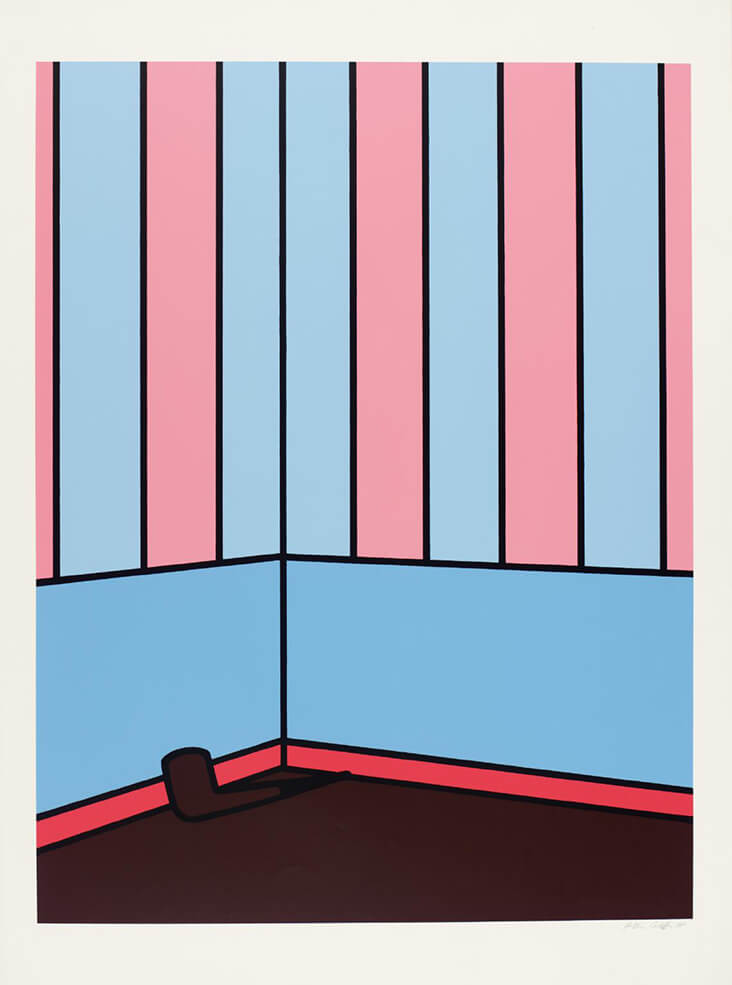
Another screenprint of the same year, titled Pipe, 1972 is more minimal and discreet, as baby shades of pastel blue and pink streak the walls and cornicing of an empty room. Just one single band of juicy coral pink on the lower walls brings heat and energy to the scene, running like a layer of jam between chocolate brown and pale blue. This searing pink also draws our eye towards an abandoned pipe thrown hastily onto the floor, an object that brings figurative and narrative references into an otherwise almost abstract scene. The later screenprint Sausage, 1978 marks a new departure for Caulfield, as we see his visual language extending to include elements of textural pattern and decoration alongside his trademark flat panels of colour. The almost laughably ordinary subject of a sliced sausage becomes animated with vitality and life in Caulfield’s hands, as it is chopped open and falls outwards over a jazzy, animated Matisse-like backdrop. Though plain brown on the outside, the inside of the humble sausage is portrayed as richly textured, juicy and moist, as streaks and daubs of coral and fuchsia pinks sprinkle it with deliciously hot, spicy flavour.














Leave a comment