FS Colour Series: Coral inspired by Joan Miro’s Red Fire
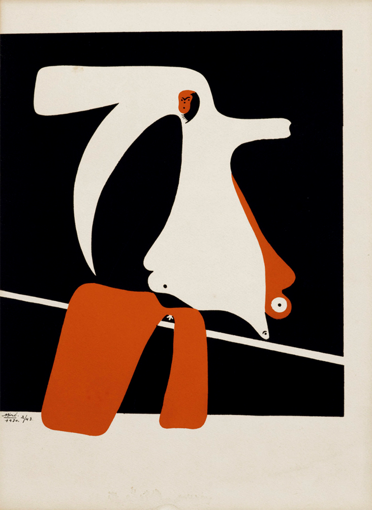
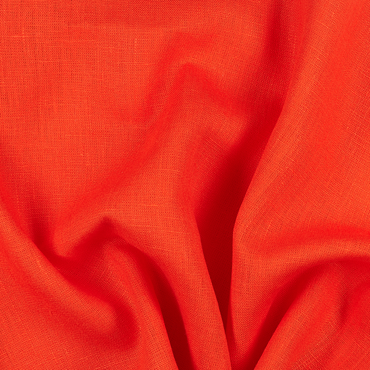
CORAL linen is a colour filled with heat and fire, burning with the raging intensity of a Spanish sunset. For the deeply passionate painter Joan Miro this red held great significance, both as a patriotic symbol for his native Spain and a potent carrier of raw, overflowing emotion that spills out from his canvases and into the room beyond. With a fervent desire deep in his belly to connect with the human spirit through colour, he wrote, “Colour is the keyboard, the eyes are the harmonies, the soul is the piano with many strings. The artist is the hand that plays, touching one key or another, to cause vibrations in the soul.”
Miro was born to a family of craftsmen in Spain, developing an early interest in drawing from a young age. Though his family initially tried to persuade him to follow a career as a Clerk, after suffering an emotional breakdown he found making art a powerful form of catharsis and release that aided his recovery. In 1912, while studying at the art academy in Barcelona he encountered Catalan’s contemporary poetry and sought ways to introduce it into his paintings through abstract arrangements of patterns and colour, writing, “I make no distinction between painting and poetry.”
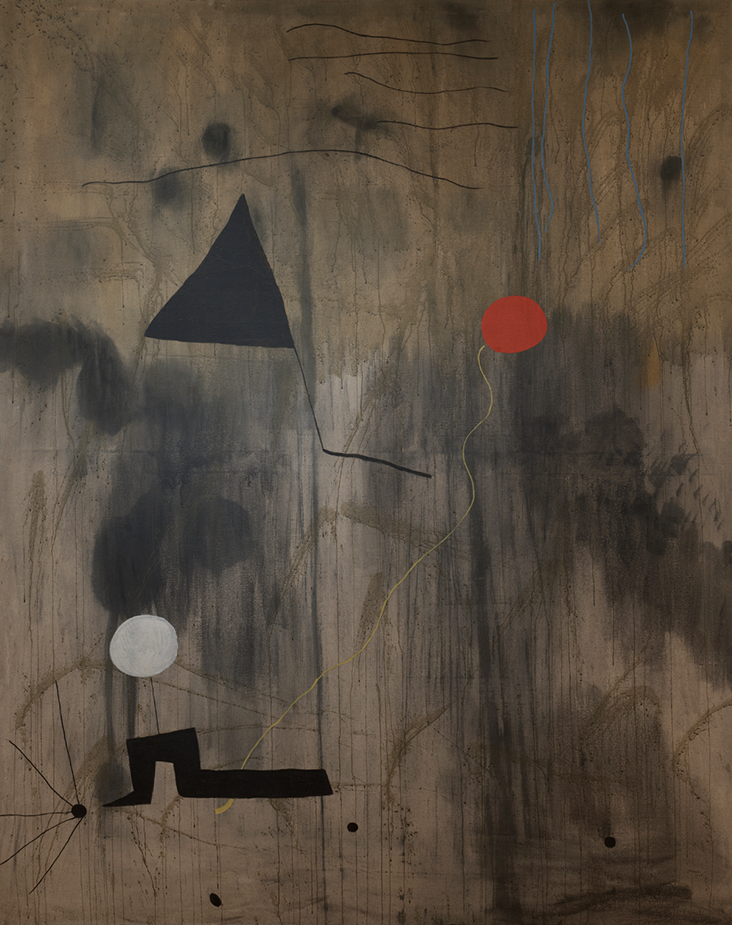
During various extended visits to Paris in the 1920s Miro was influenced by the burgeoning Surrealism of Pablo Picasso, Max Jacob, Paul Klee and Andre Masson, particularly their focus on automatism and free association, describing their influences on him: “I immediately burst into painting the way children burst into tears.” Dancer, 1925, delves into the realms of poetic abstraction, where forms dissolve as colour becomes light, passion, energy and movement. Though iridescent blue light permeates the canvas it is the red here that sings out, the pulsing hot heartbeat of a Spanish dancer. In The Birth of the World, 1925 geometric shapes float in a free world, suggesting what Miro called “a sort of genesis.” Soft, muted background colours fall away into the distance, allowing a small patch of blood red to jump into the foreground like the birth of new life.
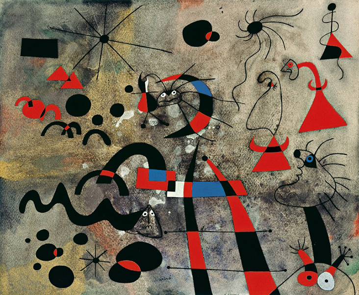
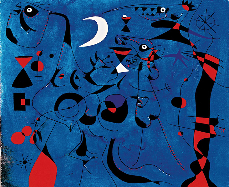
Painted 15 years later, The Escape Ladder, (Constellation Series), 1940 follows in this vein, where an atmospheric, painterly ground becomes a theatrical setting for abstract shapes and forms. The frenetic energy of this work is filled with instability and uncertainty – Miro began his Constellations series in 1939 at the outbreak of war, when he and his family faced several upheavals before settling in Mallorca. Faced with blackouts Miro could no longer look out at the night sky, so he began this series as a substitute, where strange, star-like forms spread into space and swooping bird shapes suggest bombers over Spain. Terrified eyes stare out at us and red here becomes a symbol of warning and threat, but Miro also reflected on it as a colour of humanity, writing of a desperate “need for liberation in all of us.”
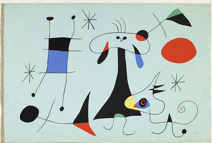
In the 1950s Miro’s work became increasingly abstract and the symbol of a hot, burning sun became a recurring motif. In The Red Sun, 1950, a fiery orb radiates glowing warmth and life, gently brushing against the horizon line as it lowers towards the ground, while subtle motifs suggesting stars or music notes wisp across the sky. Between 1954 and 1958 Miro developed his ideas in printmaking and ceramics, producing magnificent symbols of vibrant optimism. In the print Zephyr Bird, 1956, patches of red sing out against softer blues, greens and yellows, with an improvised freedom resembling abstract expressionism.
In Miro’s later years colours and forms became more streamlined and simplified, but red continued to provide embers of warmth amongst panels of cool sandy, royal blue and cucumber tones. We see this interplay in his final work of art, the monumental public art sculpture Woman and Bird, 1982, where an abstract column is streaked with strands of vivid blue, green and yellow, while a rich, glowing red represents energy, light and life.



















Leave a comment