FS Colour Series: ASH Inspired by Edouard Vuillard’s Enigmatic Light
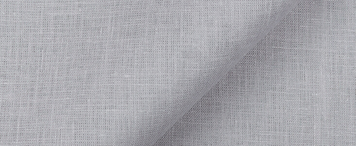
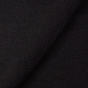
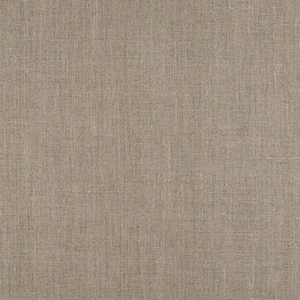
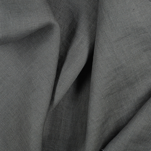
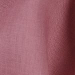
ASH Linen’s cool, quiet tone became areas of peaceful respite in Edouard Vuillard’s intimate interiors, drenching private spaces in a mysterious and enigmatic light. Leader in the Parisian Intimiste movement of the early 20th century, Vuillard’s paintings focussed almost exclusively on private indoor spaces, painted with soothing colours to convey a quality of quiet isolation and comfort. French 20th century writer Andre Gide observed with wonder how Vuillard’s paintings “speak in a low tone, suitable to confidences.”
Much like his art, Vuillard’s life was modest and temperate, changing little throughout the years. Born in 1868 in Cuiseaux in France, the family moved to Paris in 1878, and Vuillard would remain in the city for the rest of his life. Vuillard sadly lost his father when he was still a teenager, but the loss pushed Vuillard closer to his mother, a seamstress who worked hard on her home-run business to support her son – he would remain living with her until her death in 1928. Scraps of his mother’s fabric left lying around their home must have inspired the young artist’s budding mind, and in 1886 he began studying art at the academic Academie Julian. Here he met Pierre Bonnard and the pair would forge a close and long-lasting friendship based on a shared respect for Impressionist and Symbolist painting. Further studying at the renowned Ecole des Beaux Arts gave Vuillard a solid understanding of the formal, academic properties in art – he spent much of this time making studies in the Louvre of Dutch 17th century still life and domestic interiors, admiring their quiet, studious inner light.
Vuillard became an active member of the artist group Les Nabis in 1889, where he worked alongside a like-minded group led by Paul Serusier who encouraged imaginative responses to the real world with heightened colours and flattened shapes as inspired by the art of Paul Gauguin. Moving beyond the real world, Vuillard’s art became increasingly focussed on flat, decorative passages of pattern combined with hazy atmospheric light. As his personal style developed, Vuillard’s approach became more closely tied with the Intimiste movement alongside Pierre Bonnard – both made quietly personal interior views that became potent metaphors for the interior mind.
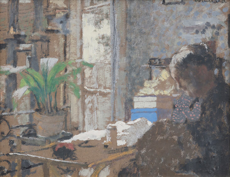
With limited means, many of Vuillard’s drawings and paintings were painted directly onto affordable panels of grey millboard, which gave his paintings a muted, neutral backdrop. The tranquil and slight painting Madame Vuillard Cousant, Scène d’Intérieur, 1898, demonstrates how Vuillard integrated the grey millboard backdrop into his overall colour scheme, building harmonious and closely related hues on top while leaving the original surface still visible. In this work rippled passages of cool grey brighten the entire colour scheme, introducing the sharp freshness of daylight into the half-lit interior. The colour gently flickers over the face of the artist’s mother on the right side, blending her into the background like a ghostly spectre. “I don’t paint portraits,” Vuillard observed, “I paint people in homes.”
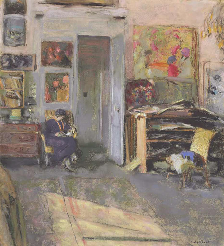
Lucie Belin Dans l’Atelier, 1915 captures a model posing in the bustling, creative apartment Vuillard shared with his mother over the years. On the right, the artist’s works are strewn haphazardly onto a plan chest, while busy, colourful paintings adorn the walls. But the open door is a tall pillar of calming, cool grey, leading us downwards towards the model, small in the scale of the room, whose body settles back into the golden chair with relaxed ease.
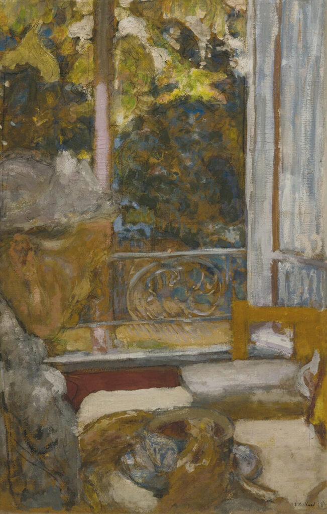
One of Vuillard’s most prized objects at home was his kodak camera, which he would use to take cropped snapshots of ordinary life, allowing him to find new and unexpected compositions for artworks. Madame Vuillard Au Petit-Dejeuner a La Toquade, 1923 reveals this unusual and experimental cropping, as the artist’s mother is only partially seen on the left quietly pouring milk into her morning coffee. A simplified colour scheme is elegantly created here as warm golden green is balanced against the icy freshness of bluish grey daylight; this sharp light streaks across painted shutters and onto his now elderly mother’s white bonnet beyond. In the later pastel drawing Portrait de Philippe Berthelot, 1928 Bonnard explores a strikingly similar colour scheme, juxtaposing warm, honey and amber tones with background washes of silvery, metallic grey. Avoiding any attempt at monumentality or grandeur, Vuillard chooses instead to portray the man caught in a moment of ordinary, peaceful and quiet reflection as the blank, cold wall behind him reflects his easy state of mind.















6 Comments
Mary Berdan
Rosie, I can only ditto what the other’s have expressed. I am a fan of both of these artists. Thank you. The color ASH is worth contemplating!
Adrienne Brown
Thank you for this wonderful post on one of my favorite artists. I really love the first painting you described in this article: “Madame Vuillard Cousant, Scène d’Intérieur, 1898”. Would you know where I can obtain a print of the work? Thank you
Rosie Lesso
Hi there, thank you all so much for the lovely feedback -I agree both artists have an incredible sensitivity for colour. I couldn’t find a seller for that particular Vuillard print, but Red Bubble seem to do a fair few others by him if you happen to be interested. Hope this helps and sorry I couldn’t find the painting you were after!
Rosemary Antel
Thank you Rosie!
I, too, love these paintings. Vuillard for his quiet contemplative grey colors and Bonnard for his glorious juxtapositions of gold/magenta and blue-violet/orange. It is wonderful to see these colors come available here at fabric-store as I dream about where I could use them. I love greys for clothing and use the brilliant colors for pillow covers. I just need more hours in the day to complete my projects.
Rosemary
Corinne Skulmoski
Hi Rosie – I love the serene quality of these paintings, they accurately capture the quiet, contentment I feel in my own sewing room. It was a stroke of genius having you do a blog on this site. It’s an education in looking at color. So glad you’re here!
Rosie Lesso
Thank you so much – I’m very glad to be here too!!