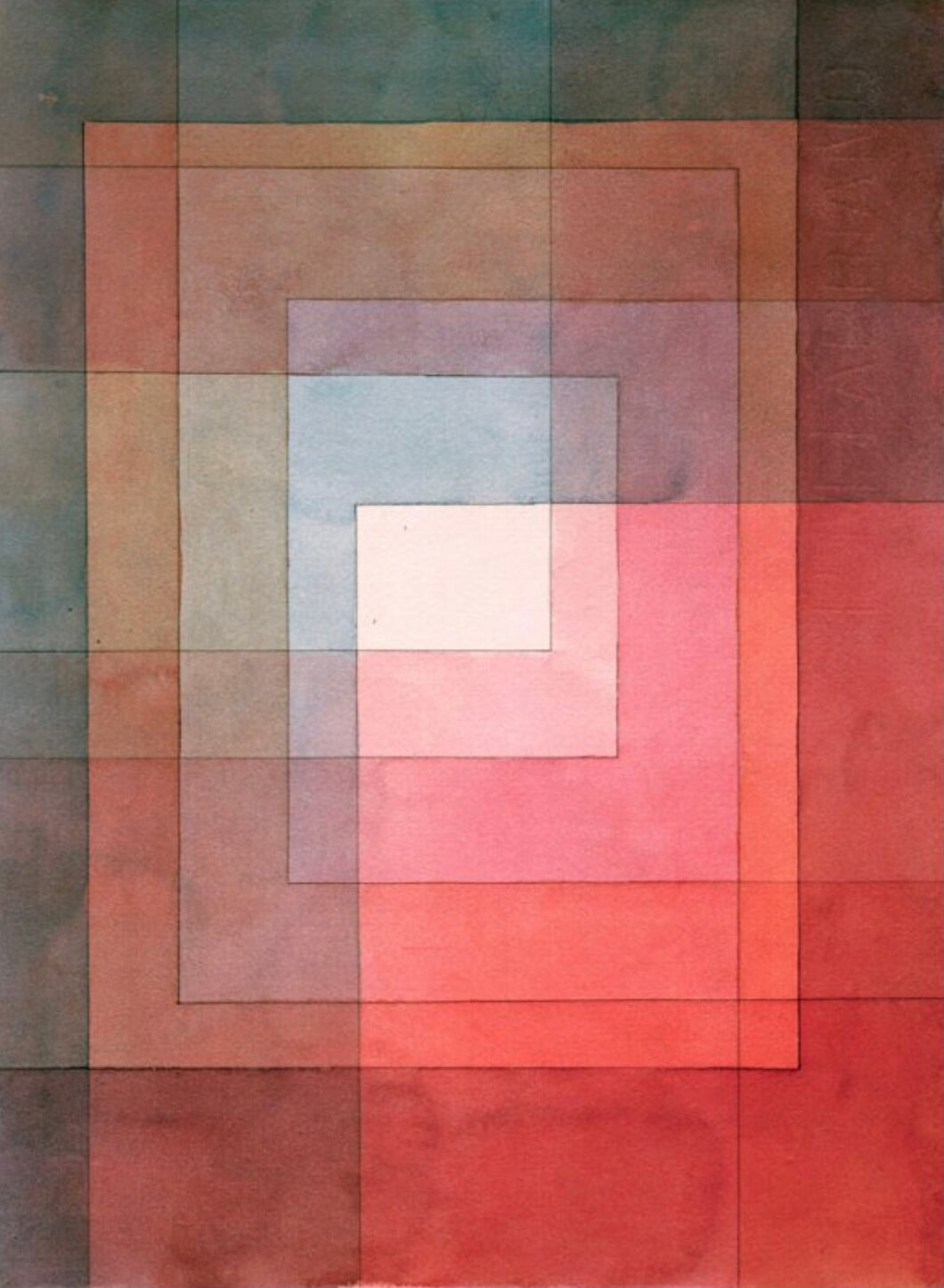
Polyphonically, 1930
Colour was a key component in the art of early 20th century Bauhaus artist Paul Klee, one he treated as a powerful, emotionally resonant force. He immersed himself deeply in colour theory, applying the principals of colour relationships into his art to create ambient, symphonic arrangements. “Colour and I are one,” he wrote in a notebook. Cashmere Rose’s tart, blush pink often appeared in his playful geometric and linear arrangements, carrying with it a sumptuous blend of warmth and vibrancy.
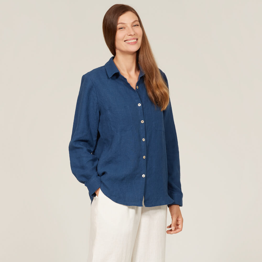
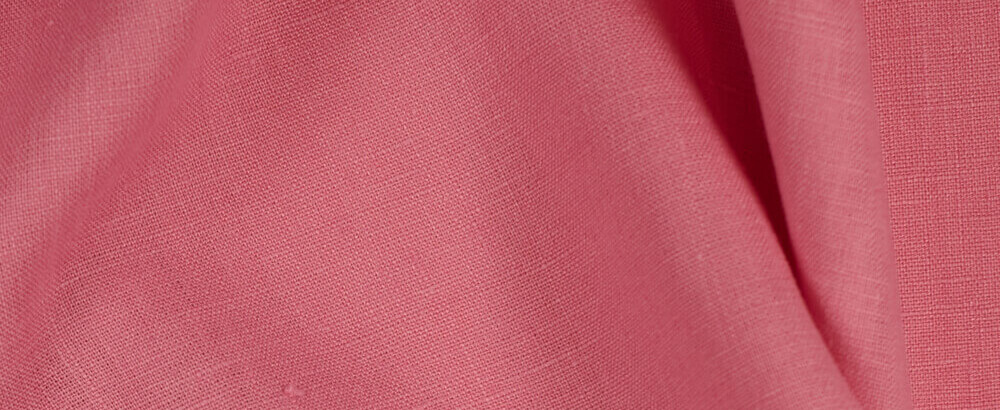
FS Cashmere Rose Signature Finish linen
Klee was born in 1879 in Munchenbuchsee, Switzerland to a creative family – his father taught music and his mother was a professional singer. Much like his parents he developed a lifelong interest in music, picking up the violin age 7, but his true passion was for drawing. While his parents pushed him to pursue a career in music, Klee was determined to follow his dream of becoming an artist. After training in the studio of German symbolist Franz von Stuck in 1900, he met Wassily Kandinsky and Franz Marc, founders of the expressionist art group Der Blaue Reiter, (The Blue Rider) whose art was aimed at ‘riding’ into the realms of the subconscious and imaginary. They had a profound impact on Klee’s own art, and he moved towards an increasingly abstract, geometric language, playing with structured, architectural shapes and patterns. “Art should be like a holiday: something to give a man the opportunity to see things differently and to change his point of view,” he wrote in his diary.
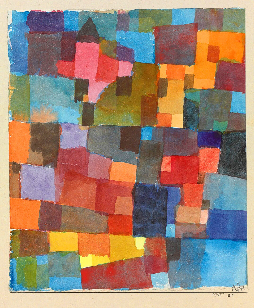
Spatial Architecture (Cold-Warm), 1915
In Spatial Architecture (Cold-Warm), 1915, we see Klee experimenting with translucent passages of paint arranged into a patchwork-like grid pattern, with smaller squares scattered over larger ones to resemble windows or entry points. In the upper left corner of the image, Klee has painted a patch of particularly bright, rose pink, the only square topped with a pointed roof to resemble a church steeple or home, acting as a point of spiritual refuge or reflection. We see in this work how Klee moved past representation to convey inner worlds of his own creation, based on intuition and emotion. He wrote, “It is the artistic mission to penetrate as far as may be towards that secret ground where primal law feeds growth.”
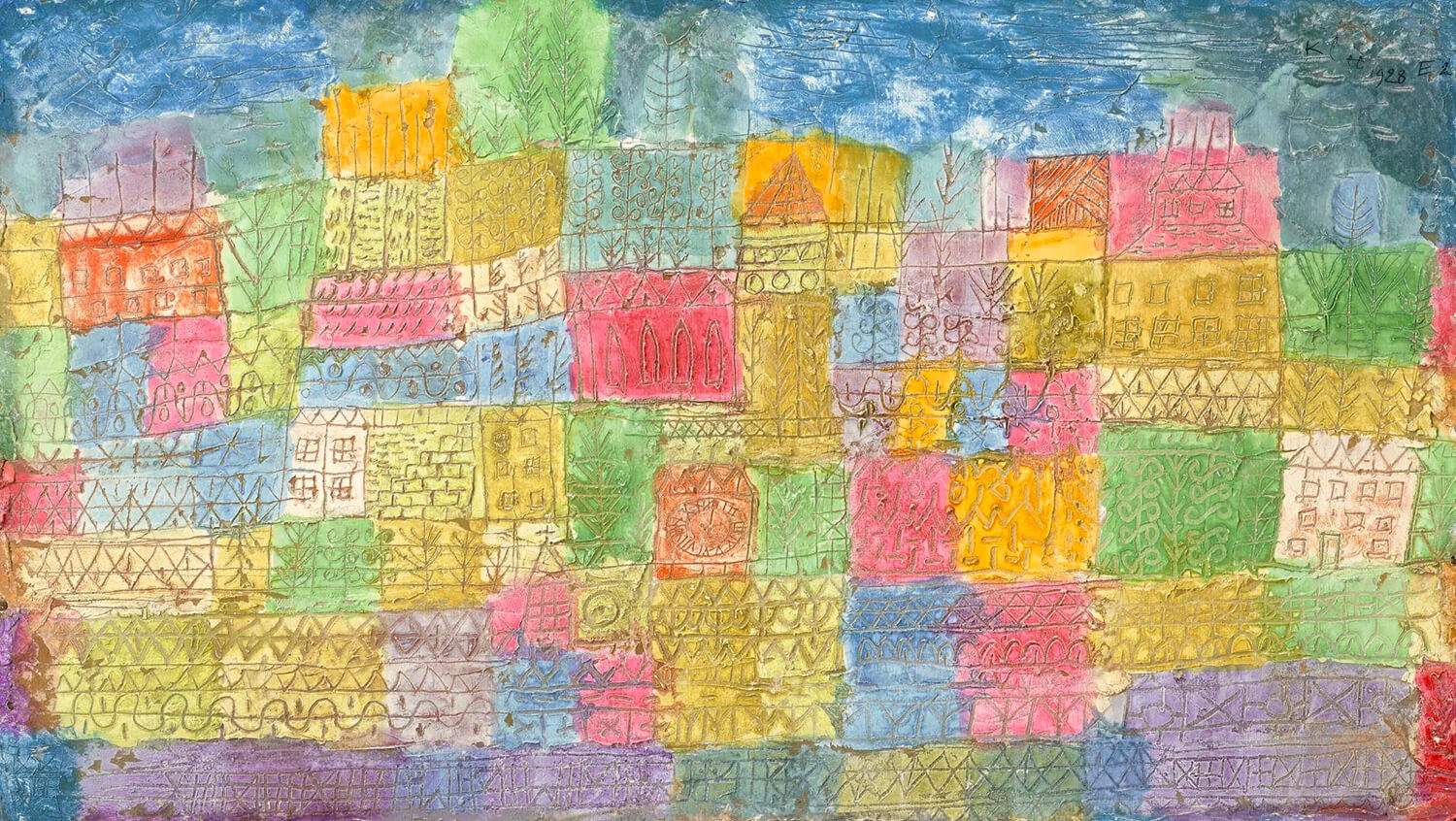
Colourful Landscape, 1928
In 1920 Klee took up teaching work at the Bauhaus in Weimar, and remained here for the next decade. Colour became the driving force in his art and teaching during this time, as he noted in his diary, “Colour possesses me. I don’t have to pursue it. It will possess me always, I know it.” Made while he was teaching at the Bauhaus, Klee’s painting Colourful Landscape, 1928, has a structured quality, with the suggestion of imaginary buildings and plants arranged into a complex grid pattern, painted in soft, harmonious shades of blue, pink, yellow and green. Blush shades of pink are scattered throughout the image, forming intense patches of saturated colour here and there that seem to pulse with energy and light. “See with one eye, feel with the other,” wrote Klee of works such as this one, which play with the boundaries between the real and the abstract.

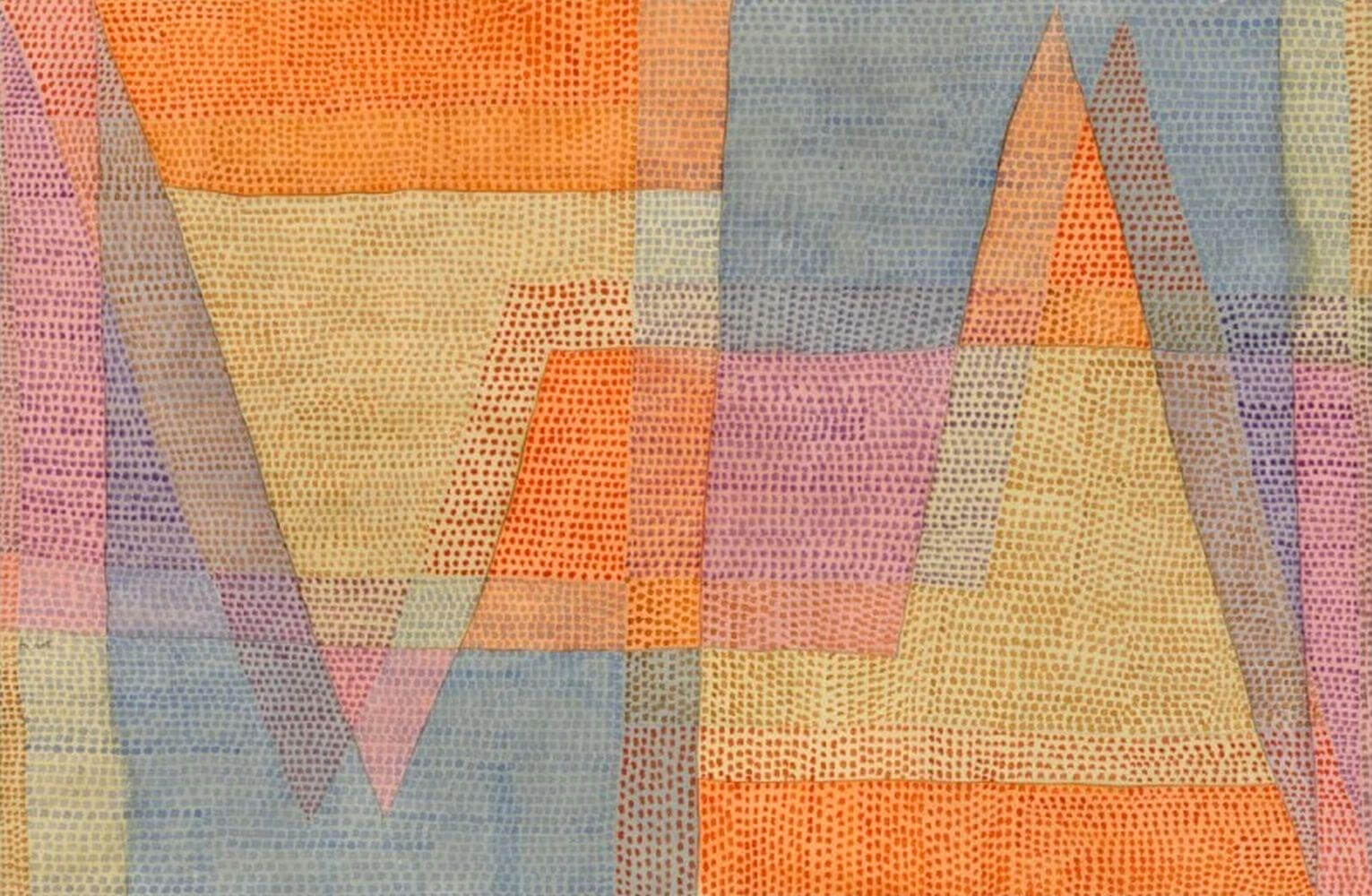
The Light and the Sharpness, 1935
In the 1930s Klee moved with his family to Berne, in Switzerland. His art became increasingly experimental, with playful explorations into texture and surface pattern. In The Light and the Sharpness, 1935, Klee creates dotted patterns over flat, zig-zagged planes of colour to create a hazy, shimmering effect. Soft, pale pink planes of colour are scattered throughout his geometric design, intermingling with orange, pale yellow and pale blue, all of which seem to shift in and out of the light as they intersect with and overlap one another, suggesting the transient movement of light and colour that captivated Klee throughout his life.