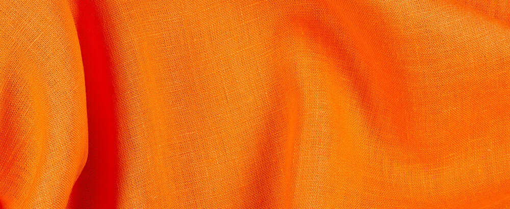
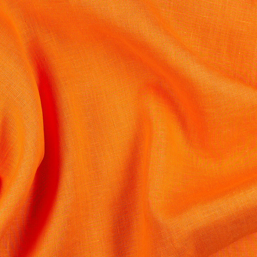
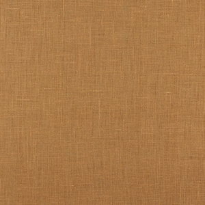
FS Colour Series: TANGELO Inspired by Josef Albers’ Radiant Orange
German, early 20th century artist Josef Albers spent his lifetime exploring the ambient properties of colour, and how their interactions could alter perceptions in the human eye. He experimented with just about every chromatic relationship possible, in a language of stark, simple geometric abstraction, allowing the radiance of his stacked colours to take centre stage. Shades of bright orange like TANGELO featured time and again in Albers’ art, often as glowing auras of light in amongst darker or more muted hues. Through balancing this shade with deep greens, greys, blues, and dark reds, he demonstrated how its properties could shift, alter, and even appear to advance or recede on the flat picture plane, proving that the way we experience colour is all about context. He wrote, “When you really understand that each colour is changed by a changed environment, you eventually find that you have learned about life as well as about colour.”
Albers was born in 1888 in Bottrop, Germany. His father’s skills in carpentry, house-painting and plumbing came to inform Albers’ pragmatic, hands-on approach to making art. After training as a teacher in the early 20th century, he went on to printmaking in Essen and Munich. He studied at the Weimar Bauhaus in 1920, and two years later became part of the teaching faculty, where he taught within several different design schools including carpentry, metalwork, glass, photography, and graphic design. Within his own practice, he was fascinated by the transparency and vivid colour of stained glass, and began making assembled sculptures from discarded glass shards and bottle bottoms.
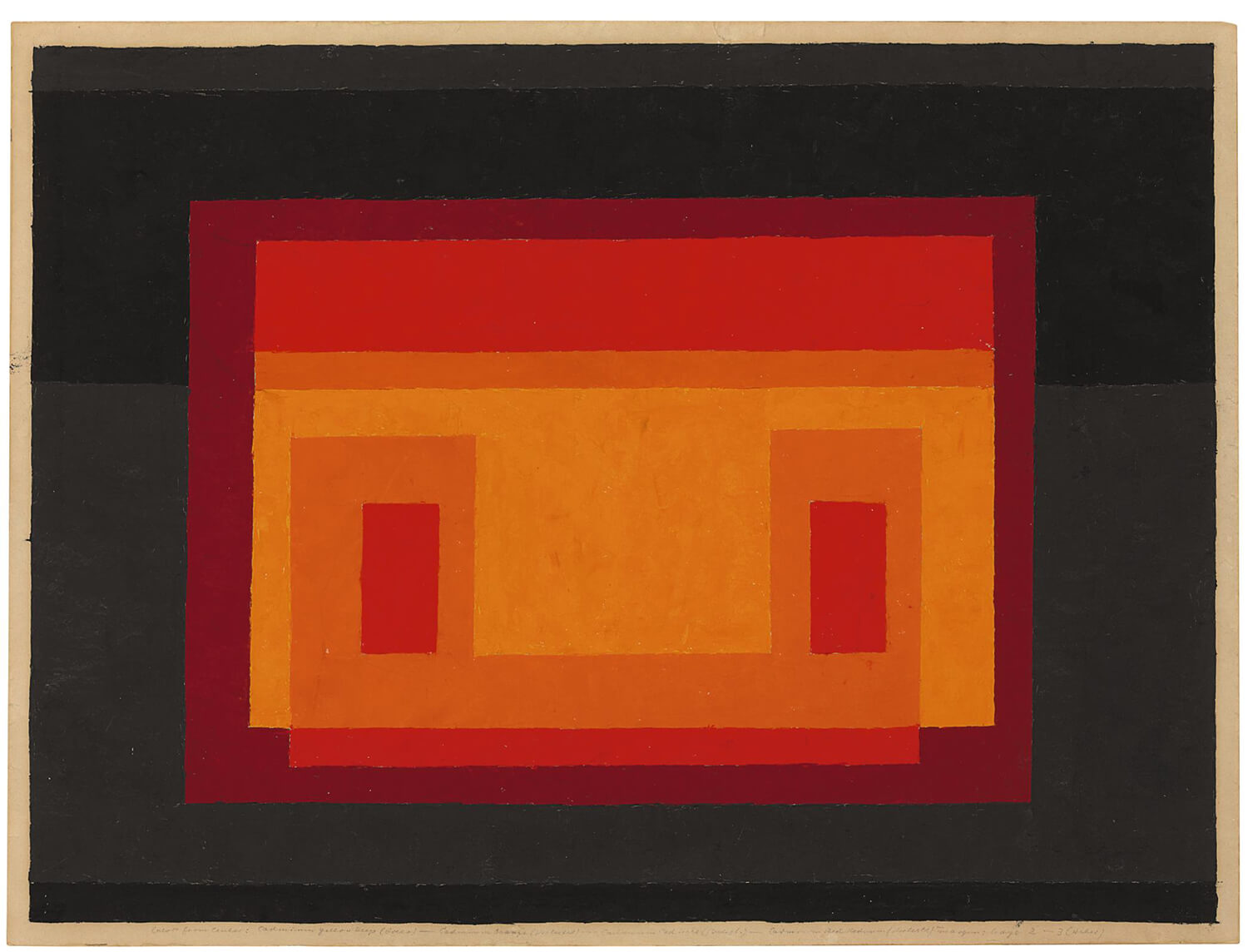
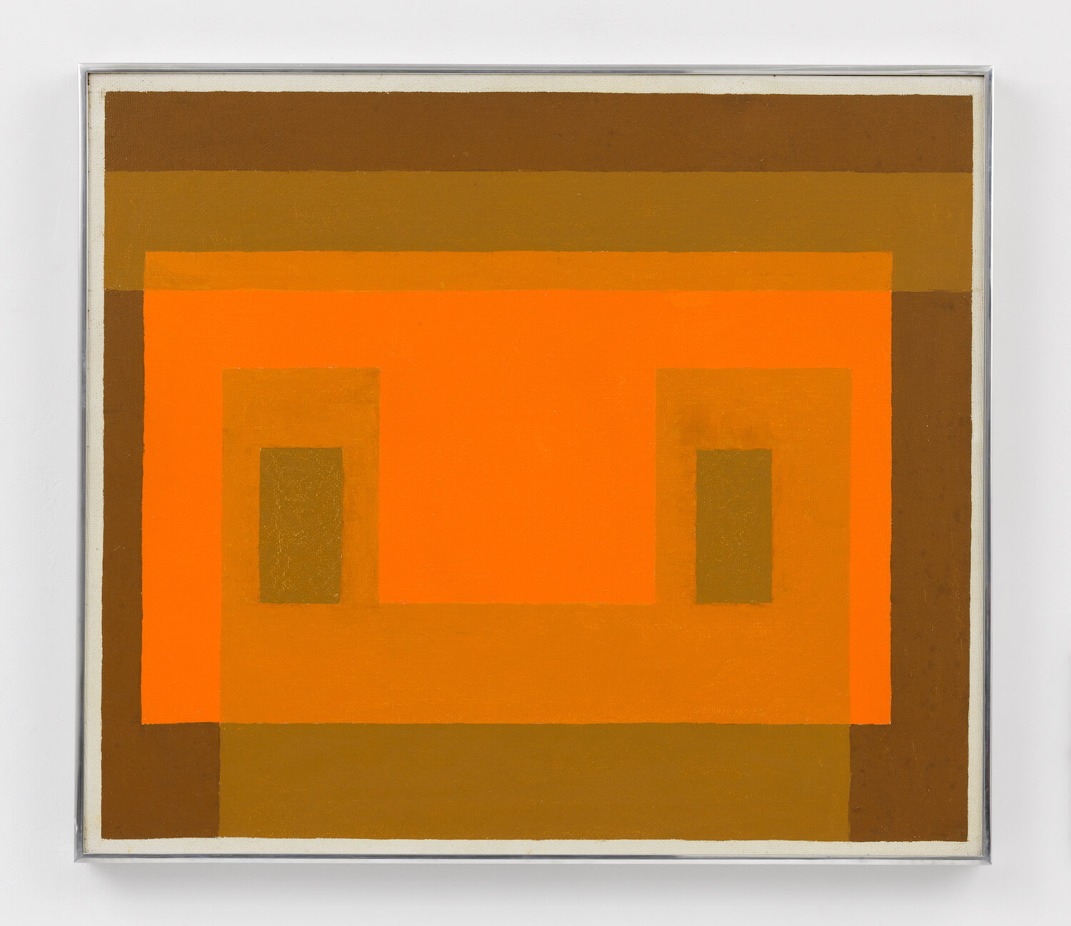
During the 1930s Albers and his wife, the textile artist Anni Albers, moved to the United States, where they both taught at the legendary Black Mountain College. They remained here until 1949, teaching a new generation of artists a series of daring, modernist approaches to colour, shape, form and design. Within his own art, Albers embarked on a series of abstract prints, drawings and paintings with vivid, chromatic frequencies arranged into geometric designs, or what he called, “maximum effect from minimum means.” In Untitled (Adobe Variant), 1947, Albers merges light, bright oranges with a series of deeper, darker hues in black, grey and red. In doing so, the orange takes on an even greater vibrancy, like blinding hot sunlight cast through an open window.
Albers moved from Black Mountain College to Yale in 1949, serving as Chairman of the Design School until his retirement in 1958, aged 70. The ambient painting Variant: Orange Façade, 1959, was made during his first year of retirement, and it demonstrates the artist’s increasingly sophisticated, subtle colour modulations during this period. Here the central orange panel sits on a muted ochre green background, shining out like a glowing light, while two solid green panels within it add sculptural weight to the image’s design. Over the orange Albers layers a series of semi-transparent, sheath-like veils of grass green, to create the same subtle, layered colour effects Albers must once have created when playing with stained glass back in the 1920s.
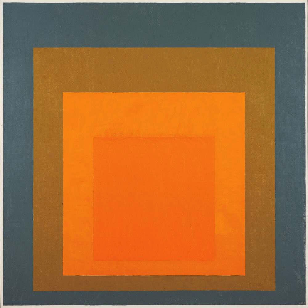
Albers began his ‘Homage to the Square’ series in 1949, and continued to work on this body of work up until his death in 1976. Homage to the Square, 1967, is a later example from the series, and it showcases the artist’s minimalistic, deceptively simple approach, with a series of layered squares in contrasting hues that create sensations of depth, space, movement and energy. The central squares, painted in two closely-toned orange hues, seem to hum and vibrate with radiant, electrifying energy. Meanwhile, the soft ochre surround becomes a buffer for the deep tonal grey-blue framing the scene, which both flattens the canvas and accentuates the luminous vibrancy within.
















One Comment
Stacey Dyer
I really enjoy these post! Thank you!