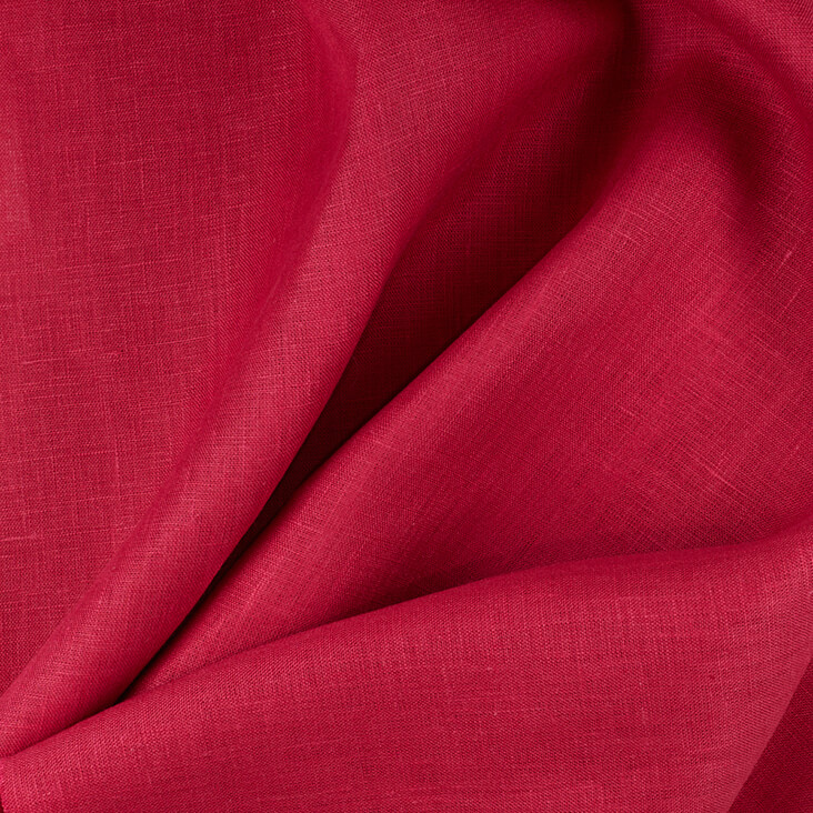
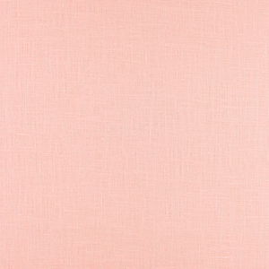
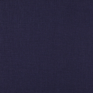
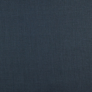
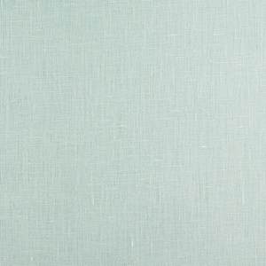
FS Colour Series: SANGRIA Inspired by Patrick Heron’s Blazing Pink
British painter Patrick Heron might just be one of the finest colourists of the entire 20th century. From his early days as a semi-figurative painter to his mature, pure abstraction, colour was always the defining principle that shaped the very nature of his art. He dived headfirst into the intensity of colour, working with the most shocking shades of blazing pink like SANGRIA, juxtaposing it with unusual contrasts like brick reds or ultramarine blue, forest green or dark violet, paying close attention to how each could cause sonorous, visual vibrations in the eye of the viewer. He said, “For a very long time now I have realised that my over-riding interest is colour. Colour is both the subject and the means; the form and the content; the image and the meaning, in my painting today.”
Heron was born in Headingley Leeds in West Yorkshire, and went on to study at the Slade School of Art in London from 1937 to 1939. He spent a brief spell working as an assistant to the renowned potter Bernard Leach in St Ives, Cornwall, before returning to London in 1945 to pursue his own painting practice. However, in 1956, Heron made his way back to Cornwall, setting up home in the house called Eagles Nest, named after its high vantage point over the Cornish coast. From there, he made some of his most important breakthrough paintings, and became a leading member of the St Ives art movement alongside Barbara Hepworth and Ben Nicholson.
Heron’s early paintings were semi-abstract in nature, documenting the views he could see from Eagles Nest. Over time, his representational landscapes and tabletops became increasingly abstract until no discernible places or objects remained. Instead, he began exploring striped patterns and fields of pure colour, which represented his emotional response to the light and character of Cornwall.
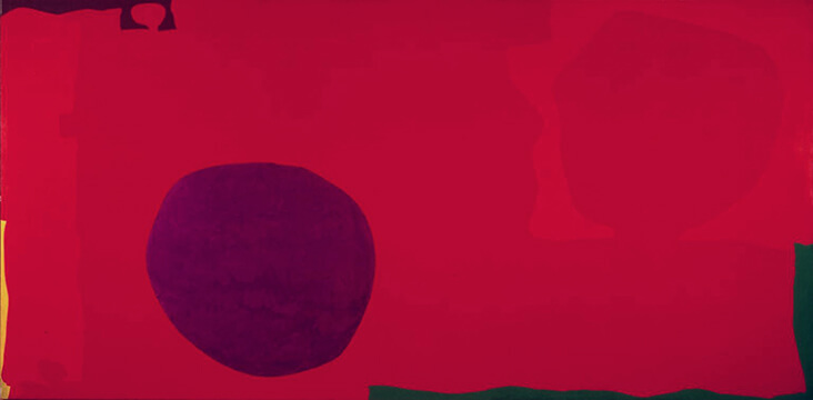
In 1958 Heron moved into the large former studio of Ben Nicholson at Porthmeor, Cornwall, and the change in context gave rise to a bold and ambitious new phase in Heron’s art, which he came to call “wobbly hard-edge painting.” It was this new body of entirely abstract work that launched Heron’s career in a wider, international context, inviting comparisons with the American Abstract Expressionists and Colour Field painters. We see how Heron brought colour bursting to life in the searingly bright painting Cadmium with Violet, Scarlet, Emerald, Lemon and Venetian: 1969, which is dominated by a vast passage of hot pink, while a violet circle resembles a celestial form on its surface. Tiny ribbons of yellow and forest green are pushed off to the far edges, creating sharp, high contrast accents.
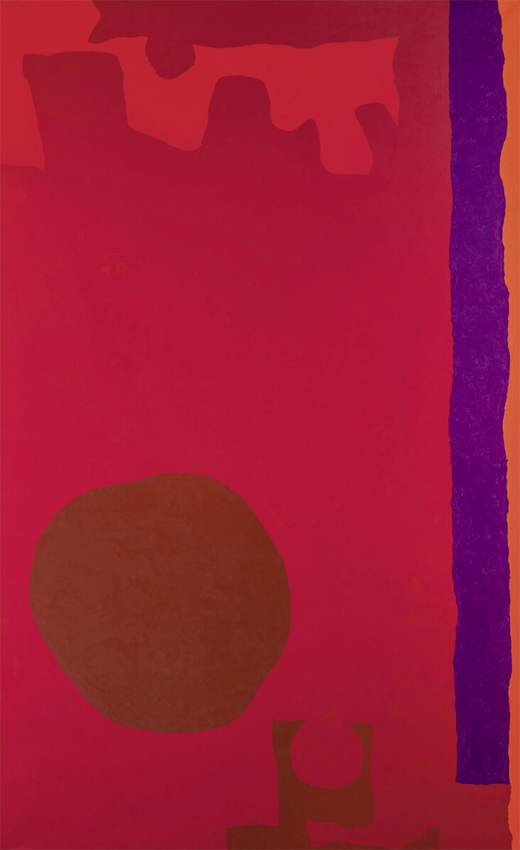
In the later Rumbold Vertical Two: Reds with Purple and Orange: March 1970, Heron once again colours his entire background with the same intense shade of fuchsia, this time offsetting it against a deep bronze orb. Loose tendrils of royal purple, coral pink and blushed peach create a series of both harmonious and discordant effects on its surface. Heron observed the magic that happens when two colours are butted up close to one another, noting, “The meeting-lines between areas of colour … cannot avoid changing our sensation of the colour in those areas.”
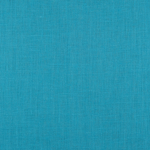
Made in the same year, Heron’s lively screenprint Interlocking Pink and Vermilion with Blue : April 1970, takes a different approach, this time filling the picture ground with an intoxicating shade of cerulean blue. On its surface are Heron’s signature “wobbly hard-edge” elements, which resemble Matisse’s paper cut-outs, with jagged, irregular edges and abstract shapes. To the right, Heron has created a cluster of red and hot pink forms that create an appealing, high-contrast clash with the blue. Heron notes, “the sharper the division between colour, the more intense the colour will be.”
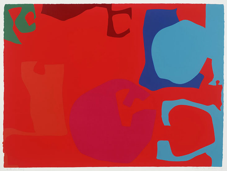
In another slightly later screenprint, Untitled, 1971, Heron creates a playful arrangement of elements that seem to jangle on the picture surface with animated energy. Red and pink pulsate with an electric charge when placed side-by-side, while a crisp, cool blue makes their fruity tones seem even brighter and more alive.


















2 Comments
Louise De caires
I agrée. He was one of the finest colourists.
Vicki Lang
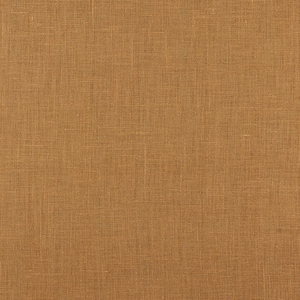
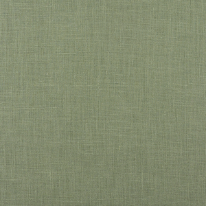
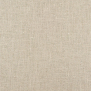
What lush colors in both the paintings and the fabric. They make a bold statement.