FS Colour Series: ANTHRACITE and Pierre Soulages’s Elegant Darkness
Soulages was born in Rodez, southern France in 1919. As a young boy he was fascinated by the bold simplicity of the menhirs – Neolithic carved standing stones – that surrounded the landscape of his home. He was also deeply inspired by a visit to the Sainte-Foy de Conques, an 11th century Romanesque Abbey filled with stark, simple carvings, and it was following this trip that Soulages decided he wanted to become an artist. When the cave paintings of Lascaux were discovered in 1940, they provided Soulages with another major source of subject material – he was particularly taken with how the rustic, natural colours of black, red and brown connected with the roots of human civilization.
Throughout the 1940s and 1950s, Soulages continued to live in France, and he adopted the American Abstract Expressionist style that was taking the art world by storm. Towards the end of the 1950s Soulages had become one of Europe’s leading Abstract Expressionists, proving it wasn’t just the bold, bombastic Americans who could make wild, gestural statements with their art. From the get-go Soulages was all about gesture, and as his art developed, he became increasingly confident with the size, scale and simplicity of his painterly marks. Working with a limited range of colours dominated by black allowed Soulages to focus on the formal properties of texture, surface and volume. During this time the black brushstrokes of Japanese art seeped into many of his most famous artworks.
Like the Japanese calligraphists, Soulages was not one to fuss or overwork his designs; he was content to make the mark and leave it there, in a moment of suspended tension. James Johnson Sweeney, former director of the Guggenheim Museum noted how, “a painting by Pierre Soulages is like a chord on a vast piano struck with both hands simultaneously — struck and held.” Soulages reveals this desire to capture the essence of a moment in time by deliberately titling his artworks with the exact day on which they were made.
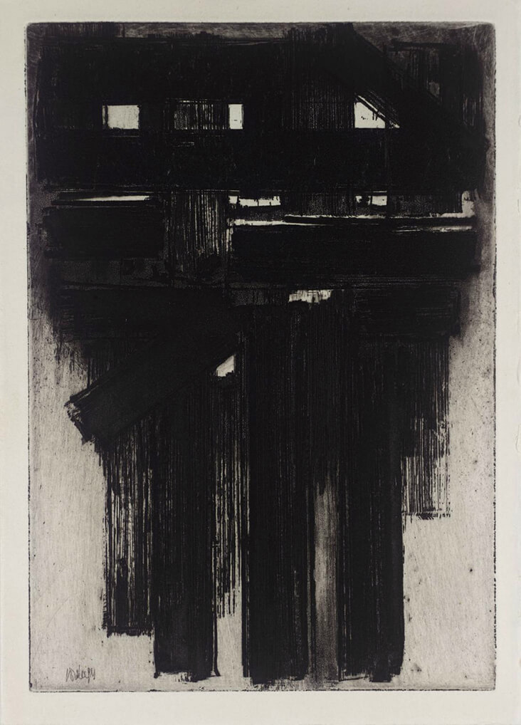
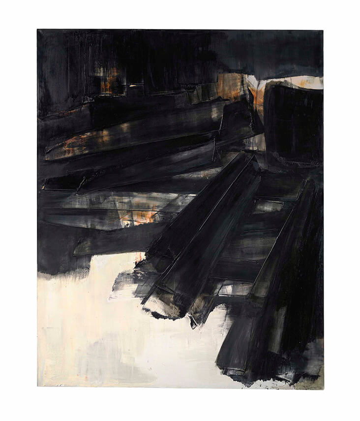
We see this momentary action at play in [no title] 1956, an intaglio print that is all black gesture, with marks that tangle into a dense network in the upper half of the image like a rudimentary form of scaffolding. Peinture 195 x 155 cm, 7 February 1957, is more complex, a patch of dark marks that congeal into a solid mass in the centre of the painting. Black here is shot through with streaks of indigo blue that seem to carry with them sprinkled patches of light. Made just a few years later, Peinture 202 x 156 cm, 27 March 1961, pushes the action into the right corner, as velvety rich black paint is applied, scraped back and reapplied to create layers of depth and mystery, while passages of white linger behind it.
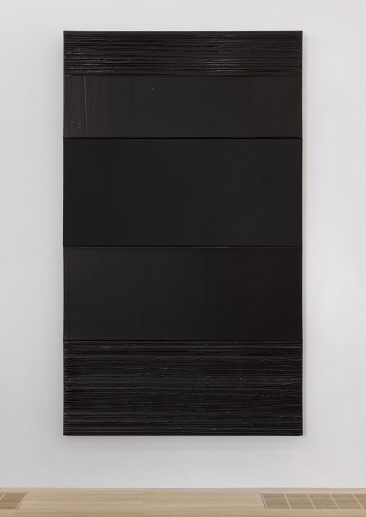
In the later multi-panel artwork Painting 304 x 181 cm, 9 December 2007, Soulages has moved into new territory, filling the entire surface area of each canvas with jet black. Closer inspection reveals how Soulages plays with the contrast between matt black and glossy black in the individual panels, observing how each differing surface absorbs and reflects the light around it in different ways. In doing so, Soulages asks us to observe the subtle, nuanced differences that can exist within a single hue, as it responds to the world going on around it.













4 Comments
Claudia Epple
I was wondering the same thing
Sid Winters
Thank you for this article, it is so interesting and has introduced me to a new fabulous painter. The paintings are beautiful. I always enjoy your articles and how you link them to a color of a fabric.
Robin Gansle
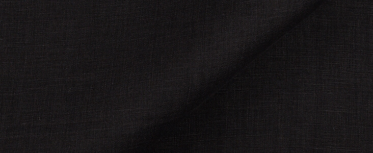
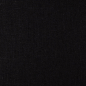
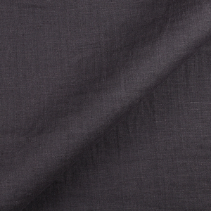
How does Anthracite differ from Black linen – I’m a HUGE fan of the latter, and curious to try the former…
Rosie Lesso
This is a good question! I think the anthracite colour is ever so slightly more grey in tone, so a softer version of black. I hope that helps!