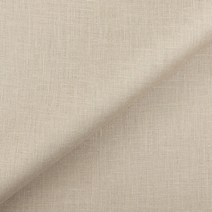
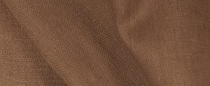
FS Colour Series: MUSHROOM Inspired by Lee Krasner’s Soft Beige
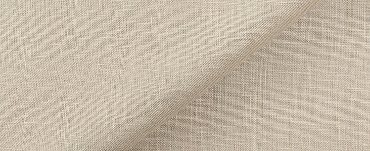
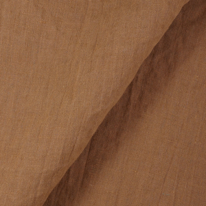
Lee Krasner was an inimitable pioneer of Abstract Expressionism, storming her way into the 1950s New York art scene with bold, bombastic paintings. Fleshy, soft shades of beige like that of MUSHROOM Linen are nestled into some of her most famous works of art, and their warm, earthy shades bring in a living, human presence. Krasner often coupled these calm, muted tones with flashes of intense colour like fuchsia pink or racing green; when seen in amongst her creamy blends of beige and off-white, they become flashes of anticipation and excitement.
Krasner was born in Brooklyn in 1908, and she remained in and around New York for the rest of her life. After training in fine art at the Women’s Art School of Cooper Union and the National Academy of Design, Krasner cut her teeth professionally by painting murals for the Works Progress Administration’s Public Works of Art Project. It was here that Krasner first came into contact with many artists who would become lifelong friends and fellow Abstract Expressionists, including her future husband, Jackson Pollock.
In the late 1930s Krasner trained with the pioneering artist and teacher Hans Hoffmann, and it was under his watchful tuition that Krasner was able to expand her repertoire into her own daring and playful brand of Abstract Expressionism. After initially toying with Cubist-style interpretations of the human figure in black and white, she began tearing up her old drawings and piecing them back together again in bold and experimental new ways on canvas, a process that allowed Krasner to endlessly recycle and regenerate old ideas.
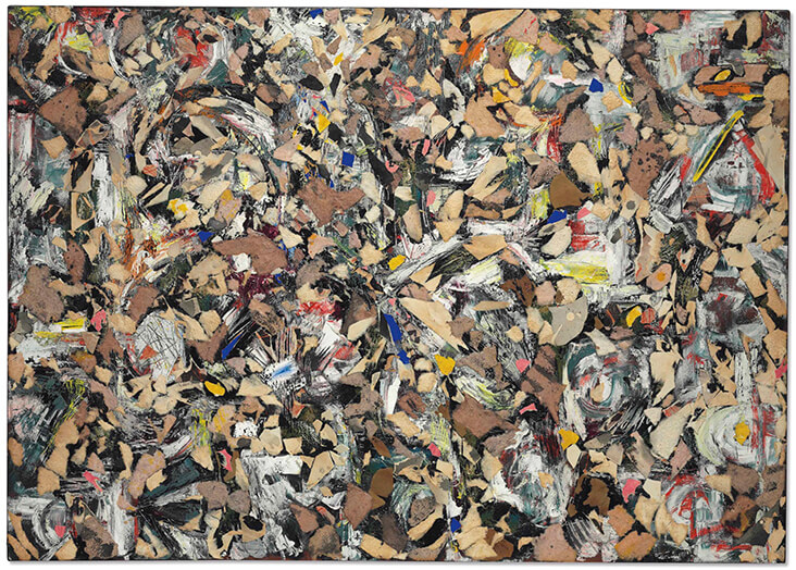
The 1950s were a particularly prolific period for Krasner, when she began working on some of her most celebrated paintings. Shattered Light, 1950 was made during this significant period, and it demonstrates the artist’s fascination with an Abstract Expressionist ‘all-over’ design, where the entire canvas is transformed into a pulsing field of decentralised energy. Sand and beige tones are scattered across the entire canvas suggesting the earthy shades of the landscape, while fragmented shards of blue and yellow are sprinkled in amongst it like jewels.
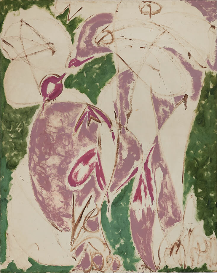
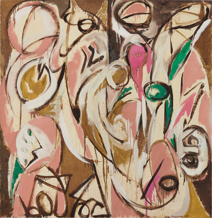
Earth Green, 1957 was made as part of a larger series exploring themes around nature, childbirth and femininity. Voluptuous forms curve across the canvas suggesting the female form, painted in shades of pale beige and hot pink. Daring shades of vivid green contrast sharply, a slice of sourness in amongst the cream. Re-Echo, 1957, shares a similar design and colour scheme, with swooping curves that weave in and out of one another in a state of continuous flow. Pale beige highlights Krasner’s fleshy tones, lending them rounded form, while warm shades of yellow ochre, brown and gold blend in with it harmoniously.
Throughout the 1960s and 1970s, Krasner’s art went through a series of stylistic shifts. She began working on a series of horizontal canvases that were geometric in design, combining bold blocks of colour with shards of old charcoal drawings. Past Continuous, 1978 is one of her most ambitious works of the era, a large-format multi-panel design that seems to shift through different states of being. Fragments of Krasner’s old Cubist-style charcoal drawings are scattered throughout the design, and their angular black lines become a structural framework on which solid panels of colour hang. The artwork is dominated by a creamy shade of mushroom, and much like her earlier works its role here is to create ambient warmth, and the free, living energy that pulsates through so much of her art.












6 Comments
Myrna Seale
Do love her work – but she couldn’t have been born in 1947!
I very much enjoy reading this blog! Definitely expanding my knowledge of so many artists!
Deb Bayne
My thought exactly so I looked it up. She was born in 1908 and died in 1984 at age 75.
Rosie Lesso
Apologies – just a typo! Thanks for pointing this out and it should be all corrected now…
Rosie Lesso
Thanks for the feedback and great to hear you are enjoying the articles!
Vicki Lang
Love the subdue colors of her art work. Would love to have a room designed around the colors of Re-Echo. It would be such a relaxing room. Thank you for your wonderful article.
Rosie Lesso
Thank you for your kind words!