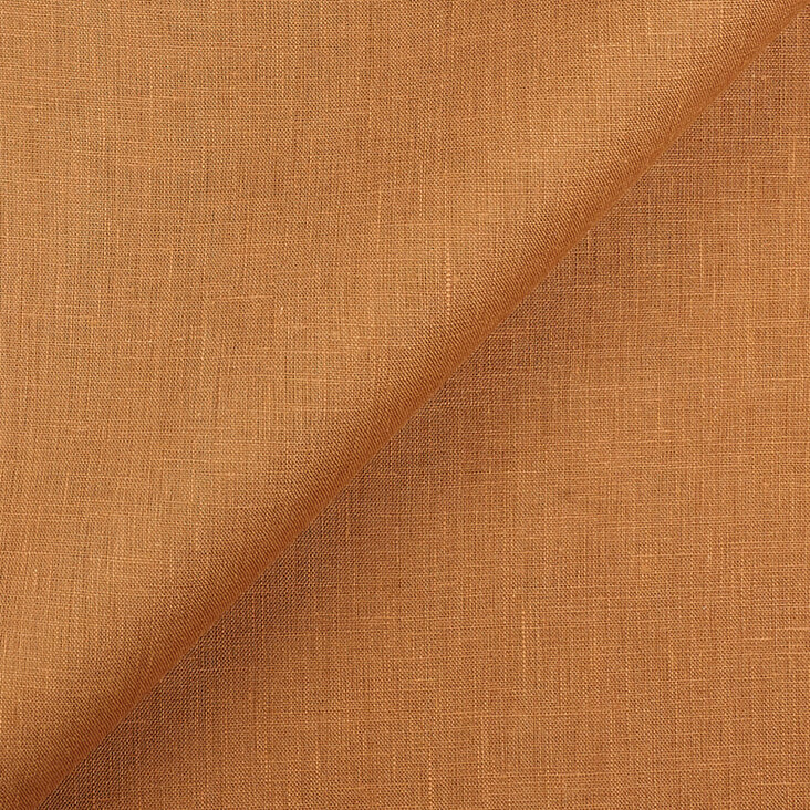
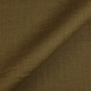
FS Colour Series: CAMEL Inspired by Roger Hilton’s Warm Ginger
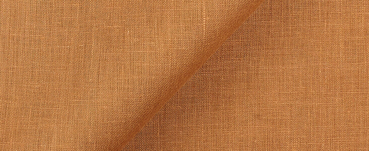
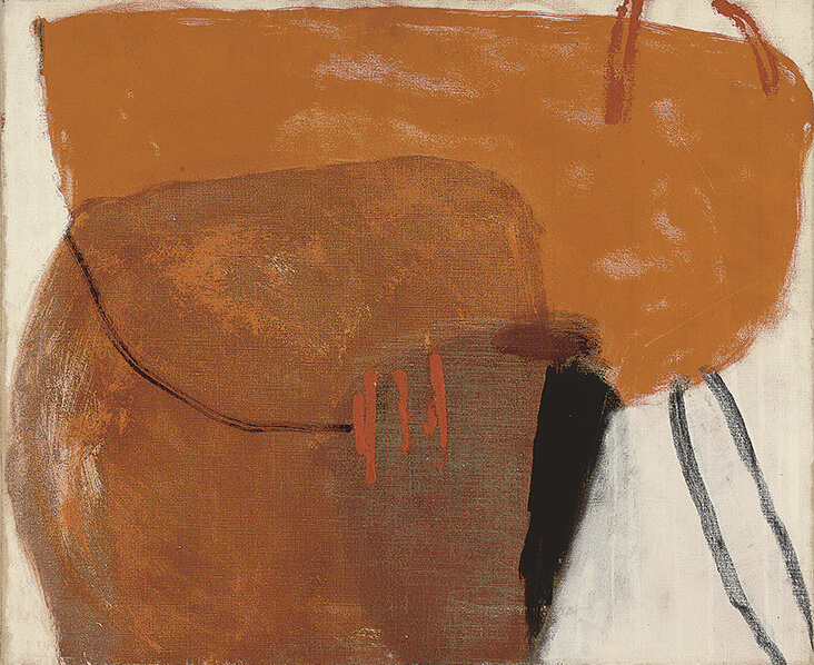
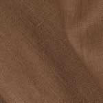
British painter Roger Hilton was one of the most pioneering abstract painters of his generation, emerging out of the mid-20th century with a bold and uncompromising style. He had an innate ability to merge tactile expressionism with ordered simplicity, producing images that confidently dominate the space around them. Striking passages of colour are a vital ingredient in Hilton’s paintings, particularly the warm ginger tone of CAMEL Linen, which appears again and again throughout his career. This colour’s ambiguous shade could allow Hilton to invoke various real-world references, from the warmth of human skin to the glow of golden earth caught glinting in the sun.
Hilton was born in 1911 in Northwood, Middlesex in England. His father was a doctor and his mother a painter, and it was she who had the most profound influence on Hilton’s childhood ambitions. In 1929 Hilton trained as a painter at London’s Slade School of Art, where his mother was once a student. As a young graduate Hilton went on to live in Paris for several years, studying with Roger Bissiere at the Academie Ransom. For the next decade, Hilton taught art at several different schools across England throughout his thirties, and it wasn’t until he was into his forties that Hilton began making the spirited and expressive abstract paintings that would eventually define his career.
A friendship with the Dutch painter Constant would prove pivotal in Hilton’s career – it was Constant who introduced Hilton to the abstract art of De Stijl led by Piet Mondrian. After this time Hilton began working in a simpler and more geometric style, and reducing his palette to a limited range of primary colours. In the 1950s Hilton first visited St Ives, later settling in the nearby area of St Just. Being here allowed Hilton to become an active member of the St Ives artist community alongside Barbara Hepworth and Peter Lanyon, among others, and like them his paintings merge references to the Cornish landscape with the pioneering languages of modernist abstraction.
From the 1950s onwards Hilton’s mature painting style developed, one of bold, simple colours and expressive passages of paint. In Simple Figure in Orange, 1959, a series of closely toned caramel, biscuit and honey shades are layered over one another in thin, scumbled veils to create the illusion of depth and space. These spicy, flavoursome colours create an ambient atmosphere of comforting warmth, and suggest the lingering presence of a human body.
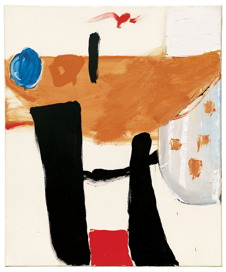
In the later Untitled, 1965, Hilton experiments with a slightly wider pool of colours, creating an expressive riff on Mondrian’s red, yellow, blue and black palette by swapping out yellow for his trademark ginger tone. Different opacities of paint jostle side by side, suggesting solid and immaterial forms in space, from the opaque solidity of black and red to the watery translucency of caramel brown and ultramarine blue.
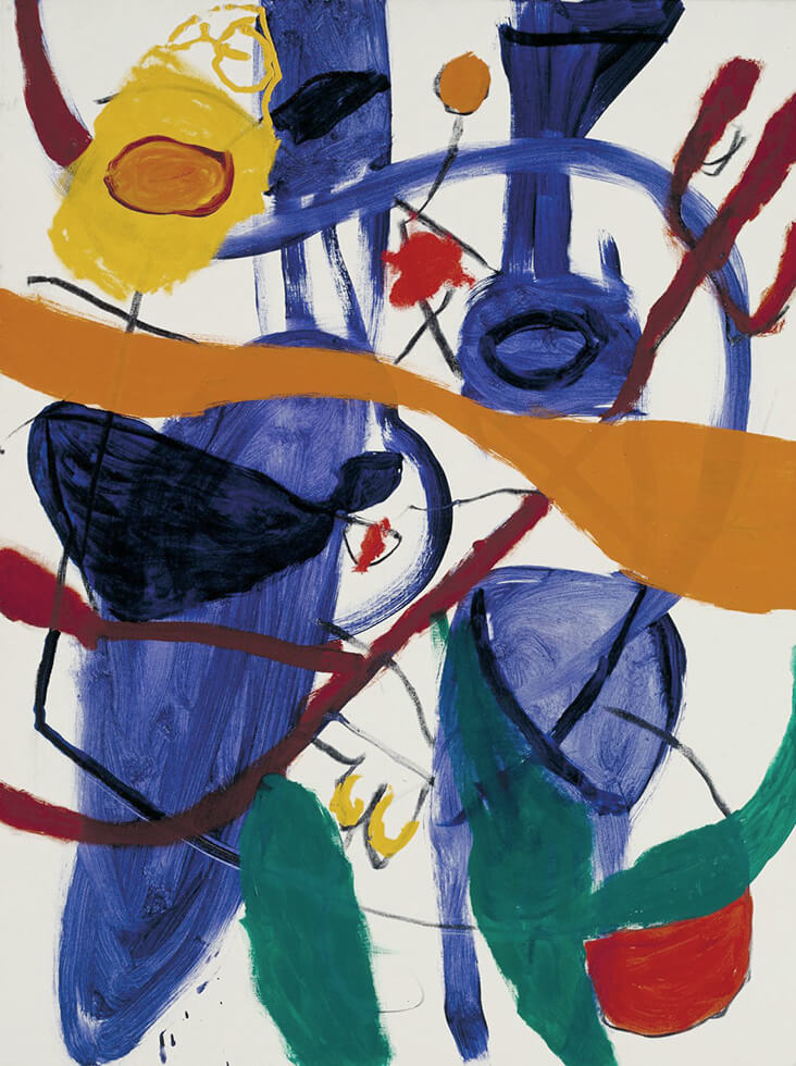
As his career progressed through the years, Hilton’s paintings became increasingly playful, wild and spontaneous, echoing the languages of American Abstract Expressionism. Untitled, 1971 is one such example, with its wide pool of vibrant colours that seem to swim around one another as if caught in a snapshot moment of movement. Hilton plays with how layered colours can invoke depth, layering vivid shades of blue over one another in the background, while a solid river of toffee toned colour runs over the top. He has said, “I like my colours dynamic and strongly contrasted. After all, one prefers something alive to something dead. The more alive a person or a picture, the better they are…”
Hilton made Untitled, 1974 just a year before he died, and despite his growing health issues, the same fresh vitality continues to run through his art. Here a limited palette of black and biscuit brown are mingled into one another, flowing organically across the page in sweeping calligraphic marks. Curved forms in camel tones seem to suggest a human body, but it could just as easily be the sinuous growth of plants, roots or rocks. As ever, the image is an invocation of energy and emotion, leaving us to fill in the gaps. Hilton once explained, “Painting is feeling. Just as much as a sentence describes, so a sequence of colours describes … I feel the shape and colours inside myself. I have the feel of a work rather than a vision of it.”














Leave a comment