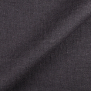
FS Colour Series: PEWTER Inspired by Sean Scully’s Dense Grey
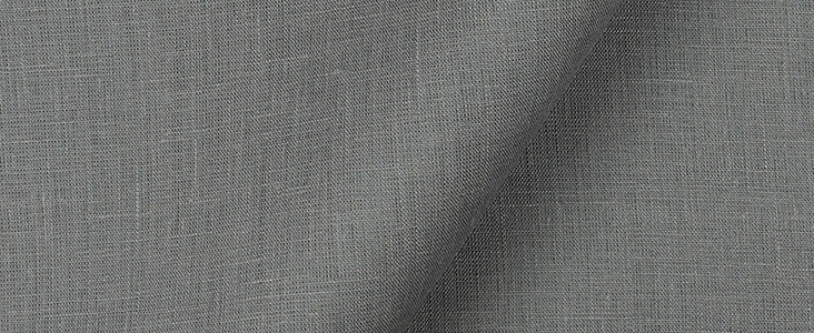
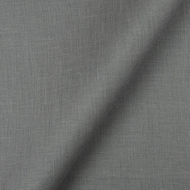
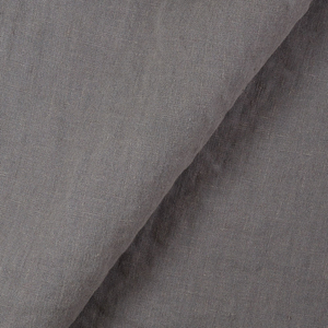
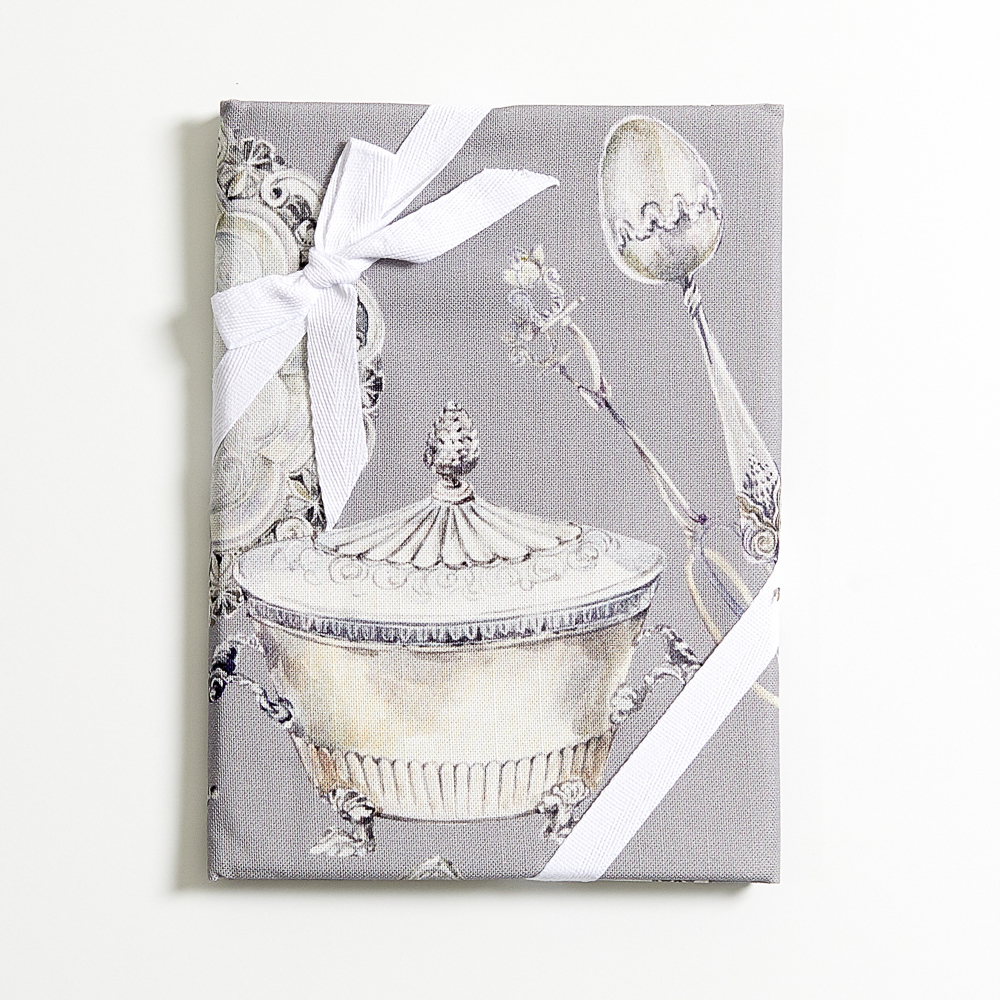
Sean Scully’s art has a dense, hard-won quality that seems innately bound to the earth. Warm, metallic shades of grey like that of PEWTER Linen dominate his works of art, stacked into loose grids that resemble the hand-made structures of human civilization: drystone walls, slate rooves or careworn paving stones. Throughout his long career, Scully has remained true to his own brand of geometric abstraction, one that he has been honing and refining for decades. Through the interplay of colour, surface, texture and pattern, Scully weaves layers of poetic mystery into the structures of his art objects, leaving them suspended in the unknown. “That’s the job of art,” he says, “to undo the logic of the world.”
Sean Scully has moved around significantly throughout his life, and this nomadic lifestyle has allowed him to defy any easy categorisation. Born in Dublin in 1945, his family later settled in South London, where he was raised. After attending evening classes at the Central School of Art in London in the early 1960s, Scully later enrolled in Croydon College of Art, London, followed by study at Newcastle University. His early art was figurative, but that all changed after a life-changing trip to Morocco. It was the local textiles that really lit up Scully’s mind, and his art would never be the same again. “I saw the striped fabrics that the Moroccans dye… I saw those stripes everywhere,” he noted, “and when I got back to work I was making grids from stripes of colour”.
In 1972 Scully won the Frank Knox Fellowship which allowed him to study for a brief spell at Harvard University. Modernist American art helped shape the nature of Scully’s paintings during this time, particularly Abstract Expressionism and Minimalism. During and after Harvard, Scully pioneered his ‘Supergrid’ series, featuring tightly packed grids inspired as much by textile patterns as urbanised grids and Piet Mondrian’s ‘Boogie-Woogie’ series.
In 1975, Scully moved to New York with the intention of making his name as an abstract artist. Life in a new city dramatically changed Scully’s art, which became looser and freer, with broad strokes of loaded paint and muted, subtle colour schemes. Travels throughout Mexico in the 1980s also fired up Scully’s imagination, particularly the eccentric and colourful architecture he encountered there. He observed, “Along the Pacific Coast of Mexico, the people living in squarish houses paint them with big patches of blue or red or some other colour. Form gets distorted by a subjective response, and that redeems it. That’s wonderful, like Minimalist painting gone wrong”.
The woodprint Block, 1986, demonstrates Scully’s desire to blend structure with tactile, hand-made surfaces; solid, geometric panels seem to slot together like the worn-down walls of a familiar old building. Warm, muted grey is the backdrop here, and it lends Scully’s artwork a weighty and appealing solidity. The aquatint print Untitled (from the Five Unions series), 1996, shows an increasing complexity in Scully’s visual language, as hazy, blurred checks seem to move in and out of focus. Dark greys on the left are contrasted with a lighter hue on the right, splitting the composition in half like a window partially blocked by shadow.
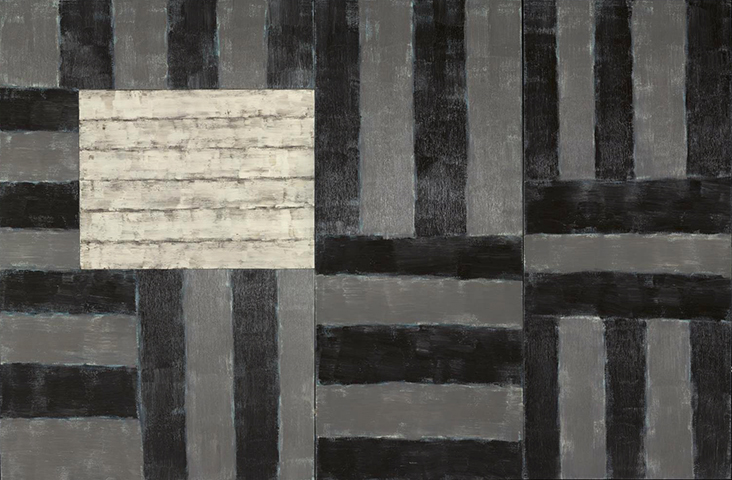
In the large oil painting White Window, 1998 we see the same pared back colour scheme, but Scully’s design is more complex, with intersecting lines in varying directions that create dynamism and movement. Dark, dense panels of grey are built up like rough slabs of slate, while just the faintest trace of blue can be seen beneath their surface, adding subtle layers of complexity.
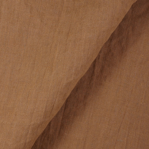
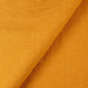
The later painting Wall of Light Stone, 2000 is simpler in design, with subtle, closely toned shades of grey, cream and black that nestle in as if they belong together. Scully’s brushwork is softer and lighter here, and he even described these pillow-like forms as “soft packets of wrapped air that I put into place”. In the slightly later Colourwall, 2005, Scully moves into a brighter palette of autumnal shades, and we see how he balances nuanced shades of colour and the qualities of light they emit when painted alongside one another. Soft, metallic grey might be the quieter shade here, but its inclusion is integral, adding density to the brightest hues and keeping them grounded to the earth.























Leave a comment