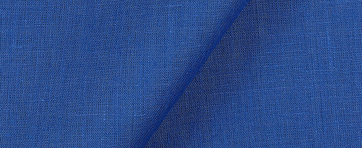
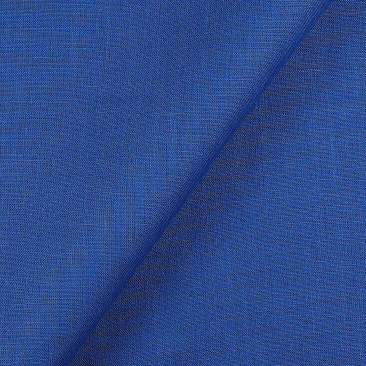
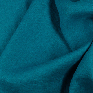
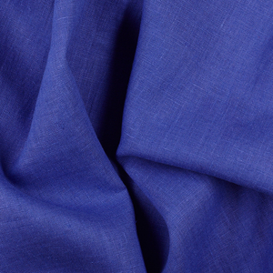
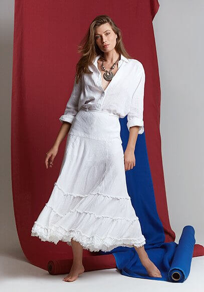
FS Colour Series: BRIGHT COBALT inspired by Henri Matisse’s Luminous Blue
Henri Matisse had an enduring obsession with BRIGHT COBALT’s distinctive shade of blue, observing with fascination how it could ignite his paintings, prints and paper cut-outs with the luminescence of the sea and sky. Throughout his long and prolific career Matisse shifted through an array of adventurous styles and subjects, but a burning passion for colour, particularly blue, was the one constant that pulled all his inventiveness together, and it has remained his greatest legacy since. “My choice of colours,” he wrote, “is based on felt experience.”
Born in the industrial town of Bohain-en-Vermandois in Northern France, Matisse made an unlikely route into fine-art, taking several detours along the way. His first job was as a legal clerk, followed by a law degree in Paris from 1887-1889. His initial forays into art were in early morning art classes, which lit a fire in his belly and by 1891 he had set off to Paris to take up art training, first at the Académie Julian, followed by the École des Beaux-Arts. Academically gifted, Matisse adapted well to formal training, but he was increasingly drawn to the experimental practices of Vincent van Gogh and Paul Cezanne, which offered up exciting avenues of exploration. One of his teachers was the Symbolist painter Gustave Moreau, who taught Matisse how to paint intuitively with imaginary, subjective colours. The early painting Pont De Seine, 1897, demonstrates Matisse’s discoveries into the way heightened, exaggerated colours could bring electric light into his art – a traditional landscape is enlivened by vivid streaks of cobalt blue, stippled across the bridge and applied in heavier streaks across a foreground boat.
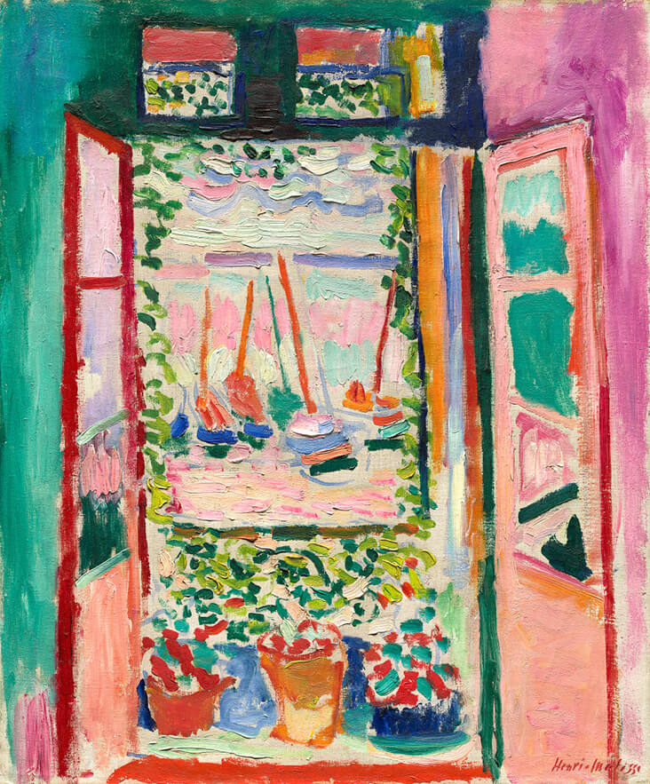
The early 20th century was a breakthrough period for Matisse, when he began experimenting with deeply subjective responses to reality, with expressive streaks of unmixed colour that would spearhead the Fauvist movement. The painting Open Window, Collioure, 1905, is an emblem of modernity, conveying the small French town of Collioure as a riotous display of vibrant colour and light. Intoxicating cobalt blue is sprinkled sparingly across the scene like a rare, potent ingredient filled with explosive flavour.
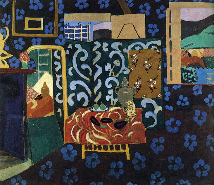
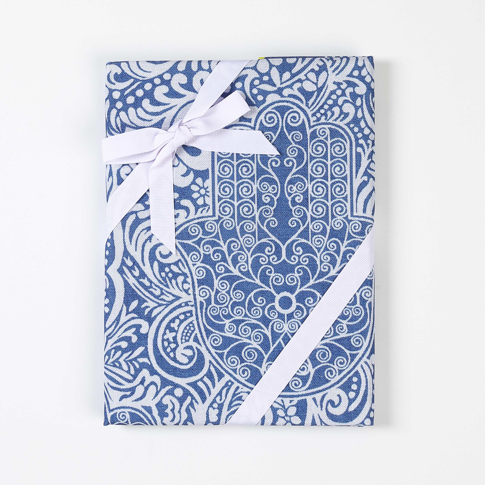
In 1912 Matisse made his first visit to Tangiers, where he was so entranced by the dazzling colours, he came to call the place a “painter’s paradise.” The vivid, entrancing blue of Moroccan sea views infiltrated his paintings, but it was the unmistakable patterns and colours of Moroccan textiles that really fired him up, sparking a lifelong obsession with collecting and painting these richly decorative fabrics. Still Life with Aubergines, 1914 reveals the impact of these dazzling fabrics on his creative practice, as tiny aubergines in the centre of the scene are entirely eclipsed by the noisy, clashing prints of his surrounding textile collection. Matisse focuses here on the musicality of flat, decorative pattern, while blue printed flowers seem to skip across the surface with the fresh vitality of nature.
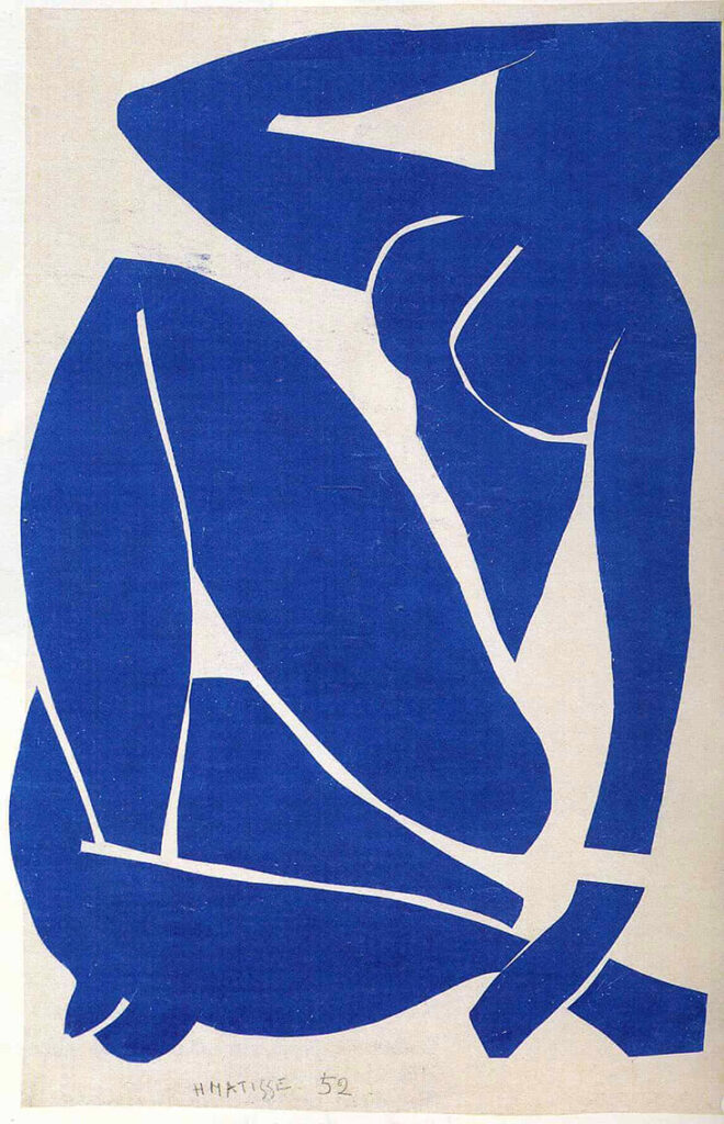
Syncopated patterns and colours continued to dominate Matisse’s art for the decades to follow as he moved through a variety of styles and methods. The 1940s and 1950s presented another dramatic breakthrough period for Matisse when he discovered his famed ‘pochoir’ or papercut technique, begun while convalescing in bed after a period of ill health. Working with sheets of paper painted in vibrant hues, he spliced through these walls of colour with his scissors, producing playful, organic shapes that could be moved around and rearranged in an array of inventive patterns. In The Sorrows of the King, 1952, a brilliant blue backdrop brings the glowing darkness of the evening sky into his scene, while scattered slices of lemon sprinkle across it like stars. Made in the same year, Matisse’s world-renowned Blue Nude series celebrate the sinuous lines and flowing energy of the female form, made all the more striking and unforgettable through the almighty power of blue.












Leave a comment