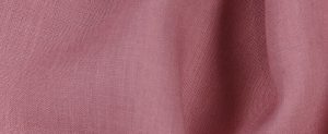
FS Colour Series: Tea Rose Inspired by Henri Matisse’s Indulgent Interiors
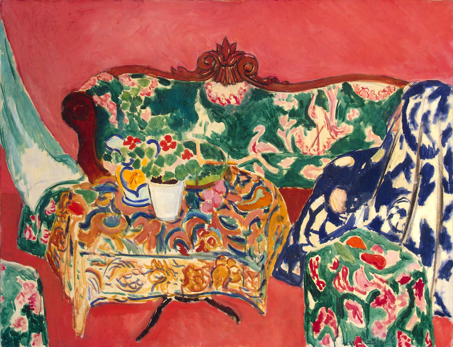
Seville Still Life, 1911
Interior views were one of Henri Matisse’s most enduring subjects throughout his career, a theme which allowed him to indulge in his great passion for decorative patterns, surfaces, textures, and colours. Tea Rose’s hot pink was one of the shades he returned to again and again, colouring anything from heavy curtains to lush carpets and smooth floor tiles. This fleshy shade gave his interiors a humane warmth, conveying the qualities of comfort and ease he so often found within his domestic spaces, and those he wanted to conjure up in the mind’s eye of his audience. He famously wrote in his notebook in 1908, “What I dream of is an art of balance, of purity and serenity, devoid of troubling or depressing subject matter… a soothing, calming influence of the mind, rather like a good armchair which provides relaxation from physical fatigue.”
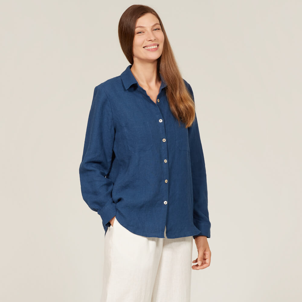
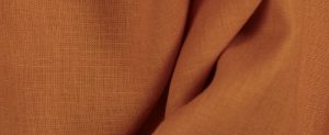
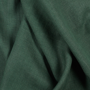
FS Tea Rose Signature Finish Midweight linen
Trained under the French Symbolist painter Gustave Moreau in Paris during the 1890s, Matisse learned early on the potent and arresting qualities of colour for conveying the most vivid artistic expression, and this thread ran all the way from his Fauvist landscapes of the early 20th century to his interior views that he revisited throughout the rest of his career. On first discovering this emotive joy for colour, he wrote, “From the moment I held the box of colours in my hands, I knew this was my life. I threw myself into it like a beast that plunges towards the thing it loves.”
An avid collector of patterned textiles gathered during his travels throughout France, Morocco, Tahiti, Algeria, and beyond, he found endlessly inventive ways of arranging and rearranging what he called his “working library” of textiles into the many places he lived, transforming them into an indoor garden of Eden that became the starting point for so many of his most celebrated paintings. In Seville Still Life, 1911, Matisse transforms a simple view of a hotel room in Seville with a heady array of clashing patterns and prints, which seem to fill the foreground of the painting with the abundance of a garden in full bloom. He neutralises the intoxicating patterns by setting them against broad, flat areas of warm and enveloping pink, creating soothing qualities of comfort and ease.
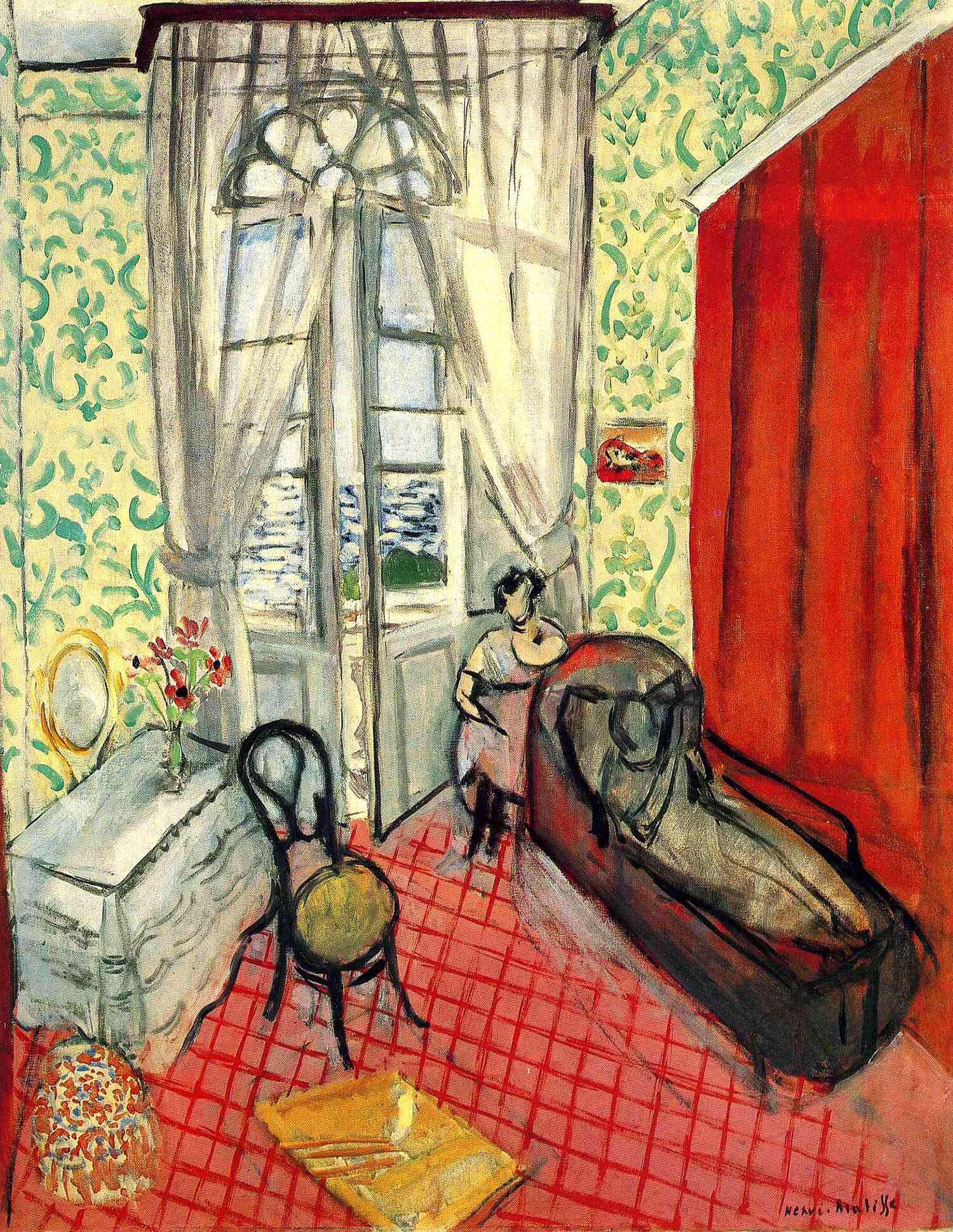
Two Women in an Interior, 1921
In the later painting Two Women in an Interior, 1921, Matisse shows an intimate indoor space from a bird’s eye view, in which two women are nestled within a rich array of textures and patterns, caught in a seemingly intimate moment as if unaware of being watched. The searing heat of the eye-catching pink and red chequered floor is mirrored by a hot red panel on the right, and these warm hues contrast sharply with the crisp, sheer white curtains and green patterned wallpaper, which seem to hold within them the fresh breeze drifting in from the ever so slightly-opened balcony windows.
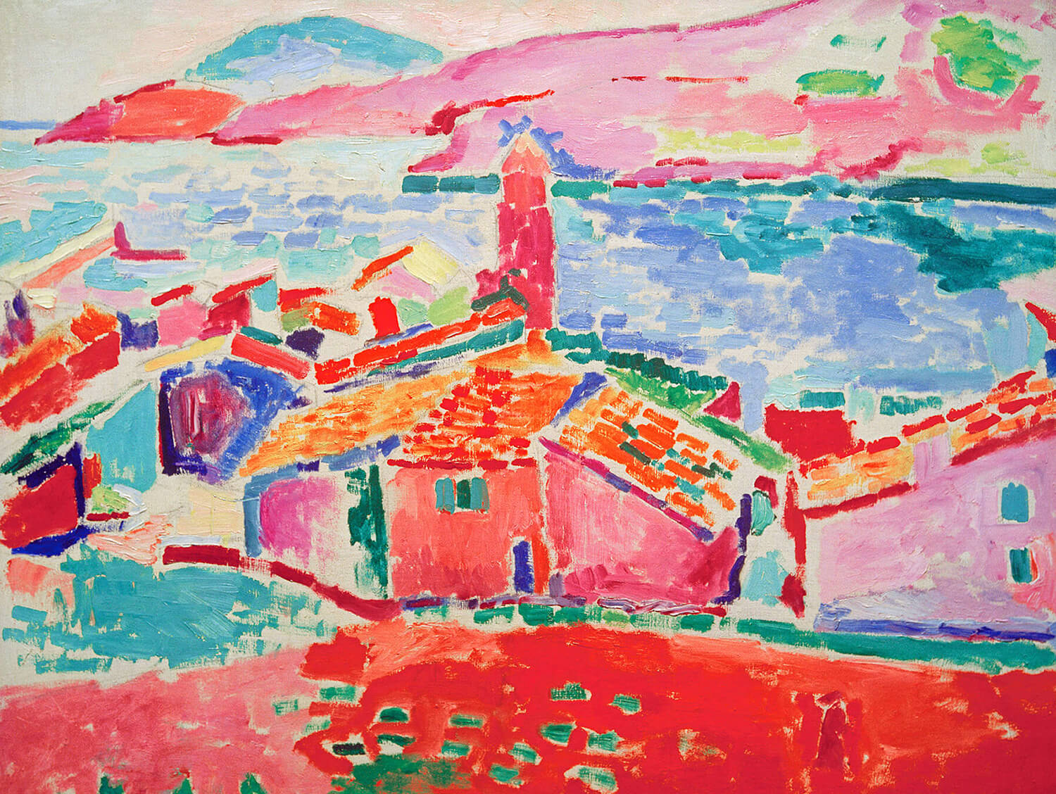
The Roofs of Collioure, 1905
Throughout his mature career Matisse would spend his winters in Nice, soaking up the unique light and colour of the Mediterranean coast during the colder season. His spirited and colourful paintings of Nice interiors, including the joyfully vibrant Interior at Nice, 1924, are now among his best-known works of art. In this artwork Matisse scatters streaks of hot coral pink throughout the entire scene, spreading it around the doorframe, across the ripe, fleshy fruit, and into the receding room in the near distance. He contrasts this rich and warm hue with cooler strands of yellow, blue and green, to create an airy freshness and vitality. As with so many of his paintings, this work showcases Matisse’s skillful mastery in balancing an array of opposing hues, and the endlessly inventive ways he found of bringing them into one.
Leave a comment
Related posts
FS Colour Series: Caramel Inspired by Paul Sérusier’s Burnt Sienna
Late 19th century French painter Paul Sérusier was a pioneering colourist, whose paintings broke free from the realism of the French Impressionists into the realms of the mystical, symbolic, and imaginary. He sought ways of communicating his innermost feelings through his colourful art, writing in his notebook, “Free form and colour from their traditional descriptive…
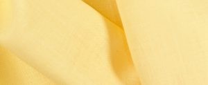
FS Colour Series: Mellow Yellow Inspired by Agnes Martin’s Golden Glow
The great American minimalist painter Agnes Martin made her name with epic canvases washed with ghostly, trembling bands of pale pastel colour that speak of memory, love, and her intimate experiences in nature. Pale golden shades of yellow like Mellow Yellow made their way into her striped bands of shimmering colour, invoking the golden glow…
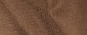
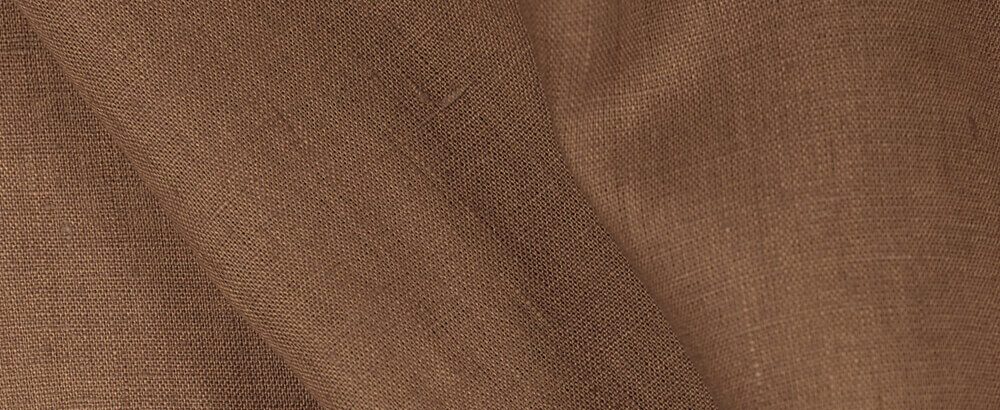
FS Colour Series: Shiitake Linen Inspired by Wilhelmina Barns-Graham’s Subtle Bronze
Renowned St Ives artist Wilhelmina Barns-Graham made work with astonishing subtlety, conveying the nuanced patina of rugged landscapes in an array of delicately shifting hues throughout her long and prolific career. Soft, subtle shades of bronzed brown like that of Shiitake Linen weaved through many of her most accomplished works of art, capturing the warm,…
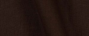
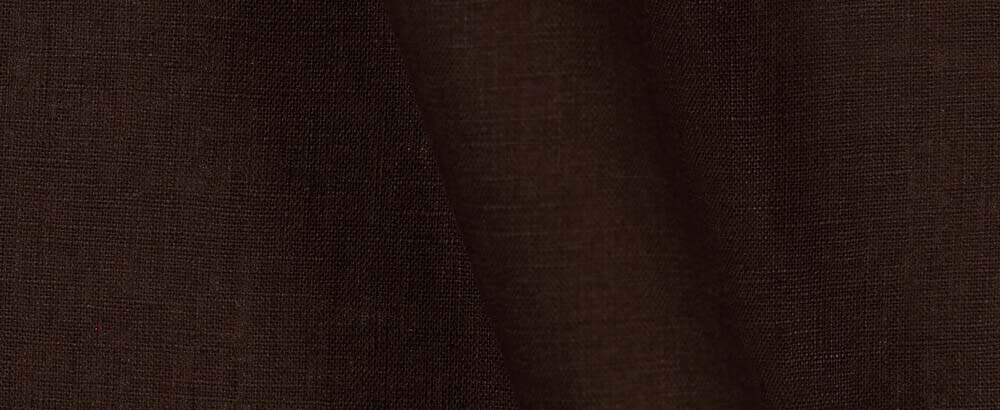
FS Colour Series: Coffee Bean Linen Inspired by Edvard Munch’s Deep Shadows
The early 20th century Norwegian Expressionist painter Edvard Munch saw art as a tool for expressing his innermost thoughts, feelings and desires, and the colours he worked with were a vital tool for expressing these intimate moments from his life. Deep shades of brown like Coffee Bean often played a key role, forming dark tree…
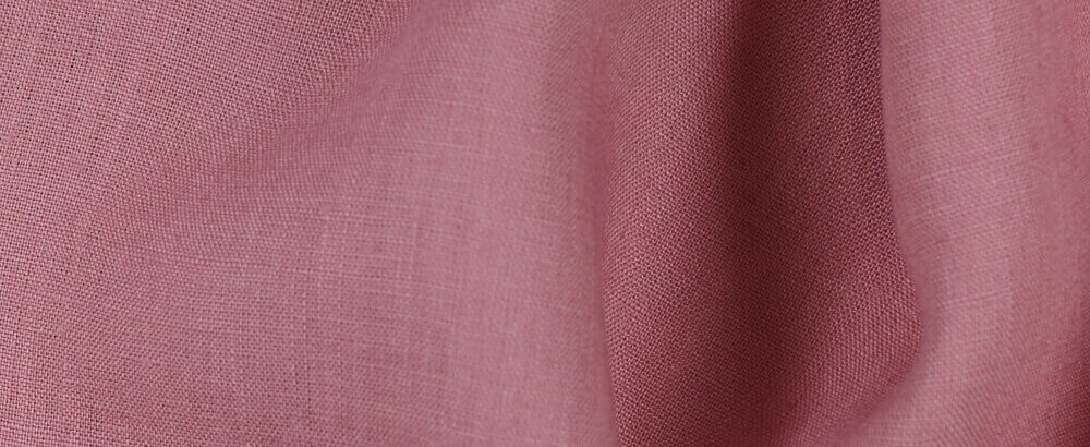
FS Colour Series: Dusty Rose Inspired by Pierre Bonnard’s Mauve Haze
Dusty Rose Linen’s muted, pink hue was an enduring feature in Pierre Bonnard’s shimmering, intimiste paintings, conveying sunlight spreading across morning terraces, breezing through curtains, or flooding across tabletops through open windows. He had an uncanny ability to breathe wonder into life’s most ordinary moments – from intimate bathing scenes to eating breakfast in the…


SEW THIS LOOK

Latest Posts


One Comment
Karen Baen
Tea rose is beautiful. I love the articles discussing color inspiration.