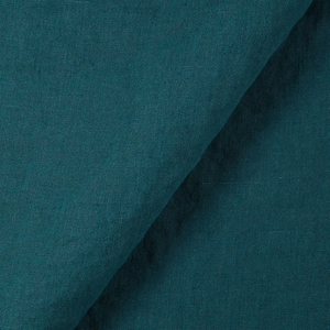
FS Colour Series: Oxford Blue Inspired by Birgit Skiöld’s Oceanic Seascapes
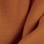
Swedish mid-20th century artist Birgit Skiöld was a pioneer in printmaking, a serial experimenter who skilfully merged traditional printing techniques with playful abstract motifs that hint at the movements and patterns of nature. Much of her work was elemental and ephemeral, made up of wispy, uneven lines and ghostly, barely-there colours, but rich, dark blues like OXFORD BLUE were one colour she dared to go bold with, using it to draw expressive, calligraphic marks and lines alluding to tree-like structures, rocks, or the rippling oceanic waves that became a recurring, enduring feature in her art.
Born in Stockholm, Sweden in 1923, Skiöld initially trained as a furniture designer at the Tekniska Konstfackskolan in Stockholm. In 1948 she set off for London, where she quickly became ingratiated with the thriving art scene, rubbing shoulders with Eduardo Paolozzi, Francis Bacon, Gertrude Hermes, Anthony Gross, and others. After visiting a printmaking exhibition with work by a series of early 20th century masters she was inspired to train as a printmaker, attending classes at Regent Street Polytechnic in London, followed by the Academie de la Grande Chaumiere.
In 1957, Skiöld established a printmaking school called The Print Workshop in the Fitzrovia area of London, which offered affordable printmaking facilities for artists. Many renowned artists came to make art here, including Jim Dine, David Hockney, Tom Phillips, Eduardo Paolozzi and Fionnuala Boyd. She referred to the enterprise as, “Not a business, not a college, not a gallery, simply an idea which has worked.” Along with running the workshop, Skiöld delivered inspiring printmaking lectures across the UK, as well as Sweden, the US, and Japan. She became a key member and secretary of the Senefelder Group in London, which promotes the printmaking practice of lithography, and a founding member of the Printmakers’ Council in the UK during the early 1960s, thus playing a vital role in promoting the practice of printmaking for the mid-20th century.
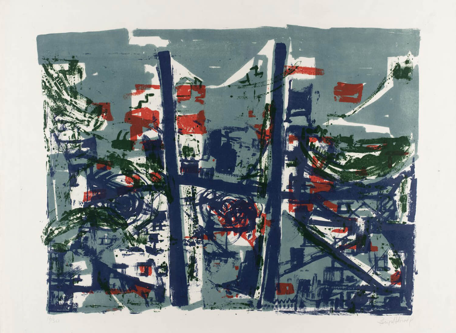
Within her own practice, Skiöld was perpetually fascinated by the organic shapes, textures and patterns of nature, which she merged with a language of modernist abstraction. In the relatively early, spirited lithographic print on paper, Landscape in Blue, 1958, Skiöld explores how scrawling, structural passages of line drawn out in dark blue become a loose framework set against a leaden grey sky, while scattered passages of textural red and green suggest energy and dynamic movement.
Throughout the 1960s and beyond, Skiöld focused predominantly on ways of capturing the colours, movement, and sensations of water, particularly in the ocean. Seascape, 1961, is an abstract flurry of layered marks that seem to swirl and overlap, suggesting depth and motion. Her subdued, elemental colour scheme of hazy lilac and pale aqua is offset against a rich cobalt blue, which is in turn peppered with small scattered marks in midnight blue that bring in depth and intensity.
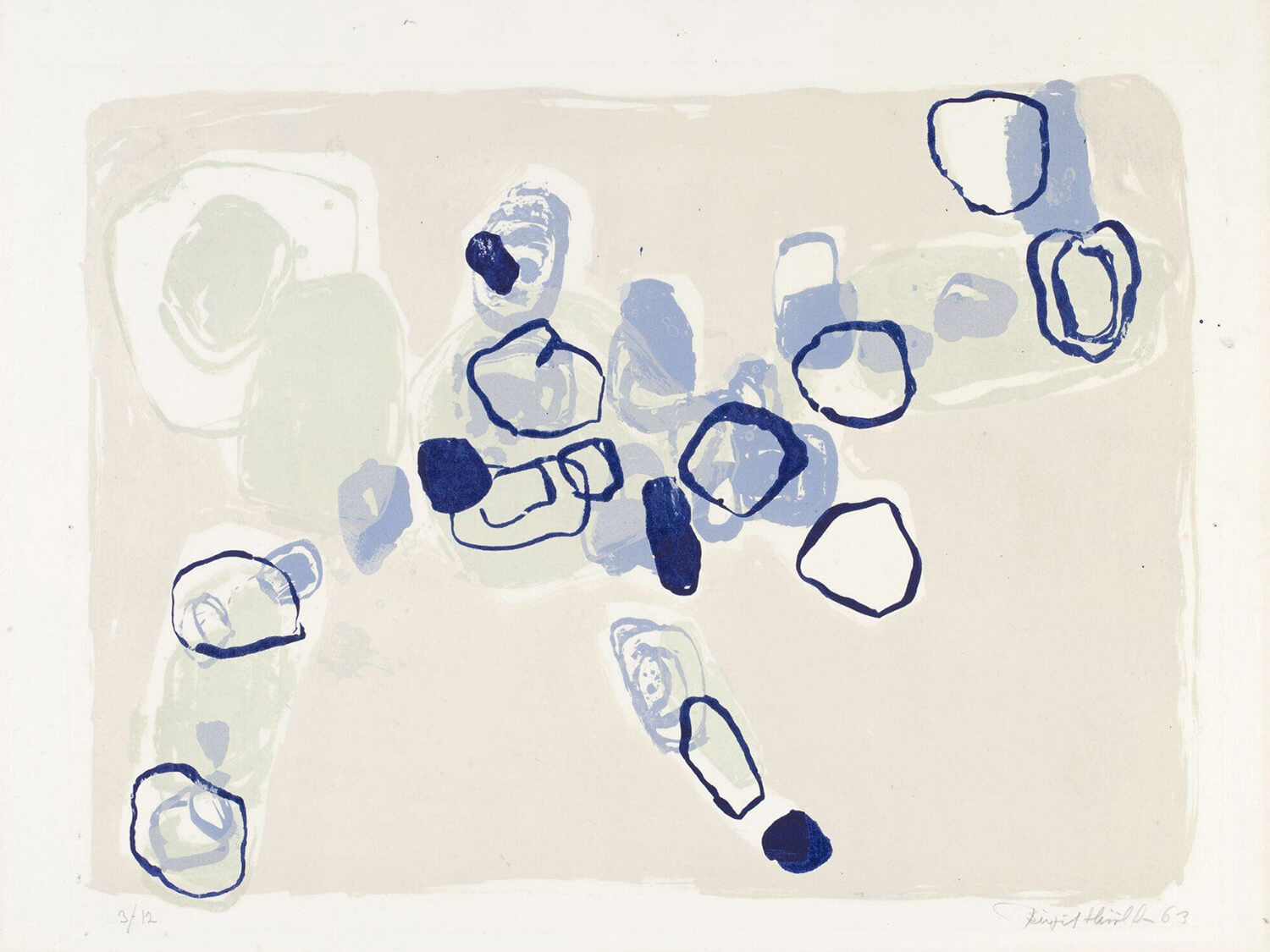
The lithographic print Archipelago – Blue 63, 1963, now held in the V&A Collection in London, demonstrates the minimalist nature of Skiöld’s mature style, with ghostly, barely-there marks colouring the image’s background, onto which expressively drawn shapes are gradually layered in increasing intensity, mirroring the soft, blurring effect of looking through water to see what lies beneath. Across the surface layer of the image Skiöld creates sharp focus with loosely-drawn, dark blue marks that could be craggy rocks, or ripples of movement falling in and out of the light.
In the slightly later, curiously abstract etching on paper, Archipelago – Red and Blue, 1966, Skiöld has adopted a finer, more linear approach, with delicate lines that capture the lapping motion of shallow water. She combines deep, shadowy blue here with passages of crisp crimson and tomato reds, creating a sharp and visually arresting contrast that could be water quietly lapping over rocks in a hidden, unknown place.
















Leave a comment