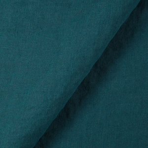
FS Colour Series: NIGHT BLUE Inspired by Mark Rothko’s Intoxicating Darkness
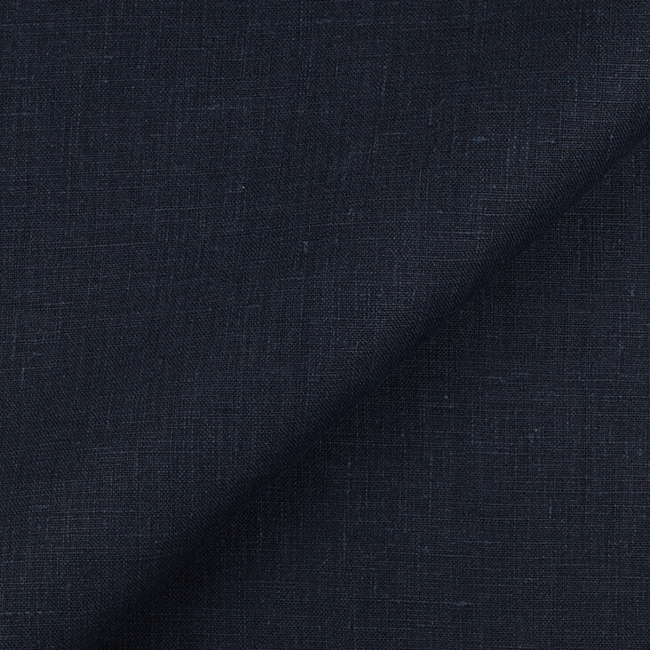
Mark Rothko knew how mesmerising night-time shades of blue could be, soaking them deep into the weave of his canvases until they formed intoxicating pools of darkness. The near-black shade of NIGHT BLUE Linen was one of his favourites, because it could invoke the raging drama and intensity of night, particularly when blurred at the edges to suggest haunting shadows, spectres or caves leading us into the unknown. He famously observed, “To me, art is an adventure into an unknown world, which can be explored only by those willing to take the risk.”
Rothko’s career began in 1920s New York, where he studied briefly with the Art Students League before setting up his own studio. His early art was figurative and garish in colour, a far cry from the sombre spirit of his later art. By the 1940s Rothko had changed tack, experimenting with a mix of Surrealism and Expressionism infused with references to mythology and philosophy. In the 1950s Rothko finally discovered his signature brand of Abstract Expressionism, painting vast, expansive colour fields in which hazy blocks of darkness seem to float weightlessly in space. In contrast with many of the action-based Abstract Expressionists, Rothko’s paintings were less about expressing his inner emotions and more about conveying universal states of longing, intensity and agony, and even inducing tears in the eyes of his viewers, like a great musical symphony. “The fact that a lot of people break down and cry when confronted with my pictures shows that I can communicate those basic human emotions,” he observed.
The shimmering colour and huge, larger-than-life scale of Rothko’s abstract paintings were intended to flood the viewer’s eyes, immersing them entirely in an otherworldly realm beyond our own, where the sublime forces of art could take over. Over time, Rothko’s paintings became increasingly simplified and streamlined in his quest to reach this purity of expression, sometimes containing only one or two stripes or squares of floating colour. He viewed this process of simplification as fundamental to his practice, observing, “The progression of a painter’s work, as it travels in time from point to point, will be toward clarity, toward the elimination of all obstacles between the painter and the idea, and between the idea and the observer.”
As his career progressed throughout the 1950s and 1960s, Rothko’s colours became darker and moodier, a bid to emulate the stark, haunting theatricality of historical painters such as Caravaggio and Rembrandt van Rijn. Rothko noted in an interview in 1960, “The dark pictures began in 1957 and have persisted almost compulsively to this day.” Dark colours also allowed Rothko to experiment with the invocation of space, and the heightened emotional tension that can be created between passages of light in amongst the darkness.
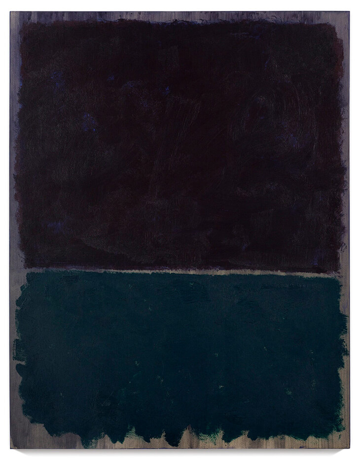
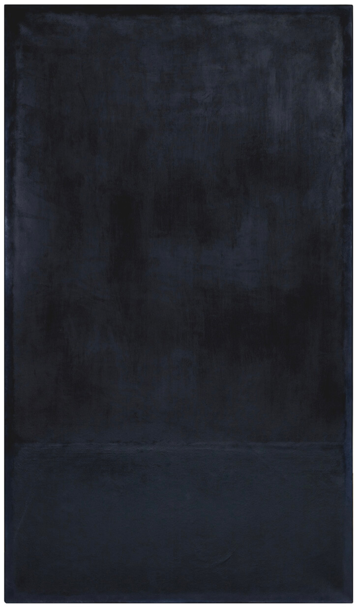
Many of Rothko’s darkest paintings are dominated by blues that veer dangerously close to black. In Light Red Over Black, 1957, a sea of intense, eye-watering red covers the entire background, while two dark, spectre-like rectangles in shades of midnight blue seem to hang in the air before it like threatening storm clouds, with wispy, indistinct edges. Untitled, from the late 1960s contrasts a painterly patch of dark turquoise with a larger swathe of dark, purplish blue that hangs over it like an agonising bruise, loaded with expressive angst. Untitled, late 1960s is even more dusky and intense, a sea of almost black blue. Closer examination reveals the subtlest trace of watery brushstrokes, layered to suggest the glowing luminosity of the night sky. On the bottom half of the painting a barely visible rectangle emerges out of the painting’s shadowy depths, painted with thicker, stickier paint. Its addition suggests the faintest hint of structure, weight and solidity, hovering in amongst the murky and mysterious depths of the unknown.
















Leave a comment