FS Colour Series: Marigold inspired by Keith Haring’s Golden Glow
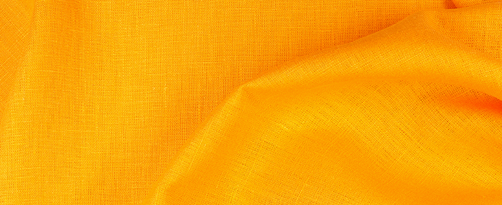
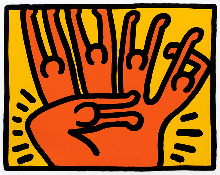
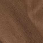
MARIGOLD linen’s rich, ochre yellow is flush with warm radiance, like a late summer sunset. American artist Keith Haring saw sunny optimism and the golden glow of human spirit in this colour, bleeding it into his freewheeling universe of jumping people, barking dogs and graphic slogans. Combining eye wateringly bright colours with cartoonish characters and politically loaded content, he produced vibrant motifs that pack as much punch today as they did back in the 1980s. He wrote, “…art … should be something that liberates the soul, provokes the imagination and encourages people to go further. It celebrates humanity instead of manipulating it.”
Growing up in Pennsylvania, Haring loved to draw from an early age. His father taught him how to create comic, cartoonish characters and he copied quirky children’s book illustrations from Dr Seuss and Walt Disney. In 1976 Haring began studying graphic art at the Ivy School of Professional Art in Pittsburgh, but soon dropped out when he realised commercial art was the wrong path for him. A year later he enrolled at New York’s School of Visual Arts, a move that would become career defining as he integrated himself with the city’s thriving, underground art scene. He befriended various influential figures including Kenny Scharf and Jean-Michel Basquiat and was influenced by Christo and Andy Warhol’s integration of everyday life into their art, writing, “Art is life and life is art.”
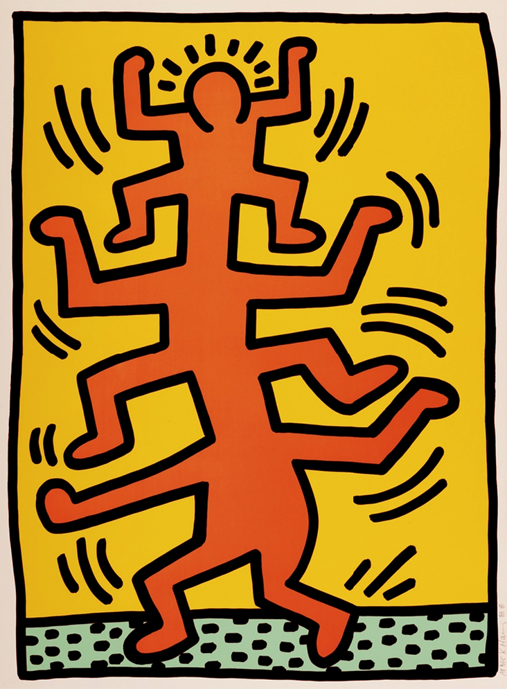
In the early 1980s Haring made rebellious graffiti artworks in alternative street venues, including nightclubs, squats and the New York subway, decorating them with energetic, hieroglyphic-like motifs that symbolised birth, death, sex and war. Initially, he worked in black and white, but soon realised colour could have a greater emotional impact, particularly when seen from a distance. When he took on gallery representation with Tony Shafrazi’s New York gallery 1982 Haring began making more traditional, wall based artworks, featuring the same graphic, linear motifs as his public artworks. In the print Untitled #1 (Fertility Series), 1983, Haring included his famous ‘radiant baby’ motif, a potent, almost religious symbol for peace and innocence. A group of pregnant women seem to glow with golden light as they jump and dance together, celebrating the imminent arrival of new life and new possibilities for the future.
Throughout the 1980s Haring was endlessly prolific, producing murals, theatre set designs, billboard posters, commercial designs, animations and graphic, bold artworks. He made public artworks all around the world, including sites in Europe, South America and Australia, engaging with indigenous communities and local children, living out his desire for art to bring peace and unity to all people. The motifs he explored became more politically loaded than ever, addressing controversial themes relating to the AIDS crisis, South African Apartheid and drug addiction.
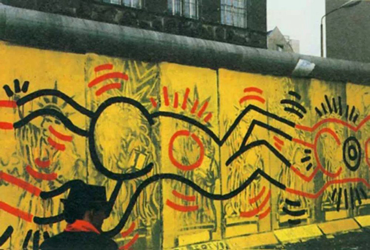
In 1986 Haring made a huge mural on the west side of the Berlin Wall. His design featured a row of interlocking figures linked by their hands and feet against a radiant, deep yellow backdrop, washing over the grim, grey concrete with colour and life. His powerful, vibrant motif came to represent unity and harmony in the face of political obstruction, which he called an attempt to “destroy the wall through painting it.” Though it was gradually demolished, first by graffiti artists and later when the Berlin Wall came down, Haring highlighted its importance as a political message rather than a commercial art object, writing, “It is temporary and its permanency is unimportant. Its existence is already established.”
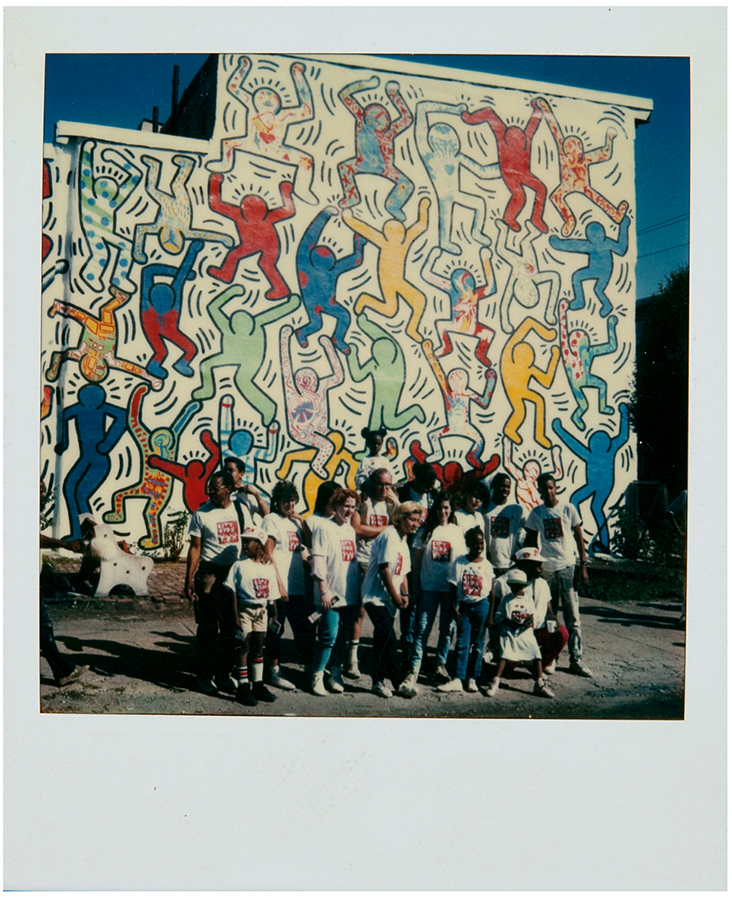
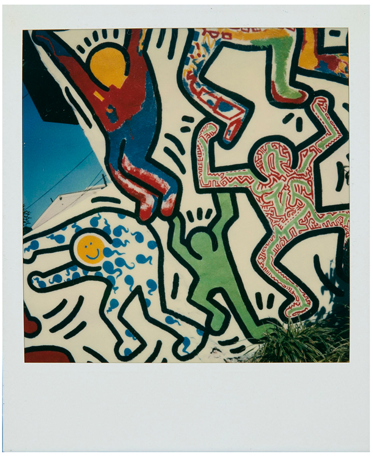
Polaroid and mural by Keith Haring / We the Youth / Philadelphia Mural / 1987 / Courtesy of The Keith Haring Foundation Archives
A year later Haring began work on another mural, this time in Philadelphia, titled We Are the Youth, 1987. Working with a group of teenage schoolchildren through New York’s CityKids Foundation and Philadelphia’s Brandywine Workshop, Haring designed a huge wall work for 22nd and Ellsworth Streets featuring jumping, leaping and dancing young figures brimming with boundless energy. Painted in bold, simple primary colours including shining marigold yellow, the figures sang of joyful happiness, bringing glowing, golden light to a once deprived neighbourhood. Brandywine Workshop’s founder and director wrote, “It wasn’t about putting murals all over the city and monuments to the artists. It was about sparking community, economic and social development.”
In the final years of his short life Haring began to explore his ‘Best Buddies’ motif, featuring two hugging figures in different colours, who radiate warmth and empathy towards one another, despite their differences. In the print series Best Buddies, 1990 made just 10 days before he died, Haring’s yellow figure seems to offer the golden glow of love, kindness and support to his friend, a universal, emblematic reminder that we are better together than apart.
















Leave a comment