From Architecture to Pattern: Frank Lloyd Wright’s Textiles
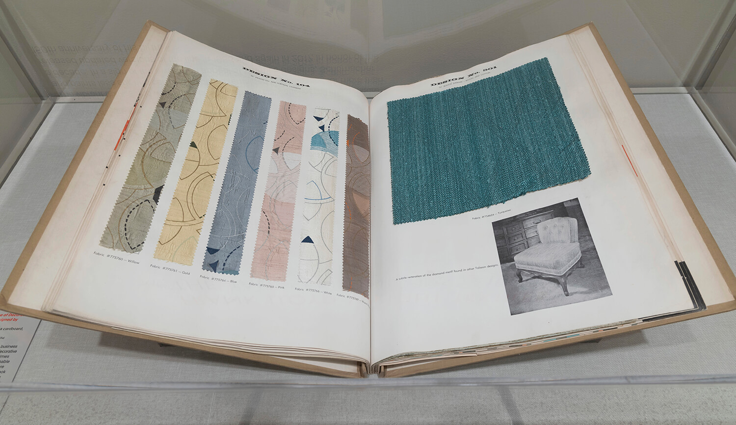
Open page from Frank Lloyd Wright’s sample book Schumacher’s Taliesin Line of Decorative Fabrics and Wallpapers Designed by Frank Lloyd Wright, 1955. Source: Yahoo
Frank Lloyd Wright might be best known as one of most revered American architects of entire 20th century – he pioneered the Prairie Style, along with ‘organic architecture’ designed in harmony with nature, and cutting-edge icons including New York City’s Guggenheim Museum. But perhaps less well known is his brief foray into textile and wallpaper design during the 1950s; Wright’s distinctive approach to pattern mirrored the architect’s building design style, with the same elegant, refined simplicity and interwoven geometric structures.
By the time Wright began dipping his toe into the world of textile design he was already a firm fixture in the American cultural landscape; he had designed hundreds of international buildings ranging from homes and skyscrapers to schools and museums. But Wright was tempted into the world of interiors through his friend, Elizabeth Gordon, then editor of House Beautiful Magazine, who persuaded the architect to produce a line of home furnishings that she suggested would make his architectural style more accessible to the American public.
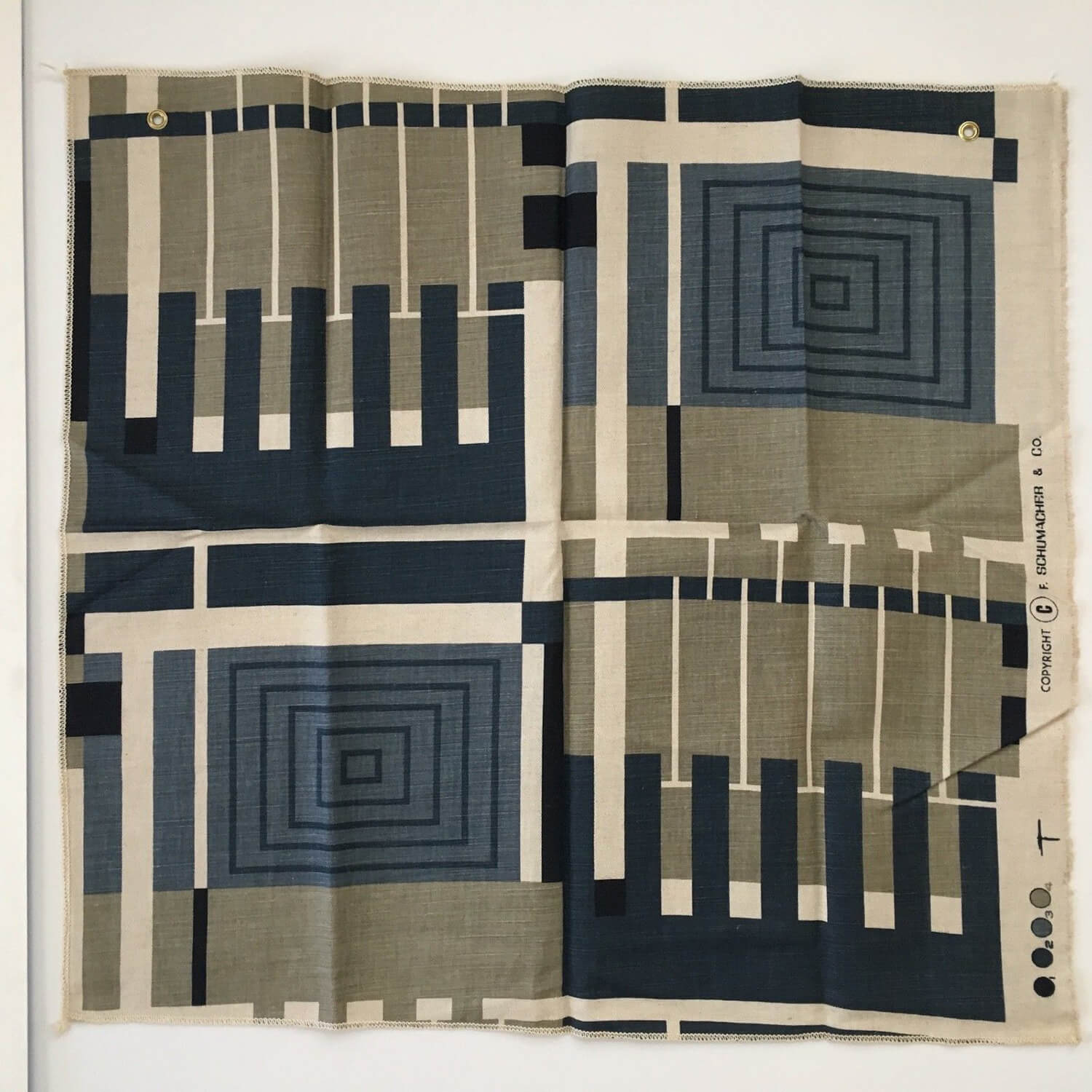
Along with paint, furniture, and wallpapers, Wright produced a series of fabrics in collaboration with interior design firm Schumacher and Company. He titled the entire collection the Taliesin Line, named after his own private home and studios in Wisconsin and Arizona. His designs were collated in a sample book called Schumacher’s Taliesin Line of Decorative Fabrics and Wallpapers Designed by Frank Lloyd Wright, 1955. Only 100 copies of the book printed, and made available to a small number of dealers.
Sara Caponigro, today’s creative director of Schumacher, recognises the significance of the enterprise, observing, “It became clear it was a very important collection that had the imprint of one of the most – probably the most – important American architect.” In November 1955, Gordon dedicated an entire House Beautiful Magazine to Wright’s career, and included a section dedicated to the Taliesin Line, which did much to boost sales once released to the wider public.
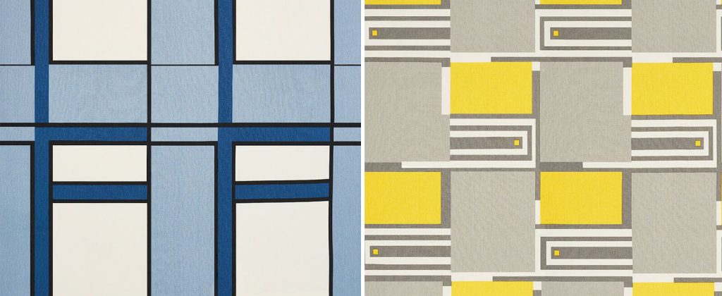
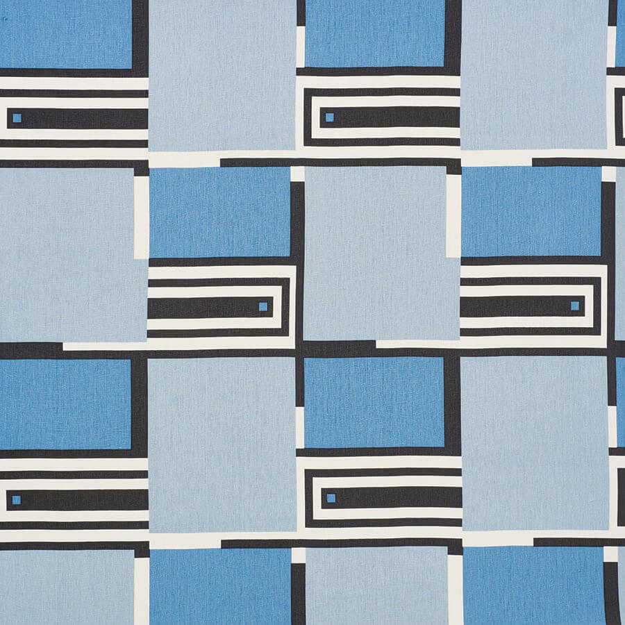
Wright produced 26 different printed textiles for the collection, which mimed the architect’s love for simple geometry, including circles, pentagons and concentric rectangles, and the intricate interplay of shape, pattern and colour explored in Wright’s textiles can be compared with many of the architect’s most outstanding architectural achievements. In some patterns, the delicate play of rectangles can be compared with Wright’s stained-glass panels, which he called ‘light screens’, such as those of Willits House in Glencoe, Illinois, 1901. In such designs, the fabric pattern’s interlayered rectangles resemble the home’s distinctive passages of cast light and shadow. Other textile patterns feature repetitive arches and circles that can be compared with the sweeping curves of the Guggenheim Museum.
The possibilities of fabric design led Wright to make some surprising discoveries around colour, surface, and texture, that might not have seemed obvious choices for his minimal, modern sensibilities. He played with linen, silk, mohair, rayon, cotton, and even lurex (introducing unexpected, yet subtle passages of sparkle). He also toyed with vivid shades of orange, green, gold, avocado green, and turquoise, colours that were typically fashionable for the 1950s, and as such his textiles were a roaring success.
Since his late career success in textiles, Wright’s fabric designs have been reissued with a new spin by Schumacher, once in 1986, when a new swathe of intense, 1980s colours were integrated, and again in 2017, with a more muted, contemporary palette in woven, soft fabrics, to celebrate the architect’s 150th birthday. In 2019, New York’s Metropolitan Museum housed a showcase of Wright’s contribution to interior design, celebrating this popular, yet often overlooked strand of his career. Exhibition curator, Amelia Peck’s aim was to draw parallels between this rare body of work and the architect’s now legendary buildings, as she explains, “The designs are certainly not of buildings in any way, but it’s the geometric pattern, and the way the geometries work together, that are very reminiscent of his buildings.”
















Leave a comment