FS Colour Series: Pearl Grey Inspired by Ed Ruscha’s Cinematic Silver
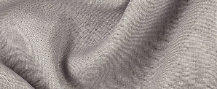
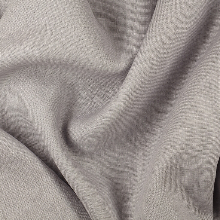
The tactile, shimmering silver of PEARL GREY made its way into the late work of American Pop and conceptual artist Ed Ruscha, forming the uneven patinas and tactile textures of old silver screen movies. For Ruscha, who has lived much of his adult life in Los Angeles, this luminescent shade of pale grey became a romantic, nostalgic longing, not just for old school Hollywood cinema, with its scratches, splatters and rips, but also for the simpler and less cluttered culture of the past, before capitalism and mass-media aggressively took hold. Ruscha explains his deep fascination with the past, writing, “I have always operated on a kind of waste-retrieval method … I retrieve and renew things that have been forgotten or wasted.”
Ed Ruscha was born in Omaha, Nebraska, in 1937, and grew up in Oklahoma City. In 1956 he moved to Los Angeles, where he trained at the Chouinard Art Institute (now the California Institute of the Arts). Following graduation in 1960, Ruscha initially found work as a graphic designer for an advertising agency, but he gradually began expanding his creative outlet into photography, drawing, painting and artist books. From early in his career as an artist, Ruscha has focussed on observations of daily life in Los Angeles, finding source material in anything from road signs to gas stations and parking lots. Over the next few years, Ruscha began making his name as a forerunner in Pop art, although his style was always more cool, detached and deadpan than that of many of his contemporaries, tying him in with conceptual art.
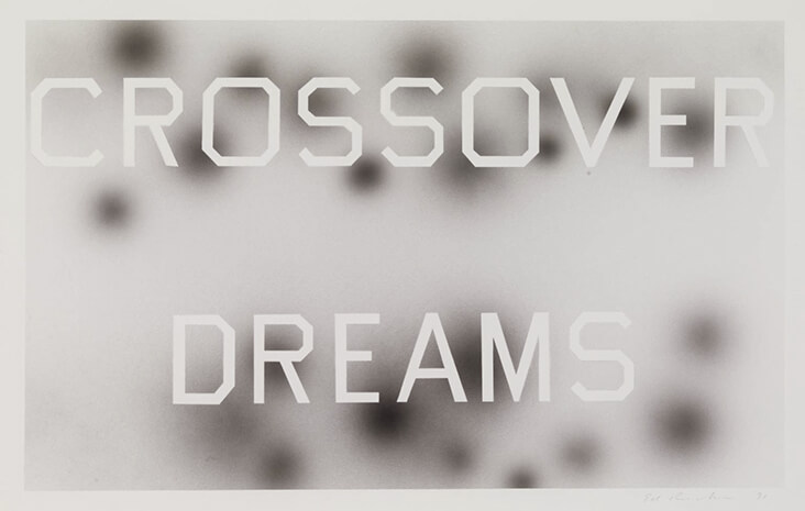
From the 1960s onwards, text played a vital role in Ruscha’s art, adding a further layer of impenetrable mystery or intrigue to his various images. In 1981, Ruscha even designed his own typeface, which he titled ‘Boy Scout Utility Modern’, made entirely from straight, angular lines, and this became an important cornerstone in his creative practice, allowing him to take greater ownership of the writing in his paintings, drawings and prints. In the acrylic on paper artwork Crossover Dreams, 1991, we see Ruscha experimenting with how text can be laid over hazy, blurred, and semi-photographic backgrounds, its crisp contours contrasting sharply and creating the suggestion of depth and space, while also alluding to the layering of film credits onto film footage. Here Ruscha fills the background with the glistening pale grey of old Hollywood movies, while the phrase, “Crossover Dreams,” alludes to the longing many emergent actors felt to cross over from theatre or television into the revered world of film.
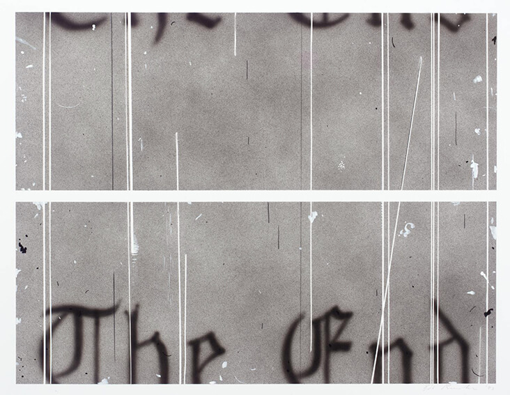
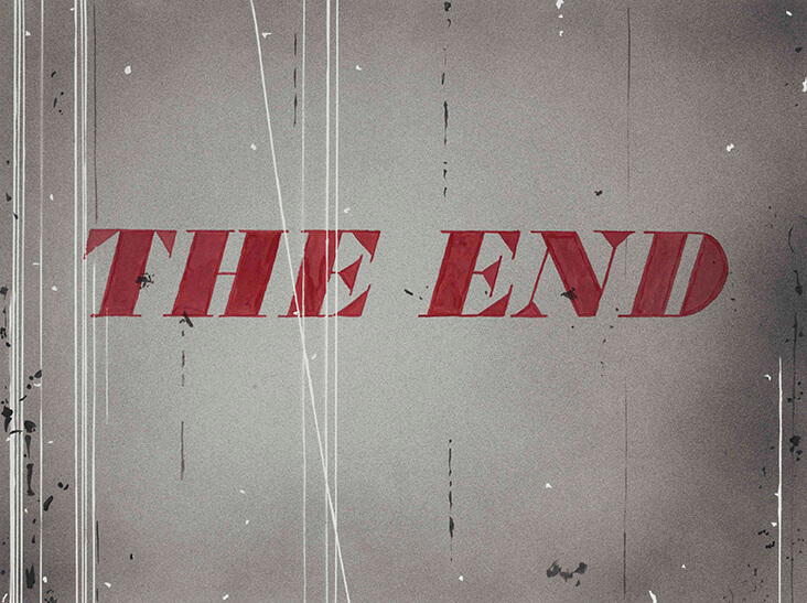
From the 1990s to the early 2000s Ruscha made a series of enigmatic artworks featuring text reading “The End.” In this particular work, titled The End #1, 1993 Ruscha paints the text as if caught between two frames of a film reel. With a combination of acrylic paint and graphite, Ruscha captures the uneven metallic sheen that was once a hallmark feature of silver screen cinema. He also includes the informal scratches and scrapes that would occur accidentally in old film reels, but which have now become obsolete in the slick digital age. The barely visible text here signals the end of old Hollywood, and the artist’s wistful nostalgia for a bygone era.
Made several years later, Ruscha’s artwork titled The End, 1997, shares the same qualities of romance and nostalgia for the cinematography of the silver screen age. The hazy silver backdrop here seems to glisten with flickering passages of light, while linear marks scrape across it like the tracks of time. Ruscha paints his text over the top in dark red, leaving visible brushstrokes to emphasize the image’s creaky, makeshift quality, and celebrates the unexpected, and often underappreciated beauty of accidents and imperfections.



















Leave a comment