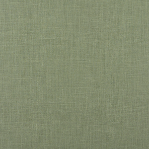
FS Colour Series: BASILE Inspired by Vincent van Gogh’s Tranquil Green
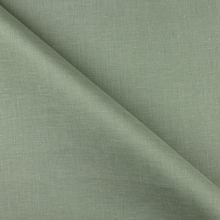
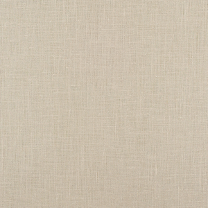
Vincent van Gogh was one of the greatest colourists of the 19th century, and his legacy lives on today. While he painted from life, his colours were heightened, elevated versions of reality, bristling with the anticipation and excitement he felt while observing the minutiae of the world around him. BASILE’s pale, fresh and minty green takes its inspiration from this great modernist master, who introduced this colour into many of his most famous works of art, sometimes as a small accent of vital freshness, and at other times streaked in iridescent brushstrokes across his masterfully expressive paintings.
The year 1889 was an immensely prolific one for Van Gogh, when he produced some of the most important artworks of his entire career. Nine years earlier, after several failed attempts at a steady career, Van Gogh had decided, tentatively at first, that he wanted to become a painter. Entirely self-taught, Van Gogh initially made dark, sombre paintings with a realist slant. But it was a move to Paris in 1886 that secured Van Gogh’s fate.
In Paris Van Gogh learned much from the Impressionist and Post-Impressionist artists he socialized with, including Toulouse Lautrec, Edgar Degas, and particularly Paul Gauguin, who became a close and longstanding friend. In 1888, Van Gogh and Gauguin moved together to the South of France, where they lived and worked side-by-side at 2 Place Lamartine, known colloquially as the “Yellow House.” The art Van Gogh made during his first year in Arles was wild and expressive, with unusual colours and uneasy distortions that reflected his increasingly distressed state of mind.
In 1889, Van Gogh admitted himself into the asylum and monastery at Saint-Remy; here Van Gogh found a quiet refuge and a place of calm solitude where his mind could fully rest. The tranquillity he felt at Saint-Remy can be seen in the art that Van Gogh made during this immensely productive year, which was dominated by lighter, cooler colours, and ordered compositions. In Vue de l’asile et de la Chapelle de Saint-Rémy, 1889, Van Gogh paints a view across the undulating landscape to the Chapel of Saint-Remy in the distance. Cool, watery shades of pale green sweep across the horizon, suggesting the shimmering movement of long grass blowing in the breeze. The same fresh mint green is scattered across the trees in the distance as they billow like plumes of smoke.
Van Gogh painted Irises, 1889, in the same year, one in a series of paintings based on the abundant irises that filled the tranquil garden at Saint-Remy. Much like his famed sunflowers, Van Gogh’s irises have a weighty, sculptural solidity that set them apart from the fleeting flower studies of the earlier Impressionists. He also heightens his colour observations, ramping up the fresh vitality of the pale green leaves, and contrasting them with the deep indigo blue of the flowers erupting above them. Meanwhile warm, rust reds weave across the foreground in a patchwork of dappled marks that seem alive with energy.
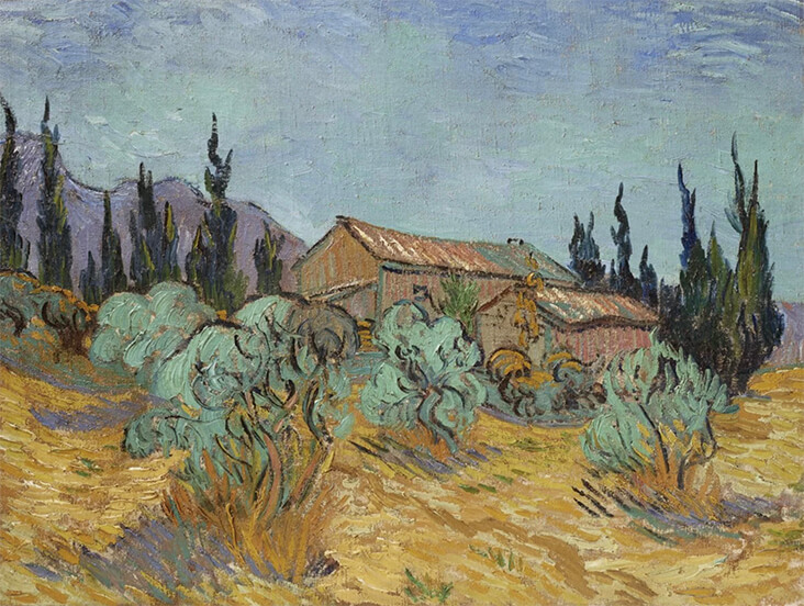
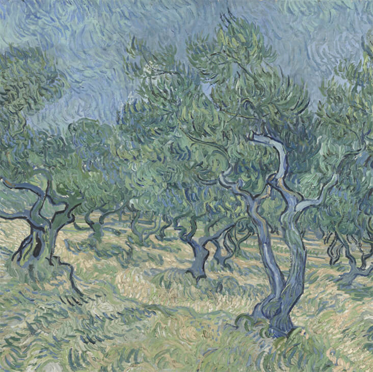
In Cabanes de Bois Parmi les Oliviers et Cypres, 1889, Van Gogh contrasts his trademark mint green in the leaves of the trees with a series of warmer hues, including yellow ochre, hazy brown and olive green. In the background, the palest shade of blue opens out across the sky, complementing the cool green leaves below. Saint-Remy was surrounded by olive groves, and they subsequently became a recurring subject in Van Gogh’s art. He was particularly fascinated by the twisting, curling, sculptural shapes of the olive tree trunks, and the pale, iridescent leaves that adorn them. Olive Orchard, 1890 is one of the artist’s most celebrated paintings of olive groves, painted in a limited palette of pale greens and grey-blues. This simple, harmonious colour scheme conveys the quiet, introspective tranquillity Van Gogh felt while sitting here painting directly from life, out in the open air with nothing but the trees, the grass, the insects, and the cloudless blue sky above.
























One Comment
Vicki Lang
Van Gogh’s paintings are full of so much emotion with the boldness of his brush strokes. Thank you for the beautiful article and the wonderful green color.