Creative Pathways into FRENCH LILAC: Victore Pasmore, Helen Frankenthaler and Tony Swain
FRENCH LILAC is soft, delicate and mysterious, conveying foggy skies or pale shadows flickering on the surface of water. Artists over the years have introduced this subtle, enigmatic colour into their art to bring in layers of poetic meaning, or even just a hint of tart freshness. Three very different artists who demonstrate the potent, creative potential hidden inside this seemingly innocuous lilac shade are Victor Pasmore, Helen Frankenthaler and Tony Swain – each reveal how this pastel shade of purple can be integrated into surprising and unexpected colour schemes.
British artist Victore Pasmore was one of a leading generation of London-based artists in the 1940s and 1950s who pioneered a daring new language of abstraction. Pasmore’s art was largely influenced by the ordered, yet playful geometry of Piet Mondrian and Paul Klee. Primarily a painter, Pasmore moved into a low-relief style of sculpture in the 1950s, a technique he saw as somewhere between painting and sculpture. In Pasmore’s elemental, slight sculpture titled Abstract in White, Black, Indian and Lilac, 1957, the artist toys with a series of planes and blocks, carefully arranged onto a white blockboard support. Though sparse and retrained, Pasmore arrived at the final composition of this artwork over a gradual process of adding and reducing wooden panels until he achieved a certain harmonious balance. Here the white ground is interrupted by black lines in varying densities, and two patches of colour, one lilac and one crimson red, vie for our attention, in amongst the fleeting grey shadows around them.
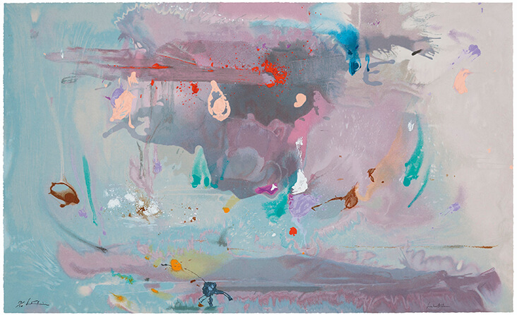
American artist Helen Frankenthaler was a generation younger than Pasmore, and her art delved into the new and unchartered territories of Abstract Expressionism and Colour Field painting. One of only a few women associated with the New York School of Abstract Expressionism, Frankenthaler was a force of nature, working on vast canvases with great swathes of watery paint that she would pour and leave to pool in spontaneous ways. Later she moved this same language into printmaking, as seen in the painterly screen print Grey Fireworks, 2000. In this artwork Frankenthaler creates a swirling mass of chaotic energy, with passages of grey, lilac and purple that blend pleasingly into one another to suggest brewing storm clouds or the murky depths of lake water. Frankenthaler scatters small splashes of bright colour over this atmospheric haze to create her ‘fireworks’; their inclusion here adds magical qualities of depth, energy, and drama.
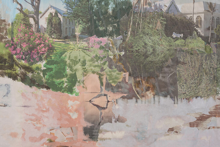
More recently, the British artist Tony Swain has introduced this same lilac colour into many of his surreal, ghostly and ethereal dreamscapes. Swain works on top of washed-out photographic images found in cheaply printed newspapers, which he collages together and paints over with fluid passages of acrylic paint, leaving just enough of the original images in place to create an uncanny feeling of familiarity. This process of concealment and transformation allows Swain to tease out new narratives and unlikely scenarios where little makes sense. More often than not Swain conjures up fantastical landscapes where wild tangles of tundra spill over one another, and pale, iridescent light colours skies and passages of water. In the elemental painting During Secrets, 2015, for example, we see jumbled up plants and trees in various shades of light green pasted over one another, some real, some painted, which together create an aura of utopian escapism. In the foreground, Swain sweeps broad passages of lilac and peach paint, amplifying the image’s dreamy, mystical qualities. Meanwhile, traces of grand architectural villas are just visible in the background, whose walls and roofs are tinged with the same delicate lilac hue.
















One Comment
Teresa Moffitt
Love your article. It gets my creative juices flowing! I am a lilac, purple kind of girl and find it challenging at times…yet here you are, showing 3 very different artistic moods using MY colors. I complicate by throwing in a little orange, versus the crimson…. And lean toward modern so as I said to start with…the juices are flowing! Thank you!!