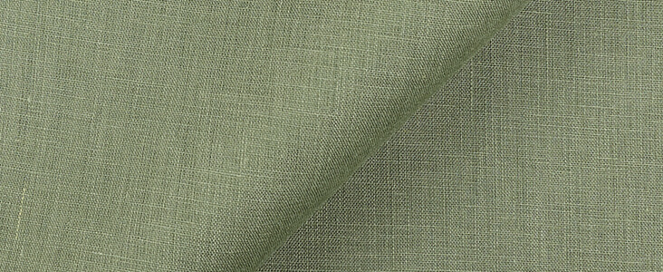
FS Colour Series: HEDGE GREEN Inspired by Joan Miro’s Fresh Mint
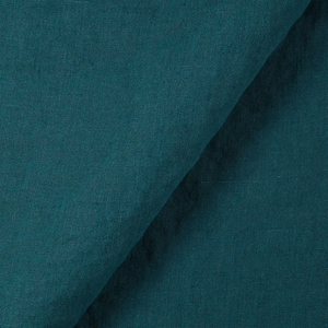
Colour was a driving force in the Surrealist art of Joan Miro, pulsing through his images with a passionate and rhythmic energy. He played with all the colours of the rainbow throughout his long and prolific career, exploring how curious and unexpected relationships could be discovered between them. The fresh, cool and minty shade of HEDGE GREEN linen appeared often, sometimes as small accents peppered across the canvas like miniature jewels, other times splashed in great streaks of expression, or even soaked deep into the weave of the canvas with the depth of the ocean. Time and time again, we see how he enjoyed the way this colour could introduce sharp, zesty freshness into his art.
Miro was one of the mid-20th century’s most innovative artists, uncovering an expressive, automatic and imaginative style that is still instantly recognisable today. Born in Barcelona, he later settled in Paris in the 1920s, where he became an instrumental member of the Surrealist group alongside many others including Andre Masson, Rene Magritte and Max Ernst. Miro’s Parisian studio became a lively meeting point for the artistic community of Paris, and Breton deemed Miro’s arrival in Paris, “an important stage in the development of surrealist art.”
Like many of his fellow Surrealists, Miro wanted to free art from the constraints of realism. He did this by beginning his work in an entirely spontaneous, improvised and automatic manner, as he once explained, “Rather than setting out to paint something, I begin painting and as I paint the picture begins to assert itself…. The first stage is free, unconscious.” Once forms began to emerge from the canvas, Miro then changed tack, taking a more considered approach, or as he put it, “The second stage is carefully calculated.” He toyed with an array of different materials, such as metal, raw canvas and paper collage, tearing apart painterly conventions and putting them together in endlessly inventive new ways. His art became a careful balance between chaos and order, structure and expression, earning him an internationally successful career.
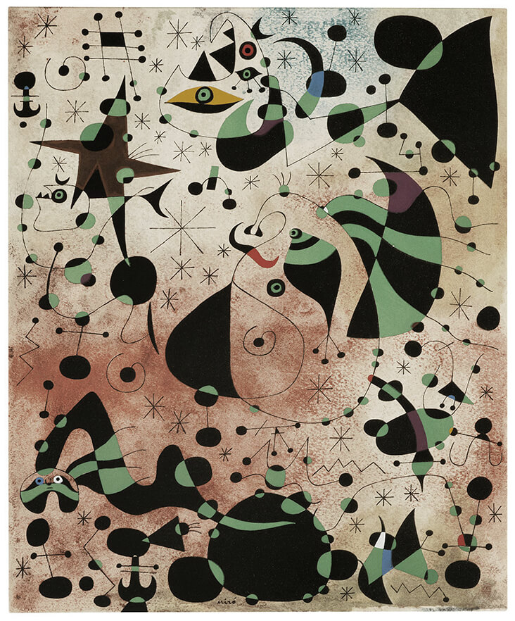
Throughout the war years Miro was forced to move throughout Europe repeatedly, and his artworks often reflected this instability with impassioned colours and strange, deconstructed forms. By the 1950s, Miro’s art had become increasingly expressive and abstract, reflecting a newfound freedom following the end of the war years. He pioneered a new approach for creating depth and space within his paintings, drawings and prints, by scumbling a loose backdrop in with washes of paint or ink, and overlaying this with careful, calligraphic lines and solid blocks of colour. We see this technique come alive in the pochoir print Constellations, 1959, one of many artworks by Miro exploring star patterns and the night sky. Here, warm shades of umber and red are scratched across the background to create hazy, atmospheric perspective, while cool shades of pale mint are scattered across its surface in opaque paint, forming an amorphous and uneven pattern of scattered marks.
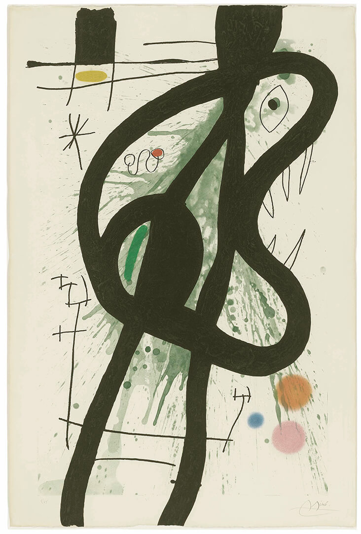
By the time he painted the oil on canvas Message from a Friend, 1964, Miro had moved into a new approach, with flat colours and simple, striking shapes. Miro once compared the dominant black shape here to a cloud or a whale, while the cool green around it could just as easily be a deep sea or a darkening sky. He contrasts this cold, refreshing shade of green with small patches of shockingly bright red, along with two panels of ultramarine blue and the smallest streak of lemon yellow. Made just a few years later, The Great Carnivore, 1969 leaps into another realm of new and unchartered territory, splashing a watery streak of turquoise green across the background, before layering over it with a bold black squiggle resembling the outline of a face. In this etching and aquatint print, Miro toys with how this cool shade of green can become a softer, more neutral background tone when surrounded by tiny accents of acid-sharp brightness in pink, yellow, blue and orange – sugary sweetness against the crisp freshness of mint green.











Leave a comment