FS Colour Series: MICRO CHIP Inspired by Richard Diebenkorn’s Ocean Mist
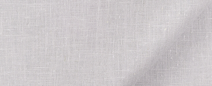
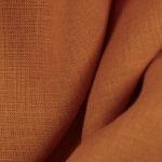
American painter Richard Diebenkorn is one of the 20th century’s most celebrated painters, capturing the hazy light of his native California with cool, crystalline colours like that of MICRO CHIP Linen. His world-renowned ‘Ocean Park’ series was made during the 1970s as inspired by the oceanic landscape of Santa Monica, where he had made his forever home. These paintings were radical for several reasons – they pioneered a minimalist approach to abstraction, with angular, architectural lines and spliced geometric panels. Colours were equally as ground-breaking – large areas of pale, misty and watery lilacs seem to expand across the surfaces of his huge canvases, broken into with jewel-like shards of intense brightness.
Richard Diebenkorn was born in Portland, Oregon in 1922, but his family moved to San Francisco when he was just two years old. It was Diebenkorn’s artistic grandmother who encouraged a love of the arts in her young grandson, sharing with him illustrated books and taking him to local galleries. In 1940 Diebenkorn trained as a painter at Stanford University, and his early work revealed a fascination with the atmospheric light and ordered rationalism of Edward Hopper.
In 1946 Diebenkorn returned to San Francisco, where he trained at the California School of Fine Arts. A bright and successful student, he joined as a faculty member at the school following graduation. Throughout the following years, Diebenkorn travelled widely, visiting New Mexico and Europe and soaking up a huge variety of influences. Throughout the 1950s Diebenkorn worked in an Abstract Expressionist style, creating loose, gestural paintings with broad sweeps of colour and dark, calligraphic marks. He later abandoned this style for a return to figurative subject matter, but much of his art from this era had an angular, structural quality that would pave the way for his most successful work to come.
After settling in Santa Monica in 1967, Diebenkorn began his renowned ‘Ocean Park’ series, inspired by the oceanic views from his studio. Diebenkorn worked obsessively on the series between 1967-1988, gradually honing and refining his language of abstract geometry to become increasingly elemental and ghostly over time. Preparatory studies made on paper reveal the intimacy of Diebenkorn’s working process as he figures out how to convey a sense of atmospheric depth through a process of drawing, obscuring and layering, always risking the potential of destroying his own work. “I don’t go into the studio with the idea of ‘saying’ something,” he writes, “What I do is face the blank canvas and put a few arbitrary marks on it that start me on some sort of dialogue.” In the spectral drawing Untitled (Ocean Park), 1971, linear marks suggest a structural scaffolding that seems to hang in the air between us and the flat page, partially obscured by the haze of a lilac sea mist.
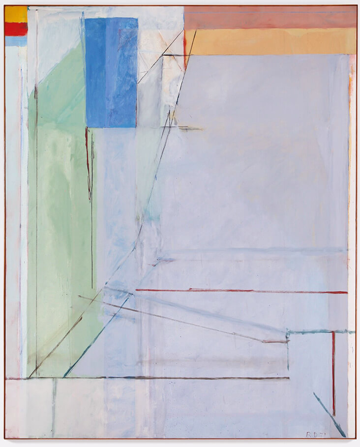
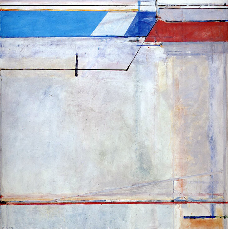
Made in the same year, the oil on canvas painting Ocean Park no 41, 1971, has the same quality of internal depth and space, as angular, perspectival lines draw us in, some seemingly fading into the distance as others overlap them. A hypnotic shade of hazy, bluish lilac dominates the scene, like a window view onto an ocean beyond. In the slightly later painting Ocean Park no. 54, 1972, the same pale, ephemeral colour dominates a large expanse of the canvas, offset against a densely worked patchwork of vivid colours, each with its own appealingly worked, hard-won patina. Ocean Park no. 63, 1973 is even bolder in design, with a vast stretch of shimmering, lilac-blue that suggests the fresh coolness of oceanic air. It is cut into with splices of deep tomato red and cerulean blue, which could just as well be boats moving through the crystalline sea of Santa Monica.

















One Comment
Elaine Rutledge
I find myself choosing shades of grey these days. I am always reminded of a story going around Los Angeles in the 1960s. A rather large lady approached Mr. Blackwell (fashion critic) and asked him to tell her what color would look best on her. He replied: Madam, God dressed the elephant in grey. Likely for that comment, I have avoided grey all my life! Until now. It’s a lovely color – a neutral that goes with so many other colors. Love it!