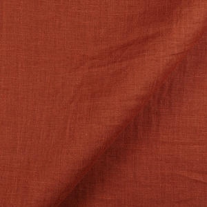
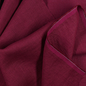
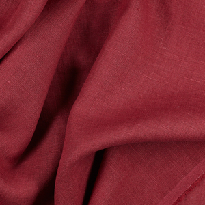
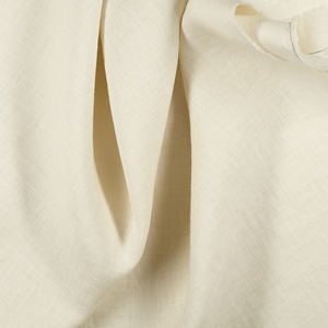
FS Colour Series: NEW SAFARI Inspired by Robert Ryman’s Quiet Introspection
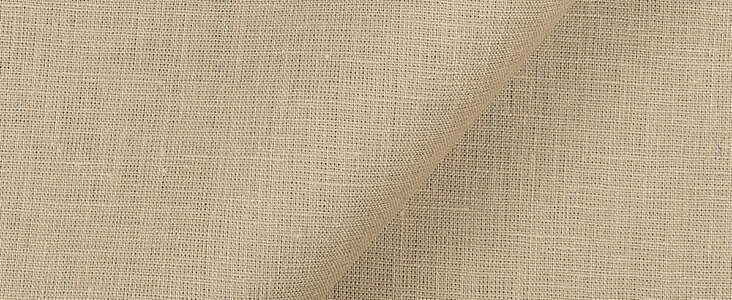
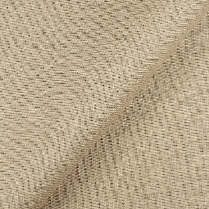
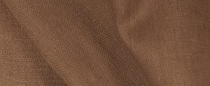
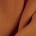
American painter Robert Ryman made many of his quiet, introspective paintings on biscuit toned backdrops, coloured with the same warm, comforting neutral of NEW SAFARI Linen. He interrupted these backgrounds with jarringly fresh shades of arctic white, sometimes skidding like an accident across the picture plane, other times neatly ordered into fenced off squares. A leading painter of 1960s New York, Ryman straddled a middle ground between the painterliness of Abstract Expressionism and the white, pristine order of Minimalism, combining visceral, tactile mark making with order, repetition and a limited colour range of white, beige and brown. “There is never a question of what to paint,” he wrote, “but only how to paint.”
Ryman was born in Nashville, Tennessee in 1930, and initially trained as a saxophone player at the Tennessee Polytechnic Institute. In 1952 he moved to New York with dreams of becoming a jazz musician. In New York Ryman trained with the esteemed jazz player Lennie Tristano and spent nights playing hard bebop in the style of Charlie Parker and Zoot Sims. By day, Ryman took a job as a security guard at the Museum of Modern Art, not realising the impact it would come to have on his future career.
At this time Ryman new almost nothing about painting, but friendships with fellow museum guards Sol LeWitt, Dan Flavin and Al Held proved monumentally profound, encouraging him to learn more about the art that surrounded him. Throughout these years Ryman studied the art of Henri Matisse, Paul Cezanne and Pablo Picasso, but it was the ‘all-over’ Abstract Expressionist art of Mark Rothko and Jackson Pollock that really pushed him to start making his own art in the mid-1950s.
In many of Ryman’s earliest paintings he would begin with a bright base colour and gradually obliterate it with an angry flurry of white marks. As Minimalism gradually took hold across New York Ryman was quick to respond, further reducing his colour range to whites and beiges, and only painting on square backgrounds. Even within these narrow confines, Ryman was keen to retain the human appeal of the hand-made mark, exploring how accidental swipes, streaks, smears and scribbles could enliven his minimal arrangements with a considered, sensitive poetry.
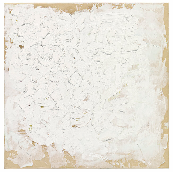
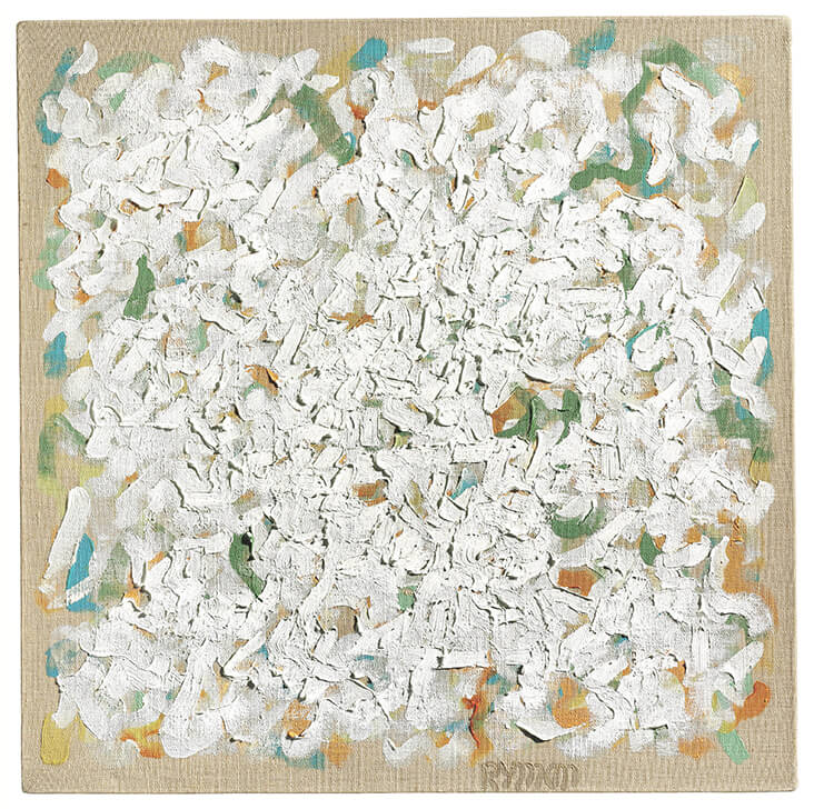
The early painting Untitled, 1961 demonstrates Ryman’s signature style, with streaked white paint applied intuitively across a warm, appealingly beige ground. In this painting he explores fully the expressive potential of paint, slapped on thickly in the centre and smeared out to the edges so we can see the rich, earthy base colour showing through. Untitled, 1962-3 is more systematic in design, with white marks criss-crossed into a loose grid-like pattern that is woven through with threads of brown, green and blue. Together they seem to hover like a woven blanket above the sandy ground of the raw, unprimed canvas below.
Towards the mid-1960s Ryman’s art became even more refined, ordered and neat, exploring how rich, buttery passages of paint could be contained within rigid boxes and frames. His works were often painted onto a small scale, lending them a sensitive, humane modesty that stood in stark contrast to the macho bravado of Abstract Expressionism that had preceded him. Many of Ryman’s works during this time also reintroduced small traces of intense, vivid colour that just peek through busy networks of white. “[It] was a matter of making the surface very animated, giving it a lot of movement and activity,” says Ryman, “This was done not just with the brushwork and use of quite heavy paint, but with colour which was subtly creeping through the white.”
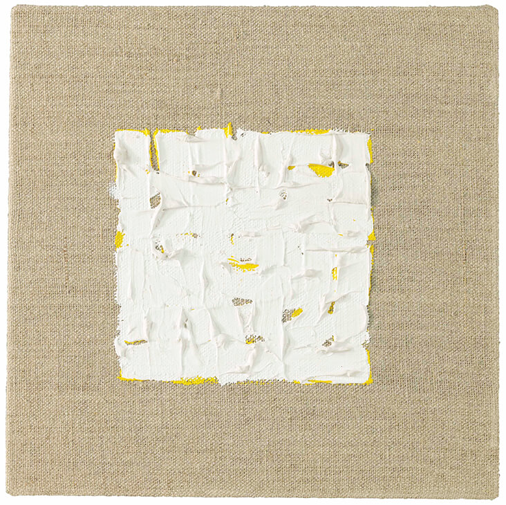
Untitled, 1964 demonstrates Ryman’s growing confidence in leaving the bare burlap ground on show, allowing its warm biscuit tone to become a definitive grounding, where two crudely painted wedges of intense white shot through with red can float free. Untitled, 1964-5 shares this same emphasis on figure-ground relationships, with a central square, roughly painted with streaks of white and tinged with strands of zesty lemon, hovering on its surface. A sharp contrast is created between the quiet, rustic warmth of the backdrop and the cool hue of the neatly contained action on its surface, demonstrating Ryman’s skillful balance of minimal, pared back geometry and the bare traces of human touch.













2 Comments
Corinne Skulmoski
Greetings Rosie! hhhmmm not sure what to make of these, looks like something I could do but on the other hand I know the thought that goes into these is still pretty intense despite the seeming simplicity. I guess I find them a little cold. Fascinating as always!
Rosie Lesso
Thanks for commenting Corinne! Always interesting to hear different perspectives on art and to open up a lively debate. I love the rough materiality of Ryman’s art but I guess it is very subjective.