Art for the People: The Dazzling Textiles of Lucienne Day
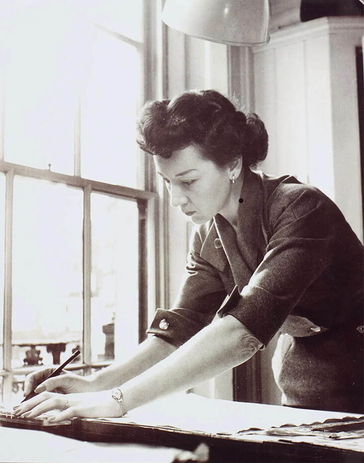
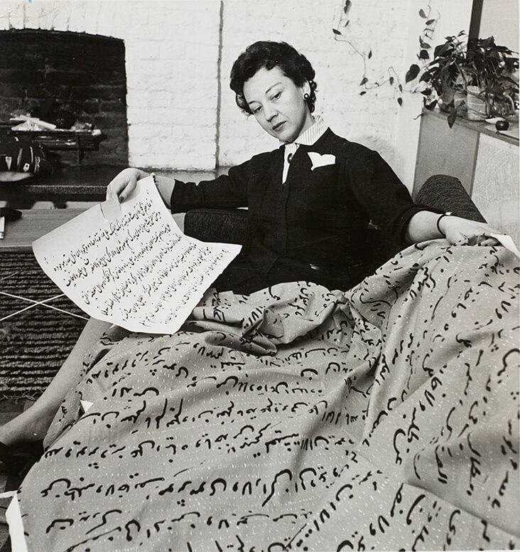
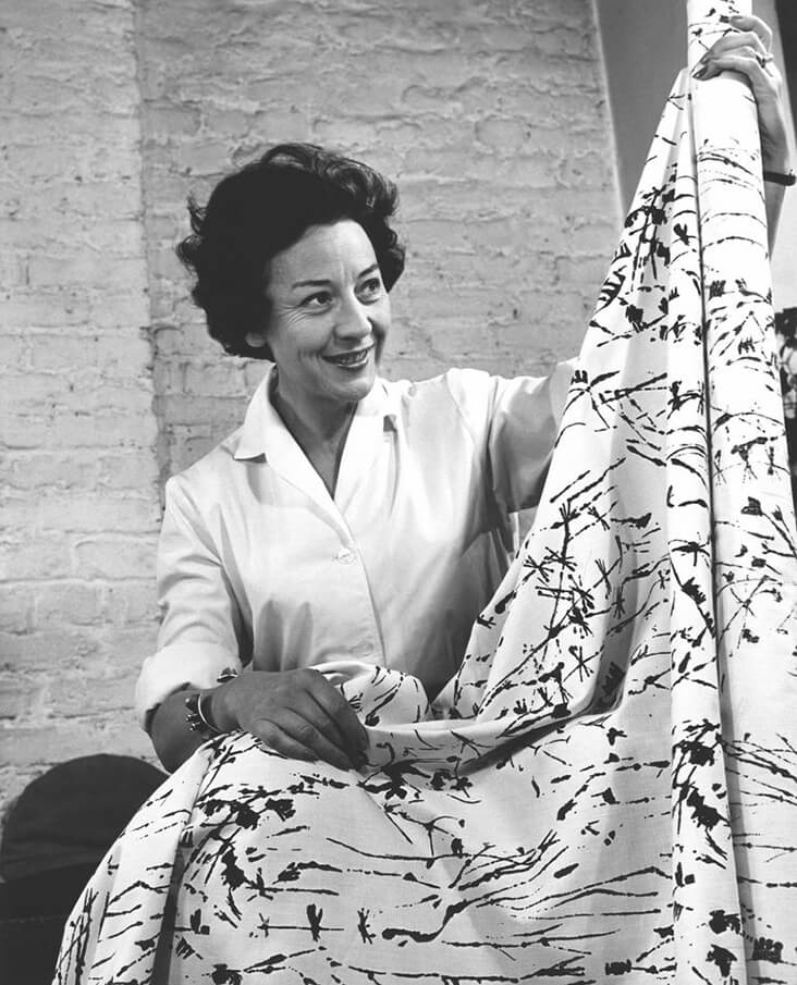
Lucienne Day was one of Britain’s foremost post-war designers, creating dazzling textiles that decorated almost every home across the country throughout the 1950s and beyond. Drawing on the English tradition for plant-based forms including flowers, grasses and seed heads, she went on to transform them into radical, abstracted repeat patterns, symbolising the regrowth of a daring new society after the harsh brutalities of war. Much like her Arts and Crafts predecessors, Day firmly believed printed textiles could be an “art for the people,” a belief she was able to realise by focussing closely on the wants and needs of her customers. With a long and prolific career spanning six decades, it is hard to imagine the face of textiles today without her far-reaching influence.
Day was born under the name Desiree Lucienne Conradi to an English mother and Belgian father, and grew up in the wealthy suburbs of London. At her strict convent school, she was retrained and quietly determined, discovering early on a great passion for design. From 1937 to 1940 Day studied textile design at the Royal College of Art. As a student, Day would often spend time in London’s Victoria and Albert Museum and it was here that she found the inspiration for her degree show fabric – her design titled Horse’s Head was inspired by a Chinese sculpture, whose outlines she transformed into a tile-like repeat-print pattern that was hand-printed onto linen. Day also met her future husband, the furniture designer Robin Day during her final year at the Royal College of Art – both would go on to forge separate and hugely successful design careers, and it was rare that their working paths would cross.
Times were hard throughout the Second World War and Day struggled to find work as a textile designer, taking on several teaching roles to supplement her personal design work. But as the war ended and textile companies recovered, Day spoke of a “tremendous surge of vitality” that overcame her as she sought out fresh new ventures. She was involved in several major creative endeavours that celebrated the wonders of modern design including the Homes for the People Movement, the Britain Can Make It exhibition and The Festival of Britain. She also benefited from a major government initiative aimed at boosting Britain’s industrial production by offering greater funding and opportunities for designers.
Day’s early designs throughout the 1940s tapped in to the market desire for floral chintz, which she initially produced as dress fabrics, before moving into areas of domestic need including carpets, wallpapers and table linens. By the end of the decade she had worked with some of Britain’s leading industrial manufacturers on a series of hugely successful commercial projects. But it was Day’s famous Calyx fabric, designed for display at The Festival of Britain in 1951 that really set her career alight. As her most radical fabric design to date, Calyx reduced the patterns of nature into a free-floating language of abstraction, as inspired by the art of Joan Miro, Paul Klee and Vassily Kandinsky. Like these artists, a muted backdrop is enlivened with linear, drawn elements and floating forms in acid sharp shades of yellow and orange. Initially hesitant because the design was so unconventional, the industrial manufacturer Heal’s Fabrics eventually took on the production of the fabric, a move which paid off when the pattern went on to earn Day a gold medal at the Milan Triennale, the International Design Award at the American Institute of Decorators, and an international following of devoted customers.
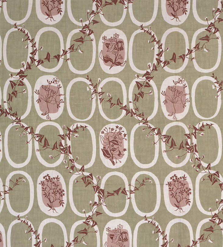
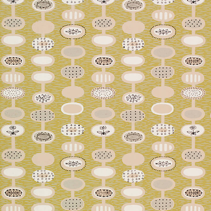
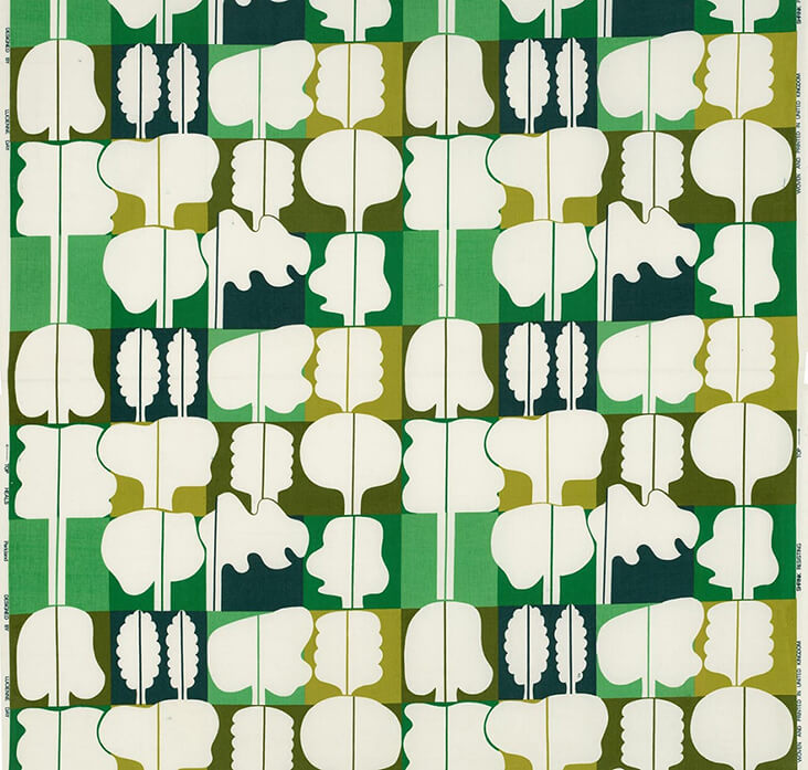
Throughout the 1950s Day’s designs became ever more radical and stylised, featuring quasi-botanical forms with linear, drawn elements and flattened panels of dazzling colour resembling the art of Ben Nicholson and Wilhelmina Barnes-Graham, as seen in Dandelion Clocks, 1953 and Herb Antony, 1956. Despite her growing fame, Day was still keen to make her designs accessible for as wide an audience as possible. While bold designs were better suited to large, spacious interiors, Day also made quieter, more subtle pattern designs for small interiors. She also embraced cheap man-made fibres such as rayon and cellulose, for, as she explained, “people who like Calyx but have smaller windows and purses.” Flotilla, 1952, Palisade, 1953 and Lapis, 1953, were specifically designed for the affordable market.
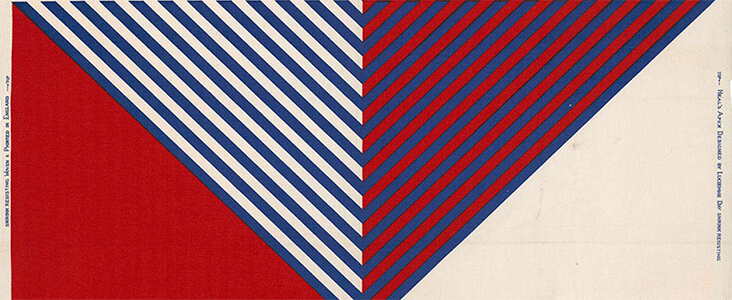
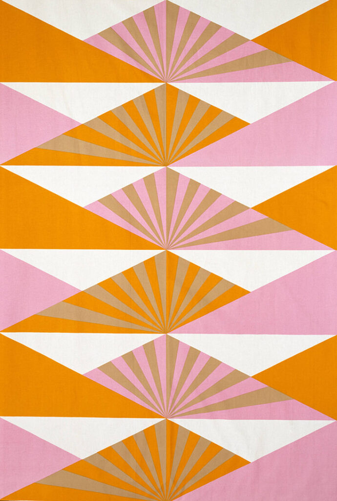
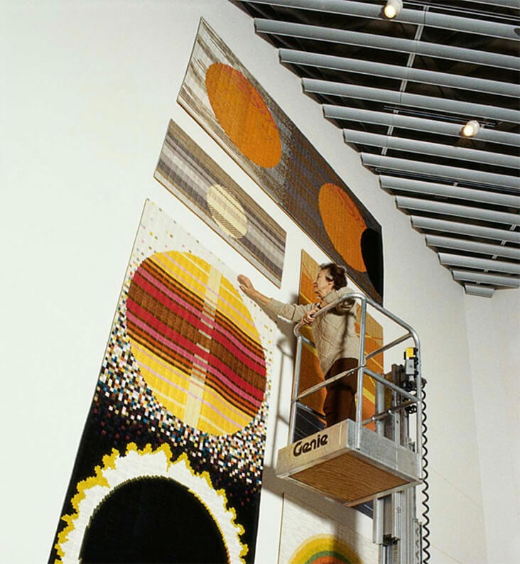
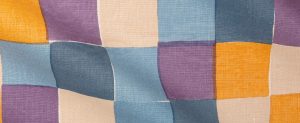
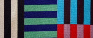
Throughout the 1960s Day’s design style continued to evolve as she embraced the decade’s trend for bigger, bolder shapes and pure, bright colour. Day worked out these designs by painting with gouache on paper, producing works of art in their own right resembling the art of Patrick Heron, which are now collected by several of today’s major design museums. Apex, 1967, and Sunrise, 1969, reveal Day’s new approach to colour and pattern, with large, blocky shapes and sharp, angular forms. When the 1970s made a return to floral prints, Day was less keen to follow the trend, choosing, unusually, to move into the production of one-off, silk mosaic prints. Made from stitched together panels of vibrant, glistening panels of shot silk, Day soon found commissions rolling in, including Window, 1986, made for Queen Elizabeth’s Conference Centre in Westminster, and Aspects of the Sun, 1990, for the John Lewis store in Kingston. This final phase in Day’s career seems a fitting finale for a designer so invested in merging visual art with interior décor, allowing her to fully consolidate her singular and unique design vision.













4 Comments
Edna Sloan
Thank you for this story. Interesting and informative.
Rosie Lesso
Thank you for the kind words!
M. Chesebro
Thank you, Rosie. Your post was ALL new to me. I enjoy your writing style and topics. Please keep up the good work! Have a lovely day.
Rosie Lesso
Thank you for the comment – great to hear you are enjoying the articles!