FS Colour Series: Apricot inspired by Pierre Bonnard’s Warm Light
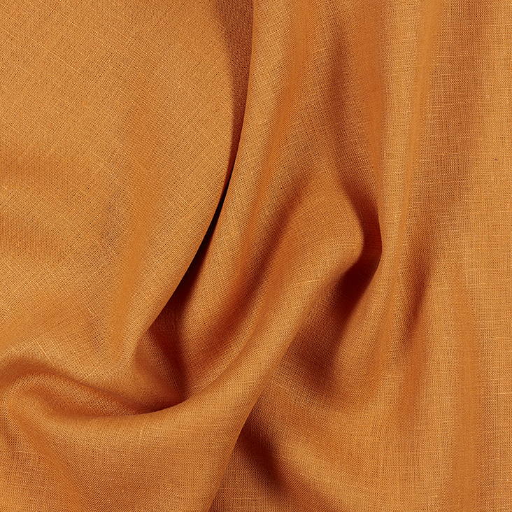
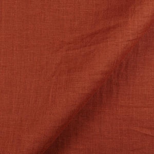
The earthy ginger of APRICOT linen echoes Pierre Bonnard’s spicy Mediterranean oranges, colours that became a central focus in his flickering, light speckled canvases. Recognised today as a vivid colourist, Bonnard captured the warm light of his native France with intimiste, naturally lit interiors, blooming landscapes and sunlit gardens. An early abstractionist, his paintings reveal tantalising glimpses into his private world of experiences before dissolving into showers of colour and light before our eyes. He wrote, “Certainly colour had carried me away. I sacrificed form to it almost unconsciously.”
Bonnard achieved early success as a leading member of Les Nabis in the early 20th century along with Edouard Vuillard and Paul Serusier, painting in a bold, simplified style composed of flat patches of colour as influenced by Paul Gauguin and Japanese prints. But by 1900 he had changed track, moving towards an Impressionist style of lively dots and dashes, painting scenes of his intimate personal life from memory with heightened, vivid colours.
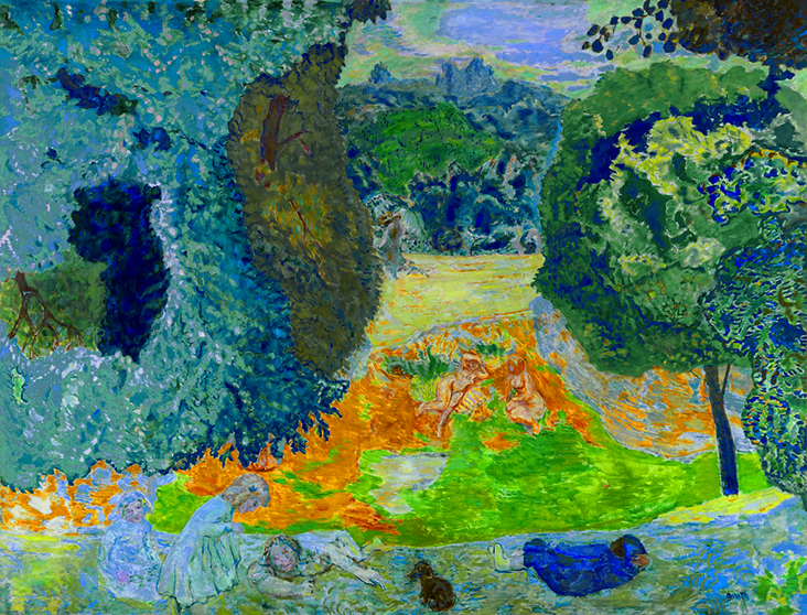
In 1910 Bonnard visited La Roulotte, a house in Vernonnet, not far from Monet’s famous waterlily garden at Giverny and was so taken he bought a house there two years later. Between 1912 and 1938 he made more than one hundred paintings here featuring interiors, still life studies and landscapes; this work revealed delicate pastels and shimmering surfaces, accentuated with vivid orange hues that seem to emanate warm sunlight.
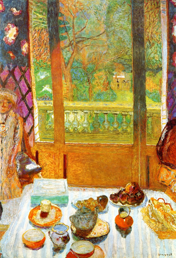
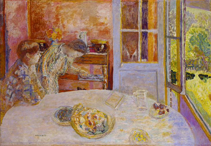
During the First World War, Bonnard continued to produce sunny, optimistic work despite the horror and destruction around him, portraying a much longed for vision of peace. One of his favoured subjects was the interior / exterior scene, demonstrated in quiet paintings such as The Dining Room Vernon, 1925. Here Bonnard draws us in with a strip of apricot orange behind an open patio door, offset with gentle blue and lilac pastel tones and small jewels of bright colour. On composing such paintings Bonnard wrote, “If one has in a sequence a simple colour as the point of departure, one composes the whole painting around it.”
From 1927 Bonnard spent increasing amounts of time in the south of France, where the change in climate had a significant impact on his work. He began flooding his paintings with an intense, hot light, allowing rich, fiery shades of orange, red and yellow to take centre stage. Nude at the mirror, 1931 resembles a patchwork quilt constructed from textured fragments of orange, yellow and red, while Dining room overlooking the garden, 1930 is infused with a light made golden by the blindingly bright central panel below the window.
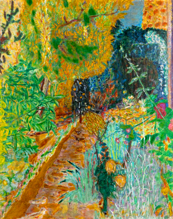
Bonnard’s colours became ever more experimental and vivid throughout the 1930s, which he combined with various decorative patterned surfaces that appear as if collaged or sewn together. In the acid bright Nude in an interior, 1935, a sliver of barely seen nude figure is overpowered by solid blocks of glowing ambers that seem lit from a sun beyond the canvas, set against a series of electric blues. The garden was made the following year in 1936, transforming an overgrown patch of grass and flowers into a harmonious symphony of colour, with the orange hitting a high note above the rest. Landscape at Le Cannet, 1928 performs the same trick, combining a complex network of smaller, softer colours together with one patch of vibrant yellow that sings the loudest song. Bonnard made these paintings during postwar economic hardships and for many they became a powerful message of hope, with several critics referring to him as a “painter of happiness.”
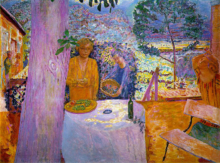
Throughout the Second World War Bonnard continued to produce his own inimitable brand of vivid, light filled canvases, retaining a sense of joy and wonder in the simple ennui of life. He spent most of the Second World War completing the vastly scaled, overwhelmingly textured The Sunlit Terrace, 1939-46, which glows with tangerine and heather blue light; Bonnard finished it just a year before he died, marking it out as a powerful symbol of resistance against the war, and a final ode to the warm optimism of orange.

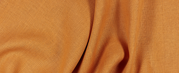
FS Lily Pattern made with Apricot Medium Weight 100% Linen
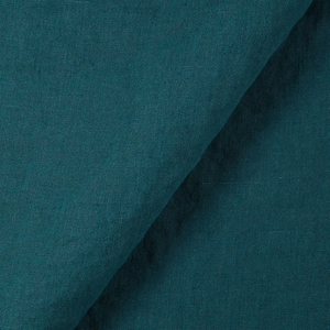
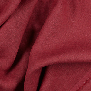
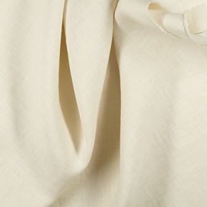
FS APRICOT 100% Linen comes in Medium and Light Weight















6 Comments
Linda Swanner
This is a wonderful article! And I love the Lily pattern showcasing this wonderful color!
Vicki Lang
thank you so much for the interesting articles. giving the colors a background in how they were developed by the masters.
Barbara Klink
I am so happy to see your art lesson about color. You write beautifully and lift my inspiration and my desire to create. This is the best lesson ever. Thank you! Barbara Klink
Virginia Duppenthaler
I fully appreciate this lesson on art history with reference to apricot color linen. Magnificent!
Laura Overturf
Dear Rosie! As a lifelong lover of all things sewing and a retired art teacher, I was so pleased to begin reading your beautifully illustrated blog about Van Gogh’s yellow…and now Bonnard! Your writing is accurate, complete and appealing. You have masterfully begun opening the eyes of people to the power of color….historically and aesthetically.
Well done, young lady! I look forward to more posts.
Sincerely, Laura Overturf
Barbara Klink
Beautiful commentary Laura. Thank you for the wonderful expression of your appreciation for this color lesson. Barbara Klink